Introduction
In this assignment I was to show my command of colour in photography, by being able to find and use different colours in deliberate relationships.
By taking 16 photographs showing the following colour relationships:
- colour harmony through complementary colours
- colour harmony through similar colours
- colour contrast through contrasting colours
- colour accent using any of the above.
Preamble.
The colour part of the course has come close to breaking me. I have spent almost a year procrastinating about this. I just don’t get colour. I have seen my peers on the course take to this like ducks to water but I have huge difficulty seeing colour (I am not colour blind I have been tested). In the compositional exercises we were being taught to see compositional elements and I got that but I could not get to grips with the colour exercises at all.
I made a few attempts at this assignment, first trying to find colour relationships and secondly taking the still life route. I finally admitted defeat and asked my tutor for assistance. She was brilliant and offered a skype call. During the call I was showing her my attempt at a still life colour relationship to which she replied “boy you really hate this colour stuff don’t you”. She suggested I have a look at the work of Guy Bordin.
What I noticed about Bordin’s work is the use of bold background colours which would contrast or compliment the shoes that he was being paid to shoot. He was also a huge proponent of colour accent with shoes (or in some cases lips or painted finger nails) providing the small splash of colour.
From Bordin I moved on to looking at the work of Martin Parr, David Lachapelle and Terry Richardson (all very controversial photographers in their own ways ). Parr's ability to observe colour and colour relationships is incredible, depressingly so for someone who has difficulty finding them in the wild. He uses this skill to produce wonderful colour saturated social commentary. Lachapelle's photographs are an orgy of colour, shocking to the eye but still maintain a balance. One of his calmer shoots involved Angelina Jolie. He shot her against grass dressed in white producing a gorgeous colour accent. In another shot Jolie is pictured eating a strawberry her green eyes matching the green stem of the fruit and producing a beautiful complimentary colour relationship with the red flesh of the berry. Richardson's penchant for shooting his subjects against a white wall and blasting them with flash has the effect of drawing the eye to any bit of colour in the photo.
At the end of the skype call the tutor gave me a final piece of advice, “Just have some fun with it” and that is what I decided to do. I would use elements of the photographers above to inform my photos and have a fun fashion shoot. I asked the models to bring outfits in primary and secondary colours and I would shoot them against blank coloured walls.
Colour harmony through complementary colours
In a previous exercise I have talked about balance through composition, but it’s also possible to balance a photograph by the colours used. The combination of two colours that are opposite on the colour wheel have the effect of cancelling each other out and making the photo more pleasing and balanced to the eye. This effect is not just limited to two colours, combination of colours symmetrically occurring on the colour wheel will combine to form grey and can be considered to be complimentary colours.
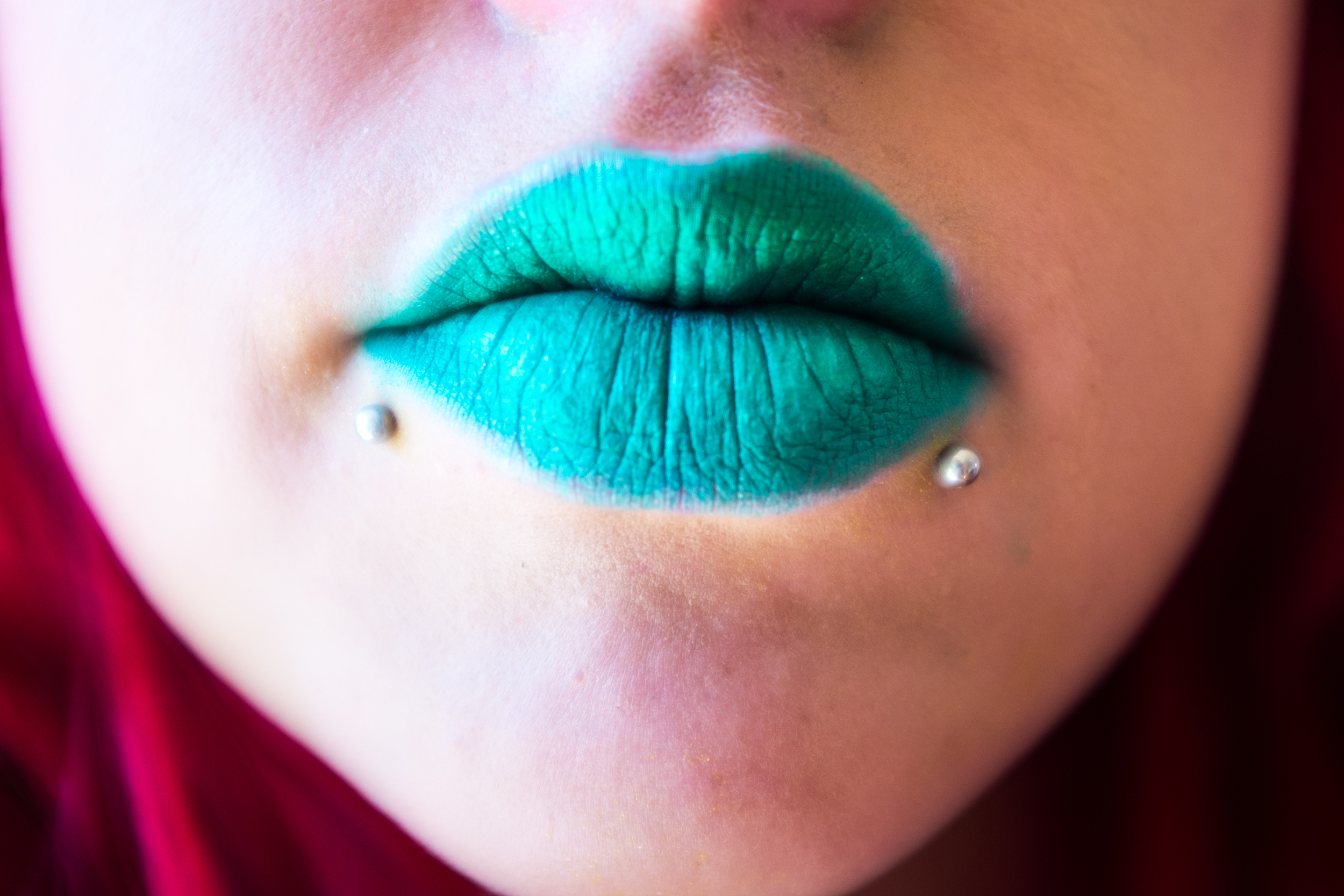

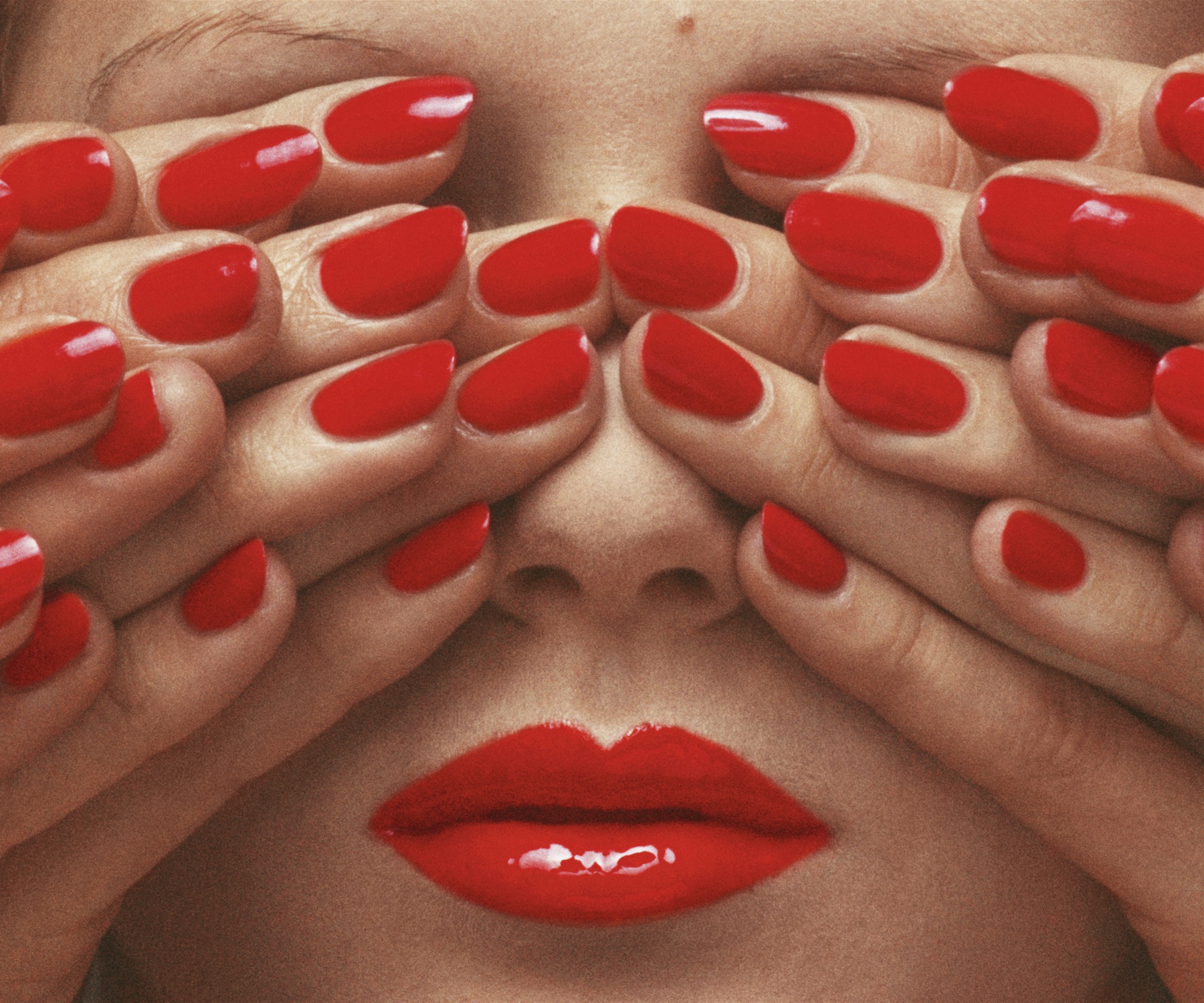
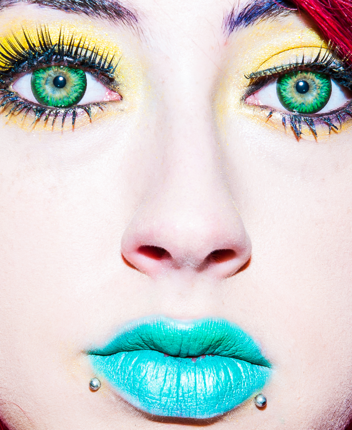
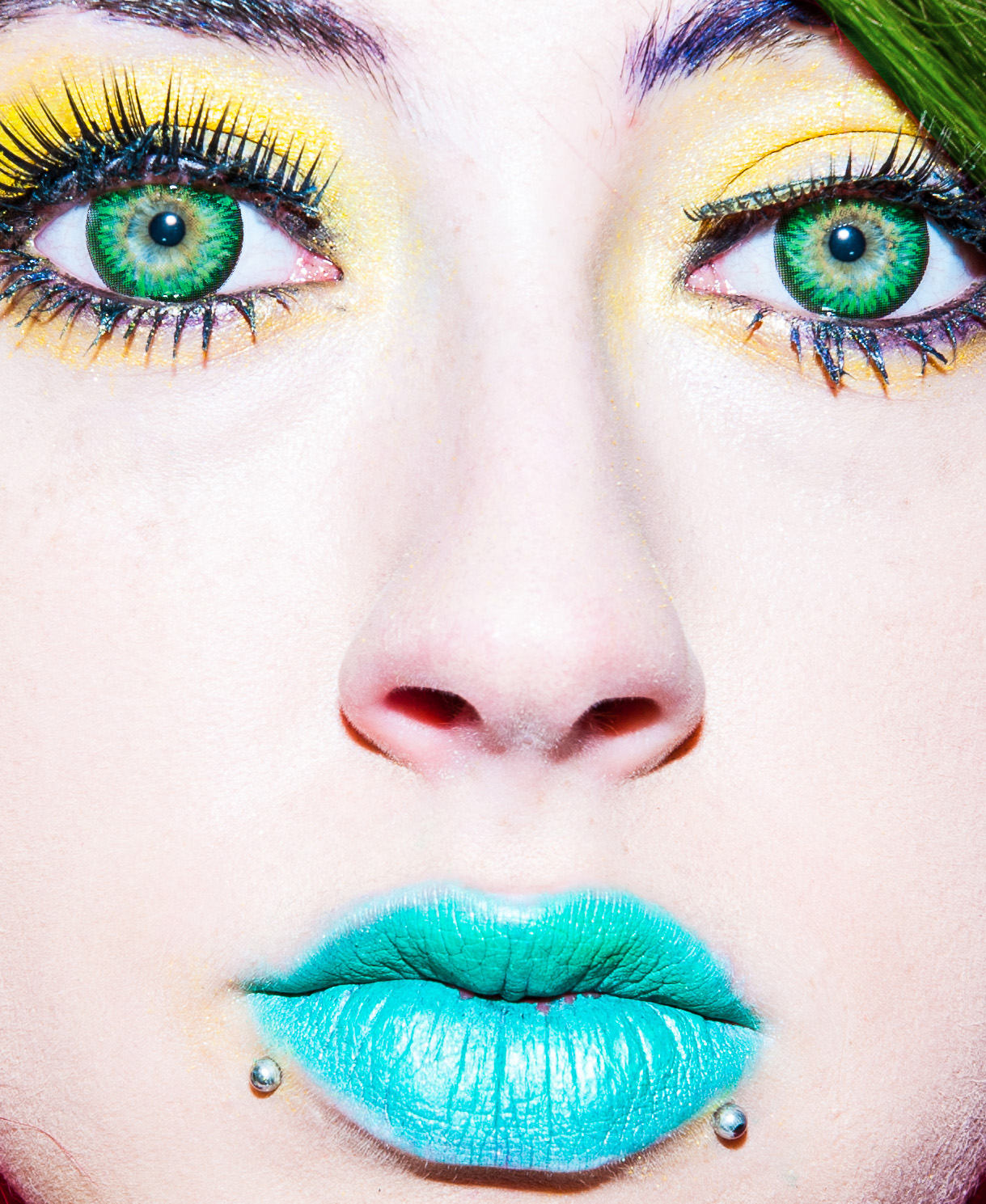
In the photo above the contrasting colours of red and green in roughly equal measure give a balanced photo. This photograph is influenced by Guy Bordin's famous photo showing a model's face wearing cherry red lipstick, her eyes covered with multiple hands all wearing the same shade of red nail polish. The effect is to dehumanise the model and that is what is happening here with the unnatural lip colour and the exclusion of other facial features.
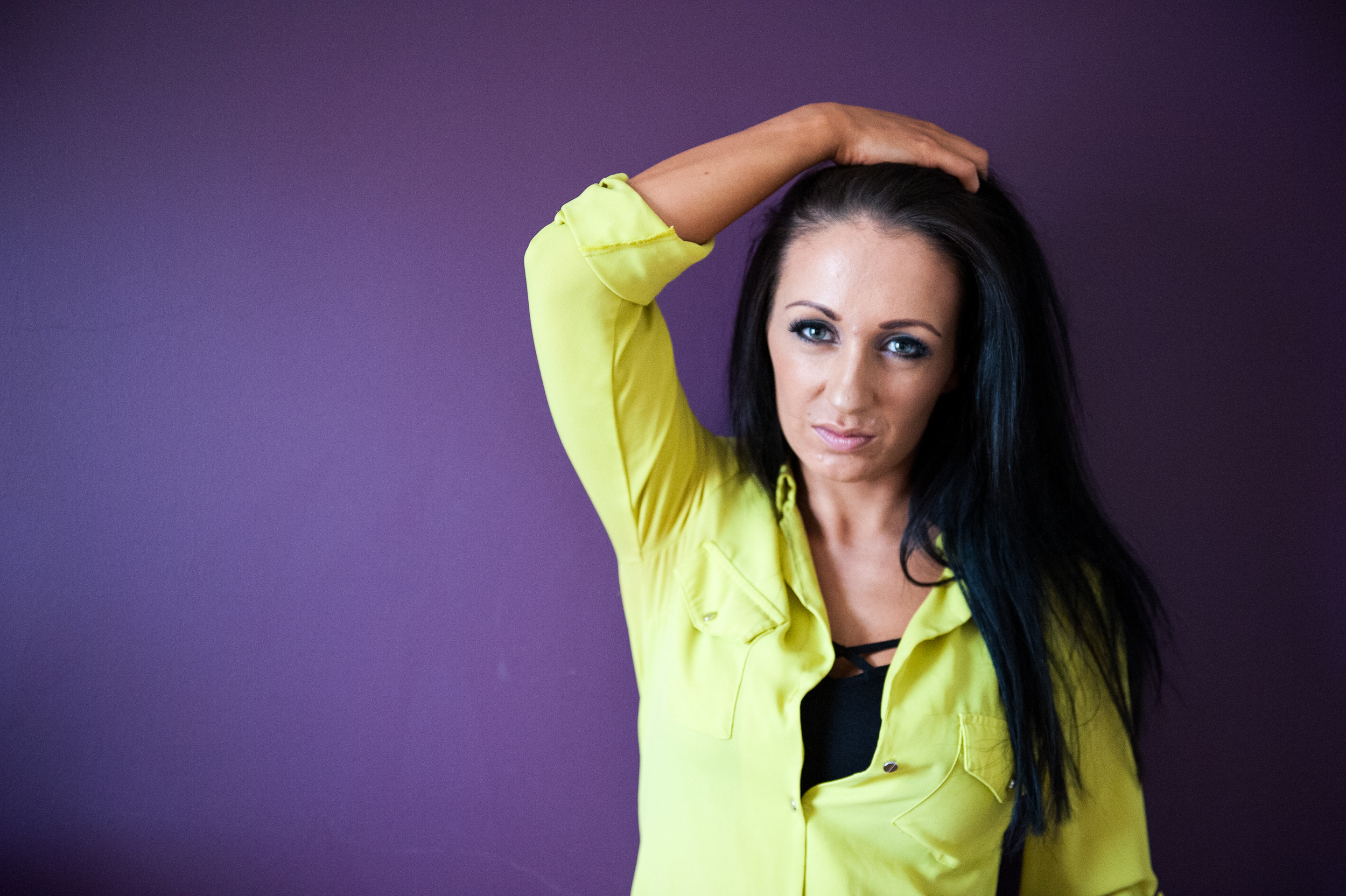
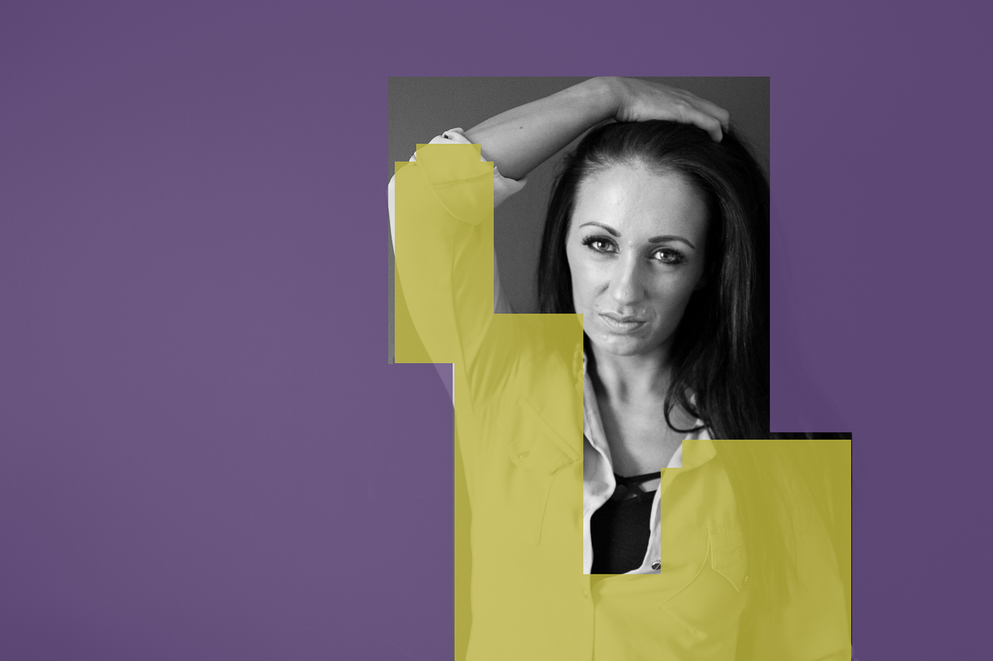
Bordin was known for using large blocks of colour in his photography and I have tried to do the same with this photo and subsequent other photos in this assignment. Although the purple and yellow are complimentary, the fact that they are out of proportion does tip the photo a little off balance but it is no bad thing to have a little tension to keep the viewer interested.


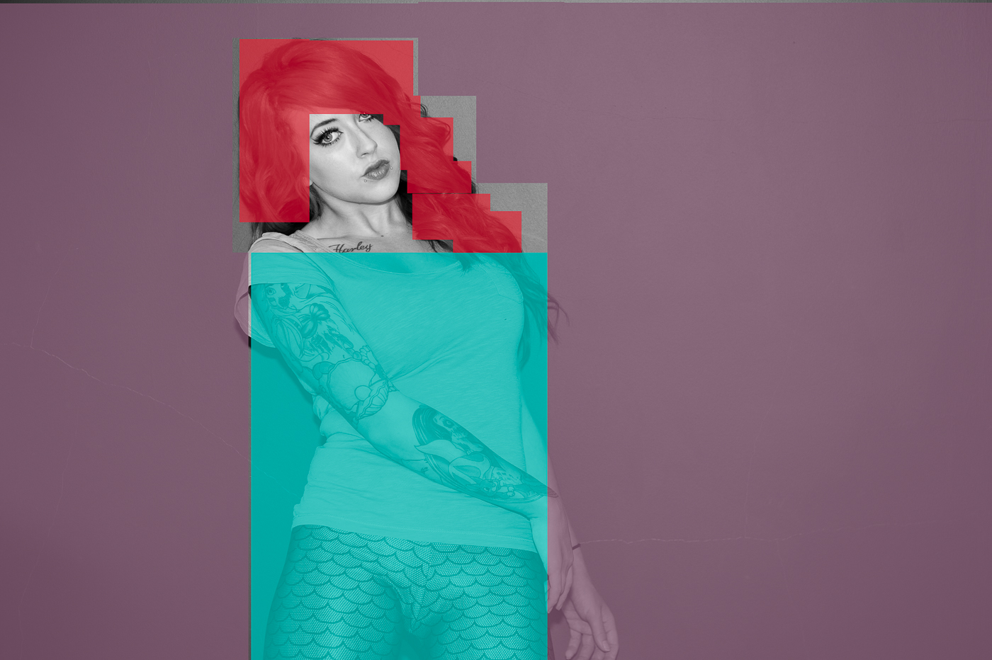
If you look at the block sketch above the red and green are reminiscent of ying and yang mirroring L shapes.


Although this is a photo is an attempt at re-creating the 2001 shots by David Lachapelle of Angelina Jolie, I have taken a leaf out of Martin Parr's book and pushed the saturation to give the photo more vibrancy. Unlike the previous 3 photos there is a feeling of left to right movement in this shot by the arrangement of the models hair.
Colour Harmony Through Similar Colours
Harmony can also be achieved by matching colours adjacent to each other on the colour wheel. This approach with give the photograph a particular feel for example warm oranges reds and yellows or cool blues and purples.


From the block diagram above we can see that the colours used are blue and purple, adjacent to each other on the wheel and gives a very calming tone to the photo. This would be hard to see if the photo is only viewed with the "Male Gaze". Bourdin's photos had a shocking sexual and misogynist quality to them, especially when you consider that they were taken in the 60's and 70's, and the subject would outweigh the styling or colour composition as is happening in to a certain extent in the photo above.


Although the red and purple in this second photo are more vibrant than the previous blue and purple shot there is not an uncomfortable clash.


Purple and red again but this time the the less vibrant purple is dominant and the red is almost a colour accent.

The harmony of this yellow and green composition is challenged by the very small bit of red in the top right hand corner. If you examin the block diagram above you will see that red makes up less than 10% of the photograph but still has the effect of adding a discordant note to the image. You can see below that by changing the hair colour to green the photo is much more harmonious.
Colour Contrast through Contrasting Colours
Putting colours together that occur about a third of the way around the colour wheel has the effect of producing contrast. As we saw in the the example above the red of the models hair clashed with her eyes. I have used these clashing/contrasting colours in the images below with varying success in creating colour contrast.


(Freeman 2009) tells us the qualities that define colour are Saturation, Hue and Brighness. Therefore it is not simply a matter of choosing the colours to create a colour contrast image. The photo above has the correct colours which are highly saturated and have a deep hue but the image is lack luster at best and does not have the feeling of contrast where as when the exposure is increased (as can be seen below) the colour contrast is immediately apparent.
 The same can be said of all the images below, they have the correct colour combinations for a potential colour contrast image but without an increased brightness level to bring out the saturation and hues they would have been dull and low contrast images. It is worth noting that if the hue had have been lighter and the saturation lower no amount of brightness would have given these images contrast. It is the combination of all three that gives the desired result.


Colour Accent
Colour accent is not that hackneyed wedding photographers (colour pop) trick of de-saturating everything in the photograph except for the brides flowers. It is a design tool to similar to single point composition where a small spot of intense colour is floating in a sea of less intense background colour. In the photo below the model's red hair could be considered to be colour accent.
"when there is an extreme difference in proportion between colours - meaning when one at least is very small relative to the frame - the dynamics become those of point within a field, the equivalent of black dot on white background. the proportions become, in effect, irrelevant. One colour becomes an accent, or spot colour, and the eye is very much pulled by its placement." (Freeman, 2009 :135)
The models red lips and top in the photo below are another example of colour accent.

Terry Richardson's photos have a colour accent quality as he shoots against a white wall flooding the image with light so that the only thing of colour remaining in the photo is the subject.


Reflection
On the face of it colour seems simple. We learn our colours before we go to school, so why did I find colour so difficult? Why d watch my peers on the course fly through the colour module while it has taken me almost a year to finish this assignment?
The best answer I can come up with is by comparing colour to music. When I hear a song for the first time I can have a reasonably good stab at singing the melody where as there are people who could listen to that song a hundred times and still not be able to carry the tune. In the same way there are people who would walk through a scene and see hundreds colour combinations where I would have trouble picking out one.
To produce the work above I had to write down the colour combinations that I wanted to achieve and ask the models to bring clothes in those colours. This is a natural ability that appears to be under developed in me. I became frustrated and then disheartened. I felt that I may have to call it quits.
It wasn't until my tutor contacted me because we had no communication in a long time and offered to talk the problem through that I started to make any headway with the assignment. She pointed me to photographers for inspiration and gave me permission to go and enjoy taking colour pictures.
By using elements of the other photographers work to produce my own images I feel that I have added to my own voice as an (fledgling) artist.
Bibliography
Freeman, M. (2013). The colour photography field guide. 1st ed. Lewes, U.K.: Ilex.