OCA TaoP

OCA degree in photography module 1

Assignment 5

Brief

In this assignment I was to put myself in the place of a photographer tasked with illustrating a story for a magazine. I have been given the cover plus several pages inside to illustrate.

Photographing my Americans

In 1955, having been awarded a Guggenheim grant, Robert Frank drove away from his wife and children on a road trip. Over a year and more than 27000 photographs later he produced "The Americans". In the words of Jack Kerouac "Robert Frank, Swiss, unobtrusive, nice, with that little camera that he raises and snaps with one hand he sucked a sad poem right out of America onto film, taking rank among the tragic poets of the world." (Frank and Kerouac, 2008 : p6)

The final book consists of 83 images and has had a profound effect on post war documentary photography. Initially the book was poorly received by the American photographic establishment. His blurry images and untraditional composition angered them.

It has been suggested that Frank falls into a group of photographers who followed a fashion for using the poor as subject matter "The great photographic portraits of America—like Walker Evans’s American Photographs (1938) and Robert Frank’s The Americans (1959)—have been deliberately random, while continuing to reflect the traditional relish of documentary photography for the poor and the dispossessed, the nation’s forgotten citizens." (Sontag 1979 : P47). In my opinion he was exploring America without the bias of being an American and that gave him a fresh view.

I had the opportunity to spend 3 weeks in America visiting several states. I wanted to think about the differences in Frank's America compared to modern America and also consider the similarities.

Some things have not changed, the beatniks are back but are referred to as hipsters. People are "Proud to be an American" and this manifests itself in a  jingoistic gun toting military patriotism where gas stations are "proud to support our troops" and strangers walk up to soldiers, to shake their hand proclaiming "Thank you for your service son!".There is still a place for the church and prayer.

Robert Frank's beloved juke boxes are all but gone replaced by hand held devices with head phones. The population spend a lot more time looking at screens, TV's, game systems, laptops, tablets, phones,  all of these devices captivate and isolate.

Civil rights have come a long way. I am not sure how common the sight of two African Americans driving a sports car down Broadway would have been in the 50's. Men openly behaving as a couple would also have been an anathema. In Frank's day there was no department of homeland security, there was no gun boat escort for the Staten Island ferry during periods of heightened terrorist threat. Consumerism and fast food were not king and queen. Americans don't crowd into the drug store for a malted milk shake as they would have 60 years ago, instead they crowd into the apple store lusting after the aluminum and glass, must have, electronic idols. America is an incredible place to live if you have money and an uncaring hell if you have not. 

1 world trade centre - Manhattan (cover image)

Post Boxes - Baltimore, Maryland

Leisure time - Canton waterfront park, Maryland

Narrative and Illustration final small-110

Sports car - Manhattan, New York

Low wage commuters - Coney Island, New York

Theatre goers - Manhattan New York

Fast Food Restaurant - Savanah, Georgia

Tourists posing - Washington DC

Savaging for plastic bottles - Harlem, New York

Superstore - Charleston, South Carolina

Church Sign - Savannah, Georgia

Church of the Millennials - Grand Central Station, New York

Video Gamers - Savannah, Georgia

Couple - Baltimore, Maryland

Liberty - Liberty Island, New York

Navy Graduation Ceremony - USS Yorktown, South Carolina

Train Platform - Newark, New Jersey

Narrative and Illustration final small-107

Narrative and Illustration final small-104

Reflection

I chose not to design a cover, if this was the a real magazine assignment I would not have that kind of editorial control. I could not limit the article to 12 photographs and still give the viewer enough of my experience of the US. I feel I have met the brief, I have attempted in the selection and order of photographs to show a little of the dichotomy between the American dream and the American reality.

Throughout the module my tutor has been encouraging me to imbue my photographs with meaning and this is probably the closest I have come. If I had taken the same trip at the start of this module the results would have been very different. Some of the photos have a snap shot quality but their subject matter and position in relation to the other photos in the series hopefully elevates them from the holiday snap category.

Assignment 4

Introduction

For this assignment I was to photograph one object using the different lighting techniques I have been studying. The aim is to bring out particular physical properties of the object using lighting. The qualities to be shown are :-

  • Shape
  • Form
  • Texture
  • Colour

The first challenge was selecting an object that had all 4 elements, was small enough to move around and light in a small studio setup and could look some what different in each shot.

The second challenge was elevating this from a purely technical exercise of applying lighting techniques to something with artistic merit. My tutor suggested looking at the still life work by Edward Western. His selection of subjects and lighting produced images of objects which take on an almost human appearance, for instance, peppers which look like lovers entwined or a cabbage leaf which could be mistaken for cascading hair. I failed this challenge miserably, perhaps the only shot where the subject (game controller) is almost unrecognisable is the first texture shot

"As photographers, we are primarily concerned with the brightness, color, and contrast of the light." (Hunter, Fuqua and Biver, 2011 : P17). I eliminated any variation of the colour of the light by using the same light source for all of the images. The brightness also had an effect as I used a sufficiently bright light source to ensure that the ambient light had no effect on the final images.

Shape

The shape (or outline) of an object is dictated by the edges. A cylinder may look completely circular in shape if only the round end is visible. Silhouette is an effective pproach to emphasise the edges of an object and is achieved by placing the light source directly behind the image, as illustrated in the first image below. I wanted to emphasise the controllers triggers as they reminded me of little demonic horns so I tilted the controller forward slightly causing the light to spill over and give the bright "Halo" effect.

Another way of showing the shape of an object is to shoot against a plain background thus removing any distractions and focusing entirely on the subject. I have used this in the second photo below. To ensure no shadows on the background I lit the controller from either side perpendicular to the cameras lens. This has the effect of making the controller almost float off the background and the high contrast lighting clearly defines the shape. To me it resembles a butterfly  in a case pinned to a backboard in a museum.

Lighting small-100 Lighting small-106

Form

"A shape is ‘converted’ to a solid by highlight and shading. A cast shadow anchors the solid 0bject on a plane and further enhances the illusion of the third dimension in the two dimensions" (Präkel, 2007 : P157).

Form is all about adding depth to the photograph and this is done with highlight and shadow. Giving the subject depth gives the photo a sense of realism. When discussing form Präkel (2007) tells us that an emotional response is triggered in the viewer. Muscle and touch memory are activated when looking at a photograph of the highlighted curves of sports car for instance.

In the first of the photos below the modeling light is set at 45 degrees to the subject, giving the illusion of light falling from the sun and highlights the curved grips of the controller whilst simultaneously anchoring the object to the plane and giving a sense of depth to the picture.

In the second "form" photo I decided to experiment with reflection instead of shadow to anchor the controller to the surface. The effect is spoiled by multiple reflections from the surface of the glass and the metal coating of the mirror as well as refraction of the light within the glass but is somewhat successful on the right hand side of the photo where the controller's grip is reflected without these distractions.

Lighting small-108 Lighting small-107

Texture

A photo with texture is one in which we can almost feel the object in our fingertips while looking at it. The best way to enhance the texture of an object is to use as small a light source as possible and positioning it so that the light "rakes" across the surface of the object. Reducing the size of the light source increases the contrast and creates the harsh mini shadows and highlights which enhance the objects texture in the photographs as can be seen below.

Lighting small-103 Lighting small-102

Colour

Hunter, Fuqua and Biver, (2011) tell us that a high contrast light source is one where all of its rays strike and object from the same direction whereas a diffuse light source is one where the rays strike the object in many directions. A diffuse light source has the effect of diluting or washing out the colour of an object however a high contrast light source intensifies the colour.  The images below were lit with a single undiffused flash unit.

Lighting small-105 Lighting small-104

Reflection

I believe I have met the technical aspects of the assignment, as for the artistic side I find myself somewhat at a loss. I still struggle with imbuing my work with meaning.

A narrative picture essay

The aim of this exercise was to set myself and assignment and then photograph it. I chose to cover the first day of the John Hewitt summer school. Every year the John Hewitt society runs a week long  literary summer school  and cultural festival with talks from authors, workshops, art exhibitions and performances. It takes place in the Market Place Theatre & Arts Centre, Armagh, and some surrounding venues for the workshops. I wanted to try and capture the essence of the event, and give the viewer a sense of being there.

I took 300 photos and selected the following to tell the story.

AA selection small-9654 AA selection small-9650 AA selection small-9643 AA selection small-9119 AA selection small-9078 AA selection small-9076 AA selection small-9047 AA selection small-8979 AA selection small-1466 AA selection small-1462 AA selection small-1455 AA selection small-1449 AA selection small-1446 AA selection small-1440 AA selection small-1431 AA selection small-1415 AA selection small-1401 AA selection small-1395 AA selection small-1383

Part of telling the story is the layout of the photographs. I used a web version of wedding album software to do the layout  so you will see the word proof on the photos in some places where my Photoshop skills were not sufficient to remove it

003 005 007 009 011 013

The lighting angle

  The aim of this exercise was to take shots using the various lighting positions and angles belowshots


Light Level with the subject - Lit from the front (with the light next to the camera)

The lighting angle small-0637

due to the size of light modifier being used (a large soft box) it was very difficult to shoot directly from the front so there is a slight angle to the lighting in this photo. The effect of having the light level with the subject and directly in front is to give the image a very flat 2 dimensional appearance.

Light Level with the subject - Lit from the side

The lighting angle small-0640

With the light at 90 degrees to the subject the face is half in light and half in darkness. the studio wall was acting like a large reflector so the right side of the subjects face is not totally in darkness.

Light Level with the subject - Lit from behind and to one side

The lighting angle small-0644

moving the light further to the back lights even less of the subjects face but does give more of a feel to the contours of the face.

Light Level with the subject - Lit from directly behind

The lighting angle small-0648

I really like this effect.  because of the size of the soft box light is almost spilling round the subject  and emphasising the shape of the head. There is definitely a more 3D feel to this photo

Light Down towards the subject at an angle of about 45 Degrees - Lit from the front (with the light next to the camera)

The lighting angle small-0611

this is a similar setup to photo 1 except the light is above and at 45 degrees. again the top half of the subjects face is fully lit and therefore somewhat flat in appearance but the shadows below the nose and chin give a little shape to the shot

Light Down towards the subject at an angle of about 45 Degrees - Lit from the side

The lighting angle small-0618


The face is almost 3/4 in darkness and although the shadows show lots of the facial contours it is not a particularly pleasing photo

Light Down towards the subject at an angle of about 45 Degrees - Lit from behind and to one side

The lighting angle small-0623


Moving the light even further behind the lights even less of the subject and leaves the face almost in total darkness

Light Down towards the subject at an angle of about 45 Degrees - Lit from directly behind

The lighting angle small-0629

I really like the edge lighting effect in this shot and how the light falls on the subjects shoulders.

Light suspended overhead - Directly overhead

The lighting angle small-0608

I have never used lighting directly from above before and the effect was unusual again similar to photograph 5 the shadows on the underside of the nose and chin give some shape but in this picture the texture of the tee shirt is much more  emphasised.

Light suspended overhead - From slightly in front

The lighting angle small-0609

This was my favorite portrait of the day. the texture of the hair and tee-shirt are great, the subject is definitely not flat and the shadows slim the face somewhat. Light suspended overhead - From slightly Behind

The lighting angle small-0610


Again a lot of the subject is in darkness and it is not a particularly pleasing photo.

Reflection

I was surprised by the different effects created by moving the light around. I have used a single studio light many times but I have not varied the angle and position as much.  I can see by combining numerous lights and angles you could lose a day in creative lighting experiments. It was a great way to spend a couple of hours and we stayed and created a few nice portraits using a single light.


The lighting angle small-0662 The lighting angle small-0669 The lighting angle small-0681 The lighting angle small-0686 The lighting angle small-0687 The lighting angle small-0626 The lighting angle small-0635


Softening the light

The brief for the exercise was as follows Set up a still-life arrangement, with any object or group of objects. The lighting direction will depend on your subject, and you might like to experiment but, if in doubt, fix the naked lamp more or less overhead, pointing down. (I am assuming that the camera is aimed at a slight angle downwards.)

Using a diffused light source to soften the shadows and highlights take two photographs, one with just the naked lamp, the other with the translucent material held between the lamp and your subject (but out of view). The two exposure settings will be different.

Look at the results, and write down exactly what you see as the differences. Look, for instance, at the strengths (blackness) of the shadows, their extent, and the hardness of their edges. Look also at the highlights, and at the contrast. Finally, was the diffusion an improvement? Record your answer.

To carry out the exercise I hired some time in a studio. I rummaged around the studio to find Items i could use in a still life and then used a single light from above at a 45 degree angle.  To soften the light I shot through a translucent reflector  the results can be seen below.

Softening the light Small-0550 Softening the light Small-0552


I should point out that one thing I did wrong was not having the camera on the tripod, this would have eliminated any doubt that differences in the photographs are down to differing camera angles.  The first photo is the "un-softened" direct light shot.  We can see that the the shadows are darker and more defined and also the colours are more saturated than in the second shot. In short the first photo has more contrast.

"A light source has high contrast if its rays all strike the subject from nearly the same angle. Light rays from a low-contrast source strike the subject from many different angles. Sunlight on a clear day is a common example of a high-contrast light source." (Hunter, Fuqua and Biver, 2012, p19). The unmodified light source has a more direct rays off light than the diffused light source. It is not only the shadows which are affected by introducing the diffuser, the reflected highlights also differ between the photographs, in the second shot they are larger and with less defined edges.

I have included a shot of the setup (NB offspring make excellent reflector stands)

Softening the light Small setup-9450

Assignment 3

Introduction

In this assignment I was to show my command of colour in photography, by being able to find and use different colours in deliberate relationships.

By taking 16 photographs showing the following colour relationships:

  • colour harmony through complementary colours
  • colour harmony through similar colours
  • colour contrast through contrasting colours
  • colour accent using any of the above.


Preamble.

The colour part of the course has come close to breaking me. I have spent almost a year procrastinating about this. I just don’t get colour. I have seen my peers on the course take to this like ducks to water but I have huge difficulty seeing colour (I am not colour blind I have been tested). In the compositional exercises we were being taught to see compositional elements and I got that but I could not get to grips with the colour exercises at all.

I made a few attempts at this assignment, first trying to find colour relationships and secondly taking the still life route. I finally admitted defeat and asked my tutor for assistance. She was brilliant and offered a skype call. During the call I was showing her my attempt at a still life colour relationship to which she replied “boy you really hate this colour stuff don’t you”. She suggested I have a look at the work of Guy Bordin.

What I noticed about Bordin’s work is the use of bold background colours which would contrast or compliment the shoes that he was being paid to shoot. He was also a huge proponent of colour accent with shoes (or in some cases lips or painted finger nails) providing the small splash of colour.

From Bordin I moved on to looking at the work of Martin Parr, David Lachapelle and Terry Richardson (all very controversial photographers in their own ways ).  Parr's ability to observe colour and colour relationships is incredible, depressingly so for someone who has difficulty finding them in the wild. He uses this skill to produce wonderful colour saturated social commentary. Lachapelle's photographs are an orgy of colour, shocking to the eye but still maintain a balance. One of his calmer shoots involved Angelina Jolie. He shot her against grass dressed in white producing a gorgeous colour accent. In another shot Jolie is pictured eating a strawberry her green eyes matching the green stem of the fruit and producing a beautiful complimentary colour relationship with the red flesh of the berry. Richardson's penchant for shooting his subjects against a white wall and blasting them with flash has the effect of drawing the eye to any bit of colour in the photo.

At the end of the skype call the tutor gave me a final piece of advice, “Just have some fun with it” and that is what I decided to do. I would use elements of the photographers above to inform my photos and have a fun fashion shoot. I asked the models to bring outfits in primary and secondary colours and I would shoot them against blank coloured walls.


Colour harmony through complementary colours

In a previous exercise I have talked about balance through composition, but it’s also possible to balance a photograph by the colours used.  The combination of two colours that are opposite on the colour wheel have the effect of cancelling each other out and making the photo more pleasing and balanced to the eye.  This effect is not just limited to two colours, combination of colours symmetrically occurring on the colour wheel will combine to form grey and can be considered to be complimentary colours.

Complimentary-9193 Small Complimentary--2

In the photo above the contrasting colours of red and green in roughly equal measure give a balanced photo. This photograph is influenced by Guy Bordin's famous photo showing a model's face wearing cherry red lipstick, her eyes covered with multiple hands all wearing the same shade of red nail polish. The effect is to dehumanise the model and that is what is happening here with the unnatural lip colour and the exclusion of other facial features.

Complimentary-8862 Small Complimentary--3

Bordin was known for using large blocks of colour in his photography and I have tried to do the same with this photo and subsequent other photos in this assignment. Although the purple and yellow are complimentary, the fact that they are out of proportion does tip the photo a little off balance but it is no bad thing to have a little tension to keep the viewer interested.

Complimentary-8283 Small Complimentary-2

If you look at the block sketch above the red and green are reminiscent of ying and yang mirroring L shapes.

Complimentary-8551 Small Complimentary-


Although this is a photo is an attempt at re-creating the 2001 shots by David Lachapelle of Angelina Jolie, I have taken a leaf out of Martin Parr's book and pushed the saturation to give the photo more vibrancy.  Unlike the previous 3 photos there is a feeling of left to right  movement in this shot by the arrangement of the models hair.


 Colour Harmony Through Similar Colours

Harmony can also be achieved by matching colours adjacent to each other on the colour wheel. This approach with give the photograph a particular feel for example warm oranges reds and yellows or cool blues and purples.

Similar-8929 Small Similar-2

From the block diagram above we can see that the colours used are blue and purple, adjacent to each other on the wheel and gives a very calming tone to the photo. This would be hard to see if the photo is only viewed with the "Male Gaze".  Bourdin's photos had a shocking sexual and misogynist quality to them, especially when you consider that they were taken in the 60's and 70's, and the subject would outweigh the styling or colour composition as is happening in to a certain extent in the photo above.

Similar-8625 Small Similar--4

Although the red and purple in this second photo are more  vibrant than the previous blue and purple shot there is not an uncomfortable clash.

Similar-8493 Small Similar-

Purple and red again but this time the the less vibrant purple is dominant and the red is almost a colour accent.

Similar--2 Small Similar--3

The harmony of this yellow and green composition is challenged by the very small bit of red in the top right hand corner. If you examin the block diagram above you will see that red makes up less than 10% of the photograph but still has the effect of adding a discordant note to the image. You can see below that by changing the hair colour to green the photo is much more harmonious.

Similar green hair--2

Colour Contrast through Contrasting Colours

Putting colours together that occur about a third of the way around the colour wheel has the effect of producing contrast. As we saw in the the example above the red of the models hair clashed with her eyes. I have used these clashing/contrasting colours in the images below with varying success in creating colour contrast.

Contrast--5 Small Contrast--6


(Freeman 2009) tells us the qualities that define colour are  Saturation, Hue and Brighness.  Therefore it is not simply a matter of choosing the colours to create a colour contrast image. The photo above has the correct colours  which are highly saturated and have a deep hue but the image is lack luster at best and does not have the feeling of contrast where as when the exposure is increased (as can be seen below) the colour contrast is immediately apparent.

Contrast Roch- The same can be said of all the images below, they have the correct colour combinations for a potential colour contrast image but without an increased brightness level to bring out the saturation and hues they would have been dull and low contrast images. It is worth noting that if the hue had have been lighter and the saturation lower no amount of brightness would have given these images contrast. It is the combination of all three that gives the desired result.

Contrast Brit-8312 small Contrast Brit-

Contrast Roch 2-8877Small Contrast--2

Contrast-8594 Small Contrast-

Colour Accent

Colour accent is not that hackneyed  wedding photographers (colour pop) trick of de-saturating everything in the photograph except for the brides flowers.  It is a design tool to similar to single point composition where a small spot of intense colour is floating in a sea of less intense background colour. In the photo below the model's red hair could be considered to be colour accent.

"when there is an extreme difference in proportion between colours - meaning when one at least is very small relative to the frame - the dynamics become those of point within a field, the equivalent of black dot on white background. the proportions become, in effect, irrelevant. One colour becomes an accent, or spot colour, and the eye is very much pulled by its placement." (Freeman, 2009 :135)

Complimentary-8551

The models red lips and top in the photo below are another example of colour accent.

DSC_8730


Terry Richardson's photos have a colour accent quality as he shoots against a white wall flooding the image with light so that the only thing of colour remaining in the photo is the subject.

Accent-8716 Small Accent--2


Accent--4 Small Accent--5   Accent-8122 Small Accent-

Reflection

On the face of it colour seems simple. We learn our colours before we go to school, so why did I find colour so difficult? Why d watch my peers on the course fly through the colour module while it has taken me almost a year to finish this assignment?

The best answer I can come up with is by comparing colour to music. When I hear a song for the first time I can have a reasonably good stab at singing the melody where as there are people who could listen to that song a hundred times and still not be able to carry the tune. In the same way there are people who would walk through a scene and see hundreds colour combinations where I would have trouble picking out one.

To produce the work above I had to write down the colour combinations that I wanted to achieve and ask the models to bring clothes in those colours. This is a natural ability that appears to be under developed in me. I became frustrated and then disheartened. I felt that I may have to call it quits.

It wasn't until my tutor contacted me because we had no communication in a long time and offered to talk the problem through that I started to make any headway with the assignment. She pointed me to photographers for inspiration and gave me permission to go and enjoy taking colour pictures.

By using elements of the other photographers work to produce my own images I feel that I have added to my own  voice as an (fledgling) artist.


Bibliography

Freeman, M. (2013). The colour photography field guide. 1st ed. Lewes, U.K.: Ilex.

Variety with a low sun

The first requirement for this exercise was to shoot when the sun was low in the sky, this is commonly known as golden hour.

Golden Hour is quite simply when the sun is low in the sky. The end-points are sunrise and sunset, but the maximum height is a little vague. It’s when the sunlight in clear sky is yellow-to-orange, and that’s approximately below 20º above the horizon. (Freeman 2014, p. 94)

The second requirement was to produce an example of front lighting, back lighting, side lighting and edge lighting.

For my subject I chose ‘The Gleaner’ sculpture by John Knox which stands in the grounds of Stormont Estate. I chose her because she is gloriously lit by the setting sun on a clear evening and there is 360 degree access to shoot the the sculpture enabling me to use a single subject for all 4 lighting techniques.

Front Lighting

This is an example of axial lighting where the direction of the light aligns to the lens axis. This is achieved by ensuring the sun is directly behind the camera during golden hour. Axial lighting can be achieved in the studio by using a ring flash.

The characteristics of a photograph shot in this type of light are :-

  • There are no shadows present.
  • Strong light reflected directly back at the camera.
  • Flat 2D appearance

You will notice in the photograph below, there are shadows present on the woman's hair, arm and dress. This is due to the sun not being exactly aligned to the cameras axis. One of the difficulties of this lighting method is the potential for the photographer's shadow to appear in the photo, and the lower the sun, the more this becomes a factor. To avoid this I moved slightly to the right until my shadow was no longer striking the sculpture but this in turn created the shadows seen in the photo(my shadow could also have been eliminated by using a longer lens and moving back from the sculpture, thus allowing me to re-align for true axial lighting)

Low sun ex small-1001

Side Lighting

In the photo below the subject is lit from the left. Roughly half of the subject is lit and half is in shadow. Choosing the correct exposure becomes a balancing act of trying not to lose detail in the shadows whilst not blowing out the highlights on the lit side of the subject. Shooting shortly before the sunset means that the light is less intense and therefore reduces the dynamic range. The direct lighting gives sharp edges between the light and dark areas of the photo leading to an image with more contrast.

Low sun ex small-1002

Back Lighting

In the photo above, the subject is back lit, in other words the subject is between the light source and the camera. One of the problems of shooting into the sun is the high dynamic range between the sun and the shadows in a photo. This can cause sensor clipping at the top end of the dynamic range (sometimes know as blown highlights) and loss of detail in the shadows at the lower end. To avoid this I have obscured the sun with the subject and by doing so have reduced the dynamic ange that the camera has to deal with.

This is a somewhat softer photograph than the previous two shots because the subject is lit from various directions by the reflected light of the sun.

Low sun ex small-1003

Edge Lighting

To achieve edge lighting you shoot towards the sun (light source) but keep it outside the frame. A dark background is also desirable as it enhances the highlighted edge.

Low sun ex small-1004It is also worth noting that the intensity of light has an effect on how you expose for an edge lit photo and consequently how that  final photograp looks. If the light had been brighter the exposure would have been shorter and there would have been more of a halo effect and a distinct loss of detail in the shadows similar to the image below.

Processed edge small-1030

Reflection

This exercise has expanded my knowledge of lighting. One of the first pieces of advice I was given when I started to learn photography was get a 50mm prime lens as it will teach you to zoom with your feet. The idea behind this was that by limiting yourself to one focal length it would make you move and explore to get the best shot. Similarly here the light source was fixed, as was the subject so I had no alternative than to move the camera to get the required lighting effects.

We are exploring a three dimensional world and creating two dimensional images of it and the position of the camera has an effect on the visual relationships between the objects in the flat image we produce (Shore, 2007). In the photographs above we can also see that there is a relationship with the objects in the frame and the light source and how we position the camera has a huge bearing on the final image (when we are using a light source which we cannot move).

In the world there are an infinite number of places to position the camera therefore it is worth putting some thought into where you should shoot from and experiment with various viewpoints.

Judging Colour Temperature 2

In the previous exercise we discovered that the colour of light changes throughout the day and is also dependent on your surroundings. This exercise explores the effect of the cameras white balance (WB) setting on colour temperature. Most photographic film was balanced for "daylight" (ie 5500k on the colour temperature scale) therefore similarly to ISO, once you had your film in the camera you were stuck with that setting for the 24 or 36 frames on the film. This was not a huge issue if you were shooting in daylight but when shooting in a room lit by tungsten bulbs photographs would have a yellow cast (Freeman.1990).  This could be overcome by using tungsten balanced film (eg Kodachrome 40) but you would be locked to the tungsten "setting" for the remaining frames on the film.

Freeman (2013) tells us that the colour of an object  is a combination of the colour of the objects  surface and the colour of the light hitting that surface. Therefore if we can control the colour of the light we can more faithfully reproduce the colour of the object/scene that we are photographing.

This exercise illustrates that concept. Modern digital cameras have the ability to set the colour temperature on individual photos if desired using the settings seen below. The custom white balance setting will allow the user to apply an individual setting on the colour temperature scale. The auto setting will attempt to automatically select the correct white balance value . As camera technology improves, the algorithms used to calculate auto white balance become more accurate. The auto white balance on my phone is incredibly accurate when taking photographs.

White_Balance2

For this exercise I was to repeat the previous exercise of taking photos in midday sun, shade and sunset using the "daylight" white balance setting, but I was to also shoot on the "Shade" and "auto" white balance settings.  the results can be seen in the matrix below

Face Matrix labeled

it is immediately apparent that regardless of the the WB setting, the photos taken at sunset, have a very yellow/orange cast . I would have expected the auto WB setting to be more accurate but perhaps as I have a slightly older camera (D700) its white balance features may not be as advanced as some of the newer models. I also noticed that because of the different backgrounds, in some cases,  it was hard to judge the colour of my skin from photo to photo so I cropped the photos to show an area of my forehead from each shot.

Skin Matrix Labeled

What stands out in these shots is the variation in the auto white balance column. The three photos go from white to grey to orange. The other stand out is that, the photo taken using the sunlight white balance setting in direct sunlight and the photo taken using the shade white balance setting in the shade are virtually identical in hue and tone. which tells me that my cameras calibration is good even if the WB auto detection is not.

There is another element to compensating for white balance. Your digital camera has a processor onboard that takes the raw data hitting the sensor and processes it into a .jpeg file that is a common file format which can be read by computers (or phones and tablets) without the need for specialist proprietary software. In short it makes it easy for you to view and  share your photographs. However there is a down side to allowing your camera to produce the .jpeg file. The settings are baked in and cannot be changed so if you shoot at the wrong white balance setting, or as in the case of the d700 the auto white balance is not incredibly accurate, you are stuck with it.

Many cameras will allow you to save your photos in RAW format ie record the raw data produced by the sensor which can then be processed on a computer (using specialist software) to produce the finished photograph. The workflow is comparable to shooting film and then producing negatives in the darkroom. RAW files are sometimes referred to as “Digital Negatives”.

Using a proprietary software such as adobe lightroom, apple aperture, darktable, lightzone, rawstudio, capture NX or one of the numerous other programs, you can make adjustments to your photographs before producing a final .jpeg image. One of the adjustments you can make is white balance. You can see in the 2 versions of the photograph below I have made WB adjustments to give myself a much more natural skin tone.

Rawsmall-1015 Rawsmall-1014

Reflection

I am most at home on this course when I am doing a technical exercise and on the face of it that’s what this was. I got to wax lyrical on settings, software, colour temperature and cameras, But underlying all this techno babble this there is another lesson to be learned from this exercise.

Light has varying colours depending on the time of day and this can be used to embue your photos with feeling and atmosphere. The yellow orange light of sunset can give a photo warmth as Renoir did with Le déjeuner des canotiers. The blue grey light produced by the shade gives a coolness think of Van Gogh’s self-portrait 1889. I am in no way comparing my work to these great artists but merely stating that the colour of light (and consequently the ability to adjust for it using white balance settings or software) is another way to express yourself in your photography and convey a message or feeling to the viewer.

I am learning that many of the things that we strive for when we start to learn about photography (e.g. perfect exposure, perfect composition, pin sharp focused photos, correct white balance. faithful colour reproduction) are part of photography craft. They are actually subjective and can be manipulated to communicate with the person viewing the photograph and produce photographic art.

Judging Colour Temperature 1

This exercise was to illustrate the effect of the colour of light on a photograph. I was to take 3 photographs of the same subject with the cameras white balance set to daylight:

  • Photo 1: in full sunlight during the middle of the day.colour of light small-1001
  • Photo 2: in shade during the middle of the day.colour of light small-1002
  • Photo 3 : when the sun is close to the horizon.colour of light small-1003

there are obvious colour differences in the three photos. In the first photo my skin is at its most natural given that the colour of light in the middle of the day (on a clear day) is white. in the shade my skin appears more blue-grey and at the sunset i am almost umpa lumpa orange.

When I was taking these shots I don't remember my skin colour changing to this extent. This because our eyes adapt to the colour of light and things appear to be lit neutrally. it would be more correct to say that our brain adapts to the messages being sent to it by the eye and so we perceive colours in shade (or in some cases in artificial light) somewhat closer to how they would look if they were lit by a white light.

the skin colour in photo 1 is a little more yellow than I expected to see and this could be down to several factors.

  1. The photos were taken in winter sun which is lower than summer sun
  2. The camera's "Daylight" white balance is not perfect
  3. The monitor on which I am viewing the photos is displaying the photos with a slightly yellow hue (I do regularly calibrate my monitor)
  4. I am actually yellower than I think I am
  5. a combination of the first four factors.

By using a single white balance setting this meant that any changes in colour between the photos was based on the quality of the light.

(Freeman:2013) tells us that, on a cloudless day,  light is made up of around 85% direct sunlight. The remaining 15% is made up of diffuse sky radiation which comes from the sky reflecting the blue wavelengths of sunlight. Therefore by standing in shade (ie cutting out the direct sunlight) I am lit by the blue light and some light reflected bu my surroundings.

Reflection

I am back in my comfort zone with these technical exercises. they do force me to ask questions and research the answers. I had no idea why there was a blue hue to photos taken in shade for instance. I have covered the colour of light before on different courses and thought I knew all about it but this exercise has proved me wrong. Many of the tasks on this course are deceptively simple yet guide you to a way of thinking more deeply about the subject.

Measuring exposure Part 1

The term point and shoot comes from the desire of consumers not to be bothered with photographic encumbrances such as aperture, shutter speed, manual focus, etc. One of the technological development to make this possible was in camera measuring. All modern cameras have this feature in various levels of complexity but if you defer to this “engineers algorithm” every time you take photograph you are letting the camera control the exposure rather than using your experience and knowledge to decide how the photograph should be exposed. Camera metering mode is a great guide to exposure and in this age of digital photography we have the luxury to look at the back of the camera and immediately see what we have shot. I don’t know how many times I have looked at the back of the camera to find an almost white overexposed image because I haven’t adequately checked the metering in the viewfinder. This makes me suspect I would not have been a particularly good film photographer. The thing to remember is ths in-camera metering is only a guide and you can adjust shutter speed, ISO and aperture to create the photographic exposure you desire.

This exercise was designed to illustrate this concept. In the first part of the exercise I was directed to produce between four and six photographs which were deliberately lighter or darker than average and discuss why.

Photograph 1.

Your camera’s light meter works by averaging the light reflected from the area being measured. This results in mid-tone halfway between black and white. In the photograph below of a white porcelain sculpture on a white background, the camera was producing a photograph much duller and greyer than my eye was seeing. Consequently the photograph below has been adjusted by two stops to produce something much closer to the actual scene.

Measuring exposure small-1008

Photograph 2

In the wedding photograph below the bride and groom were in shadow in a hallway. They are also a smaller part of the whole image but are definitely the subject and most important part of the image. There are a couple of options in this situation

  1. Choose spot metering on the camera and meter specifically the bride and groom.
  2. Use the cameras exposure composition to expose correctly for the bride and groom.
  3. With the camera in manual mode and increase shutter speed to expose correctly for the bride and groom.

It is worth noting that because of the dynamic range of the scene there is no alternative than overexposing the background to correct expose the subject

Measuring exposure small-1013

Photograph 3

The same situation arises here as i encountered in photograph 2. The model is in a dark room on a bright day. In camera metering would try to average the exposure to show some of the detail outside the window. So I manually overexposed to blow out the window and properly expose the model and interior details of the room.

Measuring exposure small-1009

Photograph 4

Here we have the opposite situation where the girls faces are lit by the LCD screens of their phones. I did not want an average exposure showing everything in the frame and thus have the camera automatically try to compensate for the lack of light. So in this case I have stopped down to correctly expose for the girls faces. This has the effect of losing detail in the shadows and further emphasising the faces as subject of the photograph.

Measuring exposure small-1015

Photograph 5a and 5b

Photograph 5a is an image of an alleyway taken with average metered exposure. Its an adequately exposed photograph.

Measuring exposure small-1014

In photograph 5b I have inserted myself in the picture, strongly lit from above and the front, this resulted in me being overexposed at the same camera settings used in the photograph 5a. Therefore I manually stopped down to adjust the exposure for me as the subject and concequently the background becomes much darker.

Measuring exposure small-1012

Photograph 6a and 6b

In Photograph 6a I was shooting in dark conditions at a relatively high ISO and I was concerned that to go any higher would introduce an unwanted level of noise into the photograph but slowing the shutter speed to properly expose the photograph would introduce motion blur (Cold night + heavy camera + lens zoomed to 200mm + worrying about being punched by a drunk person = camera shake). So I underexposed the shot getting the results below.

Measuring exposure small-1010

As I said earlier in the post, the digital age is very forgiving to photographers and another bonus of this high tech era is the combination of raw files and software such as Adobe Lightroom. The algorithms in Adobe software have meant that I was able to adjust the exposure in post production and produce what I consider to be a better image.

Measuring exposure small-1011

Reflection

I am squarely back in my comfort zone with this exercise. I felt that the colour part of the module was not progressing as I hoped and I was falling behind so rather than get bogged down in a mire of colour, self-pity, procrastination and apathy and I decided to move to the “light” section of the course in an effort to reinvigorate my study. I am not abandoning the colour section and will work on the colour assignment as well as working through the light exercises.

Although this was a technical exercise, the images used have a slightly more artistic feel than those used in previous technical exercises. I have enjoyed getting back to the nuts and bolts of elements like exposure. The direct scientific subject of light appeals to more logical side of my nature.

The one thing this exercise taught me is that although there are technical aspects to exposure they are used in a subjective manner to create the desired aesthetic.

Colours into tones in black and white

So the idea behind this exercise was to show the effects on tones in black and white by applying colour filters. The image below contains strong representations of red green blue yellow and orange.    In (Freeman, 2013) proports that the colour that we perceive is made up of 2 factors (a) the colour of the object and (b) the colour of the light that is reflected off it ( or in the case of a trnasparent object transmitted or allowed through it). White is considered to be the the absences of colour and tone and black the absence of light and tone therefor I have included black and white figures as "Controls" to show that any change in tone is based purely on the interaction between the colour of the Lego figures and the colour of the filters used. the same lighting setup was used for each photograph to remove the colour of light as a variance factor in the resulting photographs With a film Camera this exercise would have been carried out with colour film, then black and white film and adding coloured "Wratten" filters infront of the lens. The same lighting setup would be used for each photograph to remove the colour of light as a variance factor in the resulting photographs.

In the case of the photographs below I used a single digital photograph and edited it in lightroom to manipulate the image to replicate the effect of a the wratten filters. For this I used lightroom presets downloaded from the web.


original small-3008

so above you can see the original photograph with primary colours Red, Yellow, and Blue in the front row and a couple of secondary colours and black and white in the back row.

No Filter small-3008

in the photograph above has simple had the saturation reduced to zero so that the tones are exactly what they would be in the original photograph but in a greyscale form.

Wratten 15 Yellow small-3008


when a yellow filter is applied the tone of the yellow figure in the middle becomes lighter as do the green, red and orange filters. I was expecting to see a darkening of the blue figure but in this case it has stayed roughly the same.

wratten 25 Red small-3008

when the Red filter is applied the red yellow and orange figures are lighter in tone than in the desaturated image. the green figure is pretty much the same and the blue figure id darker. this is because the red filter is letting moire red light through whilst blocking the blue.

wratten 58 Green small-3008


with the green filter. red and orange figures are much darker and the green figure is much lighter in tone.

wratten 47 Blue small-3008


With the blue filter above the blue figure is considerably lighter in tone whereas the red figure is almost black the yellow and orange figures are also considerably darker.  it is worth noting that the black and white figures did not change in tone throughout the exercise, nor did the grey chain on the red ninjas nunchucks.  A summary matrix on the effects of coloured filters on the tones of black and white images can be seen below as can the setup used to capture the original image.

black-and-white-filter-effects


setup-3008

Reflection.

I have made a bit of progress on the colour part of the course in the last week. I realized that instead of procrastinating and complaining about colour perhaps I should actually try learning something about the subject. This has helped me a lot in understanding colour and how we perceive it. Learning about colour has had the effect of making me less reticent to explore this part of the course and given me more confidence that I can actually carry complete the colour assignment.

As I started to work through the exercises I have become much more aware of colour in my surroundings. I am not taking colour for granted but actually observing it and seeing it more clearly. I am looking for the colour in what I am seeing in a very similar way to looking for compositional elements in a scene before setting up to take the photograph.

Primary ands Secondary Colours

The aim of this exercise was to find scenes or parts of scenes that were dominated by the primary and secondary colours shown on the colour wheel below. Primary - Red, Blue, Yellow

Secondary - Green, Orange, Violet

printable-color-wheel-secondary-colors

The idea was to find the colour and then alter the exposure to match the primary/ secondary colour as closely as possible.

the results can be seen below

Primary and secondary colours small-3015 Primary and secondary colours small-3014 Primary and secondary colours small-3012 Primary and secondary colours small-3010 Primary and secondary colours small-3009 Primary and secondary colours small-3008


Reflection.

This exercise was difficult for a number of reasons :-

  • its hard to match a colour its either too light, too dark, too vivid, too dull or the wrong hue (an  orangey red or a purpley red for example)
  • Its not easy to find naturally occurring examples of these colours without turning to flowers and producing a seed catalogue.
  • I am very much out of my comfort zone here and I feel I am floundering through this part of the course mechanically completing the exercises but without a real insight into what am supposed to be doing or producing.

One thing that I am noticing is that I am becoming more aware of colour in everyday life. I am looking at colours and asking myself where they fit on the wheel and are they bright vivid dull dark deep etc

Controlling the Strength of a Colour

For this exercise I was to find a strong bold colour and photographs it at varying exposures, from bright to dark, varying the aperture by have to stop each time. The results of this can be seen below Controlling the srength of a colour small-3008 Controlling the srength of a colour small-3009 Controlling the srength of a colour small-3010 Controlling the srength of a colour small-3011 Controlling the srength of a colour small-3012

As you can see from the progression of the images, as the aperture gets smaller,  brightness reduces leading to the colour deepening, darkens. There is no effect on the hue (ie the red does not change to a different value on the spectrum) or saturation (ie the red does not move closer to monochrome)

Reflection.

Colour on the face of it is simple. It is something that we learn in nursery school and have pretty much mastered by the age of three. Except it isn't that simple. There are so many factors that will affect the quality of a colour and how it looks to the viewer. For instance computer video hardware is categorised be the “millions” of different colours it can display so think about the Mk1 analogue eyeball and how many more colours it can send to your brain.

Since I began studying photography I have struggled with the concept of colour at every level. Some people seem to just have a knack for it and how to use it in their images. As I go through this part of the module hopefully something will snap into place and I will start to feel more comfortable with the subject.


The Art of the Troubles

  In previous posts I have indicated the difficulty that I have with art. A recent exhibition at the ulster museum, entitled “The Art of the Troubles” has helped me achieve a greater appreciation and understanding of Art. One of my main issues was only connecting with art on the aesthetic level.

Around 6 years ago (when I was first developing an interest in photography) I went to see a an exhibition by Willie Docherty entitled Apparatus which is comprised of 40 aluminium panel prints of areas impacted and ghettoised during the troubles. I was incredibly underwhelmed and angry. I felt cheated that this guy was passing off dull snapshots of waste ground or damaged buildings as art and cashing in on the political situation in Northern Ireland. I thought that art (and good photography) had to be pretty and I didn’t understand the value of context to an art piece and how art is informed by other work.

The art of the troubles is a collection of paintings, photos, sculpture installations and video in which artists responded to the troubles or referenced elements of the political culture in northern Ireland during that period. I went into the exhibition with my ingrained preconceptions and bigotry ( I don’t care who you are but if you are over 30 and from northern Ireland you will have a certain amount of ingrained bigotry and intolerance). Within 10 minutes those preconceptions were blown away and even my inner bigot had to take a back seat. Here were artworks that I could appreciate because I understand the context and symbolism used.

The works had quite an effect on me I felt elated that the scales had dropped from my eyes but they also stirred memories and experiences that I had not thought about for a long time. Events and experiences from my childhood came to the surface and I was close to tears at several points in the gallery.

There was a lot of photography in the exhibition. Photos of the maze prison by Donavan Wiley. Some of Paul Seawright’s work showing the locations of violent murders. Scanogaphy of the knives used by the Shankill Butchers to torture and kill their victims and some of Willie Docherty’s images. One of Docherty’s photos in particular struck me because it was so similar to the images I had derided 6 years earlier. It was a photograph of burned out car. It was a type of image that I had seen hundreds of times over the 30 years of the troubles. Cars were stolen to commit robberies, transport guns or explosives, to be used as getaway cars after attacks on the police or members of the other community, or simply for joy riding. These cars would then be burned to destroy any forensic evidence. In this case the photo had been staged by Docherty and by doing this he was bringing into question the journalistic practices in use during the conflict in Northern Ireland.

My tutor has told me that I need to get more feeling into my work and this experience has shown me how artists imbue their work with feeling but also how that work can evoke feelings in others. I visited the exhibition three times. The first time was on my own, then with my partner and lastly with my children ( who are 20 and 16). By doing this I was shown that experiencing art can depend on many things. My partner was brought up in a different area of Belfast and so her experience of the time was different from mine. My son and daughter are not old enough to remember the troubles and so they had no context on which to hang the artwork. I was able to take them around the work explaining some of my experiences growing up and how they informed my view of the different pieces, but it was also very heartening to find that my kids don’t have the bitterness and bigotry that are still (although very diluted) with me.

art of the Troubles small-3008


Implied Lines

In photographic composition an implied line is a line which is suggested by :-

  1. A line of points
  2. The continuation/projection of an existing line
  3. A sense of movement and direction
  4. An eye-line ie following the direction in which a person in the photograph is looking

implied lines2 implied lines1

The first part of the assignment was to analyse the photographs above and and find the implied lines in each. the results of this can be seen below

implied lines2b implied lines1b

In the plowing photograph the implied lines are mainly eye lines and movement vectors. The bull fighting photograph has a very strong movement line in the direction of the bull and then there is a extension of an existing line running from the ground through the body of the matador.

The second part of the exercise was to carry out the same process on 3 of my own photos the results can bee seen below.

small implied lines-3009 small implied lines-3009b small implied lines-3008 small implied lines-3008b Diagonal-3001 Diagonal-3001lines

The final part of the exercise was to plan and take two photographs that use the following kinds of implied lines to lead the eye:-

  1. the extension of a line, or lines that point
  2. an eye-line

small implied lines-3010 small implied lines-3010b

I absolutely love this second photo, there is so much happening between eye-lines and movement vectors plus the little girl is like a cute cartoon character.

small implied lines-3012 small implied lines-3012b

Reflection on Tutor Feedback on Assignment 2

Having read through the tutor feedback on my second assignment there are a couple of areas that require reflection. The one comment that really stands out is

“Instead of a technical approach to ‘make the images more interesting’ spend some time thinking about what the images say, the message they impart, not just the technique they demonstrate. Exploring the ideas around the context is also a good way to begin thinking.”

Up until now, my view of photography (excuse the pun) has been all about the aesthetic. When I got my first decent camera my main aim was to take “good photographs” and back then my understanding was that a good photograph is one which is aesthetically pleasing. This understanding  informed the photographers in whose work I am interested i.e. David Bailey, Annie Leibowitz, Rankin, Helmut Newton, etc. These photographers produce beautiful photographs of beautiful people wearing (or almost wearing) beautiful clothes. These images are commercial work that they are commissioned to do by magazines or fashion houses.

In most cases, I think Newton might be the exception, these photographers also produce more meaningful work. David Bailey has carried out personal projects in Afghanistan, India, aboriginal Australia, and Papua New Guinea. He creates an almost anthropological record of the different tribes he encounters (the British army in Afghanistan could be considered a tribe). In Rankin’s recent project “alive” he explored the subject of mortality by producing a series portraits of terminally ill people. After the death of Annie Leibowitz’s partner Susan Sontag, she put together a show and a book entitled "Pilgrimage"  in which she photographed places that had personal meaning for her.

I attended the degree show at the Glasgow School of Art recently and one of the images that stood out for me was a shot of a small clearing in a wood by a graduate called Kevin Boyd. On initial examination the photograph is well a composed image of a green area which could be seen almost anywhere in the UK but on closer inspection, rusting cans of 528 contact adhesive can be seen in the grass. We are not just looking at a tranquil little clearing, this is an area used for glue sniffing, and this gives the photograph context and meaning. The photograph actually shocked me because I had no idea that people still sniffed glue. I had thought the practice had died out in the early 90s. Kevin also produce some still life photographs using the rusted cans.

The question for me as I progress through the course will be “how do I imbue my images with meaning?”.


The tutor made the following comment “in reference to the photograph below “The online and print images are both over exposed and detail is lost. I also want to know why this is black and white, what is your intent by creating this?” and I believe this is linked to one of her initial comments “You need to discuss the editing decisions you make in more depth, this is to help me understand why you have made the choices you have as you obviously to have good reasons for these decisions.”

5 Curves


Below you can see the original image. There were a couple of factors that had an impact on my editing decisions to produce the final photograph above:-

  1. In the course material Freeman suggests working in black and white because “Lacking the overlay of colour, this now-specialised medium of photography has the great advantage of focusing the attention on precisely those parts of a picture that concern us here: the graphic elements.”
  2. In my involvement with camera club competitions I discovered that one of the many things that a photograph can be marked down for is “blown highlights” or “lack of detail in the shadows” and this rather arbitrary ruling just raised my hackles to the point where the curmudgeon in me likes to produce photographs incorporating both of these elements. Pushing the contrast so that the photographs are made up of only black-and-white rather than shades of grey
  3. As a kid I loved science fiction and comic books. When I was 8 years old a new comic called 2000 A.D. was introduced and it was like nothing else I had seen before. It featured work from people like Alan Moore, Grant Morrison, Neal Gaimen and Mike McMahon to name just a few. These guys were able to create incredible futuristic landscapes and cities using just two colours, black and white. Looking at the inside of the Reichstag dome  reminded me of something from “mega city one” I could easily see Judge Dredd sitting on his Lawmaster motorcycle in the middle of the room dispensing justice from his Lawgiver pistol.

Big Fish-3008

To achieve the look on the final Image I used Adobe lightroom to

  1. Crop the image to remove the two heads at the bottom
  2. Desaturate the image to monochrome
  3. Emphasise the highlights
  4. Intensify the blacks
  5. Increase the contrast
  6. Sharpen

On the whole I feel the feedback was positive and reinforces my belief that I am showing improvement as I progress through the module. I will endeavor to follow of the tutors suggestion that I get over my fashion photographer fetish and widen the scope of photographers work I look at.


Tutor report on assignment 2

Overall Comments Good to see the prints from this exercise. A good exploration of the various technical approaches.


You need to discuss the editing decisions you make in more depth, this is to help me understand why you have made the choices you have as you obviously to have good reasons for these decisions.


The idea of giving yourself a theme or topic was a good start. You described how you first looked at flowers and street details but were unhappy with the result as they were not interesting. Begin to unpick why they were uninteresting, what was missing from this study? Why did the topic you actually chose work for you, what did it have going for it apart from an exotic location? Even when you thought you had narrowed it down I think you found this was still a huge area to explore visually.


The notes you made from your reading of Sontag are interesting and you have really explored them. I like that you have looked at both Sontag’s work as well as Rankin, Bailey and Newton and the differing approaches


Your standard of presentation is good and your organization helps me to follow your development.


I understand your aim is to go for the Photography/Creative Arts* Degree and that you plan to submit your work for assessment at the end of this course. From the work you have shown in this assignment, providing you commit yourself to the course, I believe you have the potential to succeed at assessment.  In order to meet all the assessment criteria, there are certain areas you will need to focus on, which I will outline in my feedback.   


Feedback on assignment

Demonstration of technical and Visual Skills, Quality of Outcome, Demonstration of Creativity


There is good evidence of your experimentation into the exercises and you have had a playful approach to seeing the various tasks. You have been honest with your reflection and have started to consider how you could have approached the tasks. Instead of a technical approach to ‘make the images more interesting’ spend some time thinking about what the images say, the message they impart, not just the technique they demonstrate. Exploring the ideas around the context is also a good way to begin thinking.


Your still life fruit images were a solid exercise and it was good to see the sketches. I think it is good to question your own approach to still life and prepare to explore this rather than be enraged! Still life does not stir everyone but it is good to see the passion that others have for it and how they discuss this.


Good use of suitable quotes within your reflection of the exercises, keep working like this. If you like some of the concepts of composition and tension in images explore the idea of the ‘poggendorff illusion’ to really get you thinking!


Single point: The single point image demonstration is a pleasing image; there is plenty of space around the figures and the light/ dark aspects of the image further emphases this. The lines, curves and repeating structures work well. The print presented is pleasing with a better balance between the light and dark areas compared to the online one.

Multiple points: Well two points! This image does demonstrate this although it does feel like something is missing, I wonder if a differently composed image would work better as there is something engaging about the two rather strange looking structures. The print is fine and a good interpretation of the online images.

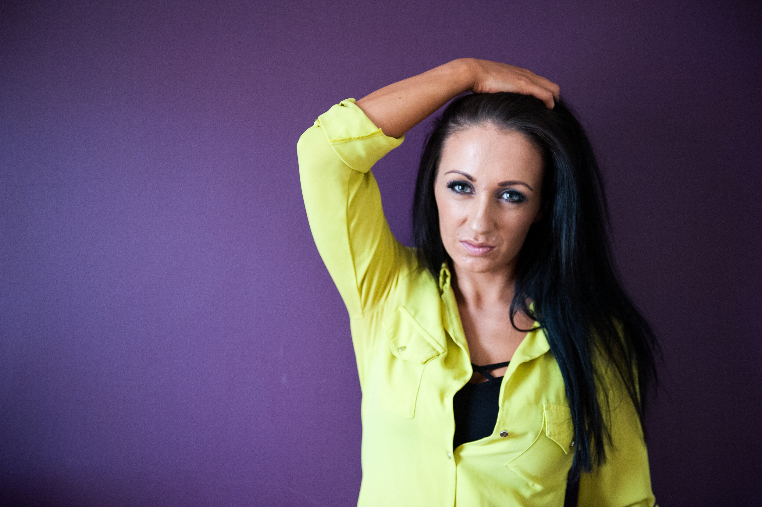
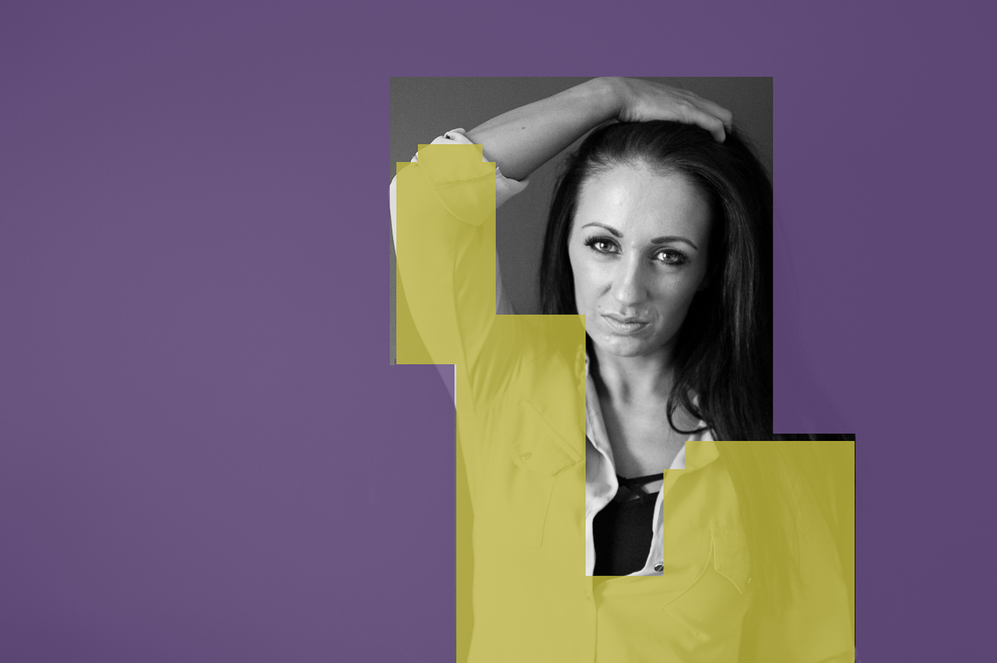
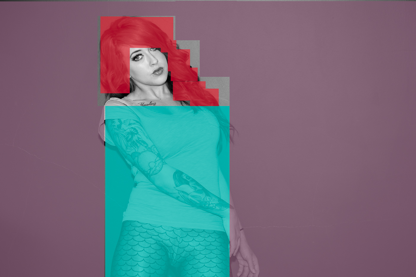
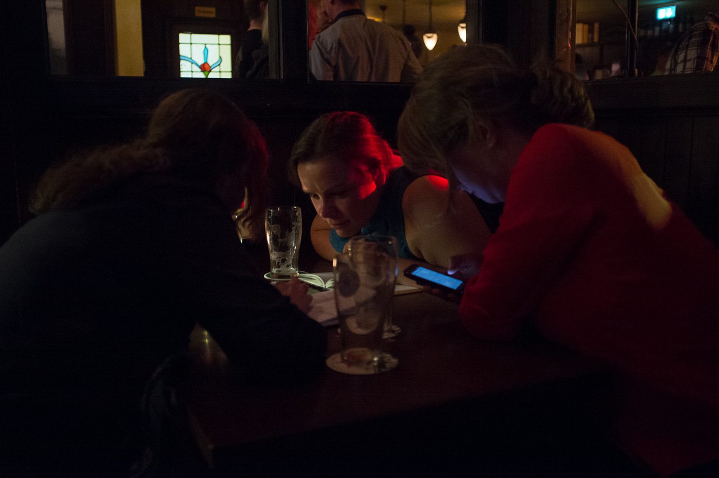
Several points in a deliberate shape: This is a rather a disturbing image, it looks like lots of people with shining eyes and strange coloured hair! The print is a little darker than the online version and seems to be cropped a little harder. Consider the horizontal lines here as they are on a bit of a lean and thus distracting, I wonder if cropping the top off would be useful to concentrate the view.


Lines, Some nice examples used here, this is obviously an area you have confidence in.

Vertical and horizontal lines: This is a visually powerful photograph. There is a little loss of information in the light areas and sky that makes this a more graphic image rather than photographic. You have converted this image to black and white I would like you to reflect on your reasoning for this.

Diagonals: A nicely seen image and your exploration of seeing it in different ways is useful. The print is solid although there is a loss of detail in the highlights, keep working on seeing this. The print has been cropped a little.

Two/ three dimension reflection: This is a good discussion and a good example. Do look at the detail in the sky, the print is bold and crisp.


Curves: This image with the repeated reflection is interesting, I wonder if a vertical crop would look good too. The online and print images are both over exposed and detail is lost. I also want to know why this is black and white, what is your intent by creating this?


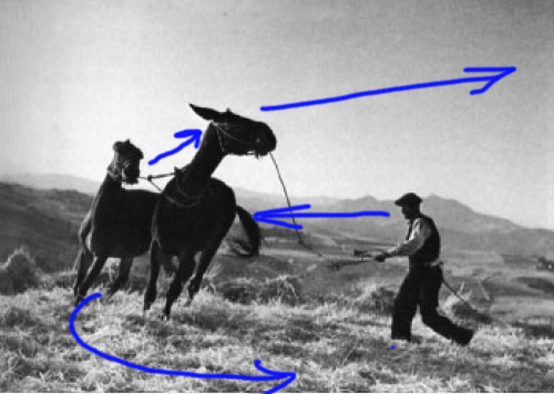
Irregular shapes: This is an interesting image, I really want to see more of this way of working. It is great to see an artist reducing his vision to lines and shape/ balance and composition. This is the evidence of the importance of this understanding for visual artists. I am so glad you included this image. The content of this image is very good although consider the composition of the photograph too, there are repeating rectangular shapes, it might be also interesting to have more depth of field to include the held photograph?


Train: Rectangles repeated and this demonstrates this suitably. The print is sharp and a little darker than the online version.


Stadium: Good sky detail here and the puffing clouds work well to add interest. The print is sharp and clean although a little darker in the shadow areas.


Buildings: The irregular shapes and reflections of the sky work well and the sky detail means there is an extra interest. The online version has a little more detail in the shadow areas, the print is a little blue green.


Implied triangles: This has potential as an interesting photograph but it has some issues with the exposure balance. The online version is almost sepia in tone and the print is cooler and almost green.


Urban triangle: this almost looks like an optical illusion so you need to look twice, well seen. Consider how this would have changed if you had changed your angle of view, ie higher or lower. The print is solid and there is some sky detail. Dense cloudy days are so difficult to work with as a photographer.


Train triangle: This is a well captured moment. Visually there is so much happening with lines/ triangles and the moment. The print for this is good, again there is some loss of detail in the highlights.


Rhythm: An interesting subject and the repeated photographs on the wall are well supported by the horizontal lines. I wonder if the person on the left of the frame is a little too near the edge? It does create a real tension through this imbalance.


Pattern: The change of angle of view is a great way to really see things. This is an interesting observation of pattern.  I take it looks a little murky cause it is through glass? The square format contains the shape quite well.


You have explored and questioned your approach here; your determination to explore the environment from a variety of angles and light situations is useful. I would also suggest you also explore your angle of view some more, many of your images are taken at standing height and I wonder if on occasion being low or high would further enhance your image outcome?


You have some good reflection of your progress here. You are starting to become a more considered photographer. You discuss the need for planning, this can be helpful but keep looking at how other photographers work and see they also narrow down their areas of exploration so they build up an expertise and a rhythm of approach, this means they don’t pre judge what they will be photographing but rather look into the detail of the image topic.


Prints; you presented colour prints alongside your blog. This was good to see, the print quality is good and the images are crisp.

When printing it is also good to explore the framing options of the image within the photographic paper ie have a larger border around the images. Also look at different print finishes and think about how they can support your work.


Learning Logs or Blogs/Critical essays

Context


You have explored and revisited your images, this is good practice and a good area to develop.


Suggested reading/viewing

Context

Architecture:   Candida Hofer, Joel Sternfeld

Aerial:   Yann Arthus-Bertrand


Challenging composition:   Hiroshi Sugimoto (photographer) http://www.sugimotohiroshi.com/seascape.html


Some varied approaches to still life:   Newton, K. Ralph, C (ed) (2006), Stilled: Contemporary Still Life Photography by Women, Ffotogallery.


You have been to an exhibition and this has informed your approach, do continue to be independently exploring and researching a number of approaches. This builds your own understanding of the possibilities of the photograph as a medium.


Pointers for the next assignment

Keep reflecting on your image making journey.

Do look at a variety of photographic artists to further inform you and give you examples of a variety of approaches.

Your technical approach is solid, keep experimenting with your composition and angle of view and exposure  to get the best out of your images.

Assignment 2 - Elements of Design

The idea behind this assignment was to incorporate what we have learned on this part of the course into a set of photographs directed towards one type of subject. The brief was to produce 10 –15 photographs, all of a similar subject, which between them will show the following effects: •Single point dominating the composition •Two points •Several points in a deliberate shape •A combination of vertical and horizontal lines •Diagonals •Curves •Distinct, even if irregular, shapes •At least two kinds of implied triangle •Rhythm •Pattern.

I had a couple of false starts on this assignment. The first subject I attempted was flowers and I then moved on to street details but I was really unhappy with the resulting photographs. Although they showed the compositional concepts, they were far from interesting viewing. I had the opportunity  to visit Berlin at the start of May and I felt that this trip would yield better shots for the assignment. (NB: clicking on any of the photographs in this post will take you to the full resolution image)

Single Point

1 single point

The single point in the image is the couple seated in the empty stadium. The composition is edging more to the "Eccentric" as I have placed them well away from the centre of the photograph but the colour of the lady's hand bag and the man's jeans help isolate them against them the sea of grey seats. The couple are also highlighted by the pool of sunlight and the central curved shadow points directly to them. I did experiment with cropping the photograph so that only the seats and the couple were visible but this lessened the sense of scale and space of the stadium.

Multiple points

2 points 2-2041


This wide angle landscape has 2 points as its subject. the first being the office building or apartment block in the foreground isolated against the trees, and the second being the abandoned industrial complex on the horizon. This Image has been digitally manipulated to increase the colour vibrancy and saturation, and also remove some smaller buildings. The composition remains "as shot" as can be seen from the original below.

2 points original-2043


Several Points in a Deliberate Shape

2 points shape-2040


This shot of an art installation by the music video directing duo "Alexandliane" at the Olympus Photography Playground in Berlin shows multiple points (ie wigs on sticks) which when viewed at a certain angle become the shape of a heart ( the individual points out of context can be seen here).

A Combination of Vertical and Horizontal Lines

6 Horizontal and Vertical


This shot could be considered to be a combination of horizontal, vertical and diagonal lines. These steel poles are part of a memorial to the wall which separated East and West Berlin from 1961 to 1989.  The horizontal lines are created by the shadows of the poles and the diagonals obviously are the effect of perspective.

Diagonals

2 diagonals-2043

This first shot reminds me of the cheesy world cruise  brochures  with a couple  who are looking out at the sea from whichever luxury deck they happened to be standing on at the time, the diagonal lines of the windows representing the waves. This context is imposed by the people in the corner of the photograph, if you take a piece of paper and cover the people and the hand rail, then the photograph takes on a much more abstract feel with no context of what the lines represent. In effect, this photograph could be read as a “single point” composition where the diagonals provide texture (symbolised waves).

9 shapes b-2073

“The world is three-dimensional; a photographic image is two-dimensional. Because of this flatness, the depth of the depictive space always bears a relationship to the picture plane. The picture plane is a field upon which the lens’s image is projected. A photographic image can rest on this picture plane and, at the same time, contain an illusion of deep space.” (Shore, 2009:40). The diagonals in this picture are created by the translation of a three-dimensional space into a two-dimensional image i.e. the effect of perspective. This tricks the brain into thinking that we could reach in to this photograph as if it has depth. That “depth” is the effect of the diagonal lines which are actually horizontal if viewed straight on, but there are another set of diagonals which are generated from the vertical beams of the building on the right and left hand side of the picture. These diagonal lines give the effect of the building looming menacingly over the viewer.

Curves

5 Curves

One thing this course has taught me, is that curves are much easier to represent photographically when inside the curve itself. This photograph was taken inside the Reichstag dome which was designed by the British architect Norman Foster to represent the reunification of Germany.

The presence of the curved walkway is so strong that the viewer may not notice the curve created by the wall of mirrors running from the top centre of the photograph to the bottom right-hand corner. For me the photograph is in two parts, the long flowing curves of the walkways implying movement and direction and the shattered mirror effect in which, for the most part, the people are static. The building in the background of the image outside the Dome gives us an anchor back to reality. Without it this would look like some kind of science fiction movie set.

Distinct, even if irregular, shapes

In January of this year I visited an exhibition of paintings by William Scott at the Ulster Museum. Scott’s work is all about shape.  The older and more experienced Scott became the simpler and more abstract his pictures, until in his final years the paintings consisted mainly of coloured shapes. (Examples of his work can be seen here).

More recently I visited the painter Paul Walls (Examples of his work can be seen here) to talk about art. During this discussion Paul took me into his studio and showed me how he begins a painting. Walls works from photographs, identifying shapes within the photograph and drawing or painting them to become the basis of his final painting as can be seen in the image below (please note this image is supplementary to this text and not one of the images to be considered for the assignment).

Paul-3030

For both artists shape is incredibly important. For Walls the shapes formed the basis of the paintings which he can then layer in complexity to produce a heavily textured final image,  Whereas Scott deconstructed his view of the world into simple shapes and colour. This part of the assignment was closer to Scott’s way of working, I found myself looking at the world to find shapes which would stand alone as the subject of the images.

8 shape -2044

The photograph above is a symphony of rectangles. The doors and windows of the train are rectangles. The train itself forms two separate rectangles and even the platform and the gantry above the train, constrained by the frame of the photograph also form rectangles. The gantry railings are subdivided into rectangles, and even the advertising and stickers on the train are rectangles. If you look closely into the windows of the train, the yellow safety rails inside appear to further subdivide the windows into smaller rectangles. In fact the only thing that isn’t a rectangle in this photograph is the slightly bemused passenger watching me take thephotograph. This photograph could also be considered as a candidate for rhythm

9 shapes c-2053

This is the roof of the Berlin Olympic Stadium but the shape we are looking at, the large oval, is formed by a distinct lack of roof. If the sky here was pure blue this would be an incredibly boring photograph but the clouds create enough tension and sense of movement (we are all familiar with how clouds travel across the sky) to make this image pleasing to the eye. If you consider the lighter areas of the photograph as a single shape (i.e. the oval and rectangle below it) it is reminiscent of the pots and pans that William Scott included in many of his paintings. This is a conceit observed after the fact and the photograph was not composed to reference Scott’s work.

9 shapes

The last photograph in the “shape” section could be considered a repeat of the stadium shot but with an irregular shape. One element that sets this photo apart from the previous image is the reflections in the windows of the buildings which give a more pleasing level of interest to the darker areas of the photograph.

Implied Triangles

3 Implied Triangle

In the photograph above the implied triangle is formed by the heads of the performers and the lines are reinforced by the "eye lines" of the guitarists.

1 diagonals

Here a small patch of green forms the inverted triangle in this urban scene.

4 Implied Triangle

This is one of my favourite photographs from Berlin and contains several triangles :-

  1. The structure at the top of the photograph forms a triangle with its apex pointing down towards the commuter
  2. The sloping fronts of the trains coupled with the horizontal line of the station windows forms another inverted triangle
  3. The side windows of the trains are triangular
  4. The commuters legs form another triangle

Rhythm

I find rhythm to be one of the more difficult compositional elements to grasp. Michael Freeman states “When there are several similar elements in scene, their arrangement may, under special conditions, set up a rhythmic visual structure. Repetition is a necessary ingredient, but this alone does not guarantee a sense of rhythm.” (Freeman, 2007: 48). I have found it incredibly difficult to pick out scenes which would be considered to have rhythm.

Rhythm seems to follow from left to right through photographs. This may be because in the west we are conditioned to read from left to right top to bottom and perhaps someone who is used to reading Hebrew or Arabic (read from right to left) may see rhythm differently in images.

In the image below we first encounter the woman who is looking at the portraits. The rhythm then builds as we move from left to right through the photograph encountering the portraits as she would. There is also a sense that this wall of photographs continues far beyond the constraints of the frame.

7 Rythm 2-2043

Pattern

Our presence as human beings on the earth produces patterns on its surface but because of the scale of these patterns they cannot easily be seen from the ground. The Magnum photographer Donovan Wylie realised this when he decided to do a project on the British Army’s watchtowers in Northern Ireland. His solution was to shoot from a helicopter at roughly the same height as these watchtowers were placed on hillsides. (An example of this work can be seen here).

The further we get into the air the more obvious the patterns become. The aerial photographer Alex McLean has spent years documenting the patterns created by our homes, our recreational areas, our farms, our transport systems, and our waste. (examples of this work can be seen here).

7 pattern

The photograph above shows the patterns created by houses and gardens in the suburbs of Berlin. Unfortunately I did not have the luxury of controlling the aircraft’s position, afforded to Wylie and McLean, to emphasise the patterns in the composition.

Reflection

There may be a question  regarding  whether  I have met the brief of this assignment. In the instructions we were asked to incorporate what we have learned on the elements of design part of the course into a set of photographs directed towards one type of subject. I found this brief to be very restrictive and it did not allow me to produce the quality of photographs that I would be satisfied to submit for assessment. By choosing the city of Berlin as the subject did I corrupt the spirit of the assignment?

I think the answer is no for the following reasons

  1. I have met all of the compositional goals of the assignment
  2. The photographs are varied but are essentially photographs of the city.
  3. This is my third trip to Berlin but by looking at the city through the photographers eye it was a completely different experience. To trot out a cliche “it was like I was seeing Berlin for the first time”
  4. I was more inspired to produce better photographs shooting a city than if I was shooting flowers in a forest.

In short I would rather stray a little from the brief if that leads to better images

In this assignment I believe I have demonstrated the required compositional skills whilst showing the development of a different way of seeing the world (i.e. as a photographer) and developing an understanding of how, what I am seeing in three dimensions, will translate to a two-dimensional image.

I feel with every exercise and assignment that I complete, I am showing improvement in the images I produce.

Bibliography

Freeman, M 2007, The Photographer’s Eye, Lewes: ILEX

Shore, S 2007, The Nature of Photographs: a Primer, 2nd ed. London: Phaidon


Curved lines

The aim of this exercise was to look for and take four photographs using curves to emphasise movement and direction. small Curved lines-3018

In this first photograph I like the way the curved white line cuts neatly through the maze of shadows on the ground created by the tree branches. This line guides the viewer through the photograph and around the bend as it guides the runner in real life. The fact that the runner is off the ground and casting a strong shadow is reminiscent of the photograph of a man jumping over a puddle (Cartier Bresson, 1932)

small Curved lines-3010

In the second photograph the movement is more gentle. The old couple are pictured slowly ambling over the humpback bridge crossing the canal the curves of the bridge are reflected in the water of the canal. The curved contrast nicely with the rigid horizontal and vertical lines of the loch in the centre of the photograph and the anarchic undergrowth at either end.

small Curved lines-3016

This photograph doesn't quite meet the brief of the exercise there is motion generated by the runner, and it will follow the gentle curves of the fence background, but the median curves represented by the ribs of the bridge holding up tons of steel and concrete, their sturdy and strong appearance allowing the runner to pass under with confidence.small Curved lines-3015

My final photograph is of a statue in Belfast called "'beacon of hope". In Belfast we have a tendency to ignore something's official name and bestow our own nicknames, consequently this statue is known as "The Thing With the Ring", "The Doll on the Ball" and " The Nula With the Hula". The reason I chose to use this sculpture in the exercise is because there is not a single straight line on it. The myriad of curved metal bars emanating from the single curved spine (although traditionally spines are at the back of a figure) combine to make up the figure of a woman holding aloft "the Ring of Thanksgiving".  So essentially, thanks to its design, it would be impossible to take photograph of this sculpture without capturing curves.

Reflection

Was I wrong to include two photographs which did not specifically meet the brief of the exercise over two photographs which would have met the brief but were of much lower quality? Of course the ideal answer is that I should have strived to create two more high-quality images that met the brief. This failure was due to my approach to this exercise. Instead of sitting down and thinking about how to create images I just grabbed my camera and went out looking for images.

For instance in the last five minutes reflecting on this exercise it has occurred to me that instead of dismissing light trails as clichéd I could in fact have tried playing with long exposure and light painting, perhaps a runner with a head torch or several runners. Or perhaps swinging or throwing balls of fire. It does show that a little pre-thought could have made this exercise a lot more interesting and a lot less difficult.

David Bailey's Stardust

stardust I am a bit of a David Bailey fanboy so this might be  a somewhat biased review. Along with Terence Donovan and Brian Duffey he is considered to have been influential in helping to create the "Swinging 60's" culture in London. His name is synonymous with photography in fact he is one of the few photographers who is a household name. He is the first photographer I knew by name (in part due to a series of funny Olympus television adverts). His high contrast black and white portraits have remained a constant of his work from his early days as a vogue photographer and are a staple of his new exhibition "Stardust" at the national portrait gallery.

When I found out the national portrait gallery had given their ground floor over to Bailey I just had to make my way to London to see the show. I have several of his books but I wanted to see the work blown up on a gallery wall in all its glory, and I was not disappointed.

The exhibition is separated into different themed rooms. one room is a tribute to his wife Catherine. It is a mix of family snap (if your family snaps were taken by David Bailey) interspersed with artistic/formal dressed/nude portraits of her.  There are also some quite graphic photographs of the births of their children. Upon entering this room you are under no illusion as to the depth of the love Bailey feels for his wife. She is represented in this room in her many identities wife, lover, model and mother.

There are the expected and brilliantly executed celebrity portraits but there are also shots from many of Baileys numerous non glitterati laced projects. He has hung photos of the people and locations in the east end beside and in contrast to photos of the indigenous people of the Naga Hills and their homes. This is not by accident and similarities can be drawn between the two sets of photos along the lines of tribalism and disappearing cultures.

There are also photo series from his other travels depicting aboriginals, the Sudan, Papua New Guinea, and Dehli. These show that he is not a one trick pony, he has a curiosity about the world and he wants to see and record as much of it as possible.

Among the portraits of celebrities, artists and photographers there are six images from his "Democracy" project. Over a period of three years, visitors to Baileys were offered the opportunity to be photographed naked, none refused and none were rejected. Bailey used the same equipment setup, camera angle and lighting for every photo, a truly democratic process. These are my favorite Images. Baileys distinctive black and white style is applied to the human form in all of its variation.

If you happen to be in London between now and the start of June I can highly recommend spending some time with Baileys work, even if you are not as much of a fan as I am.

As i have said Bailey is one of my inspirations the photograph below is an attempt to emulate his style.

Maguire-1128