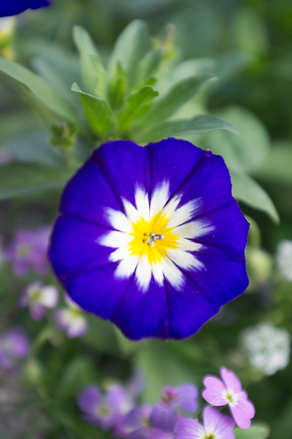
So the idea behind this exercise was to show the effects on tones in black and white by applying colour filters. The image below contains strong representations of red green blue yellow and orange. In (Freeman, 2013) proports that the colour that we perceive is made up of 2 factors (a) the colour of the object and (b) the colour of the light that is reflected off it ( or in the case of a trnasparent object transmitted or allowed through it). White is considered to be the the absences of colour and tone and black the absence of light and tone therefor I have included black and white figures as "Controls" to show that any change in tone is based purely on the interaction between the colour of the Lego figures and the colour of the filters used. the same lighting setup was used for each photograph to remove the colour of light as a variance factor in the resulting photographs With a film Camera this exercise would have been carried out with colour film, then black and white film and adding coloured "Wratten" filters infront of the lens. The same lighting setup would be used for each photograph to remove the colour of light as a variance factor in the resulting photographs.
In the case of the photographs below I used a single digital photograph and edited it in lightroom to manipulate the image to replicate the effect of a the wratten filters. For this I used lightroom presets downloaded from the web.

so above you can see the original photograph with primary colours Red, Yellow, and Blue in the front row and a couple of secondary colours and black and white in the back row.
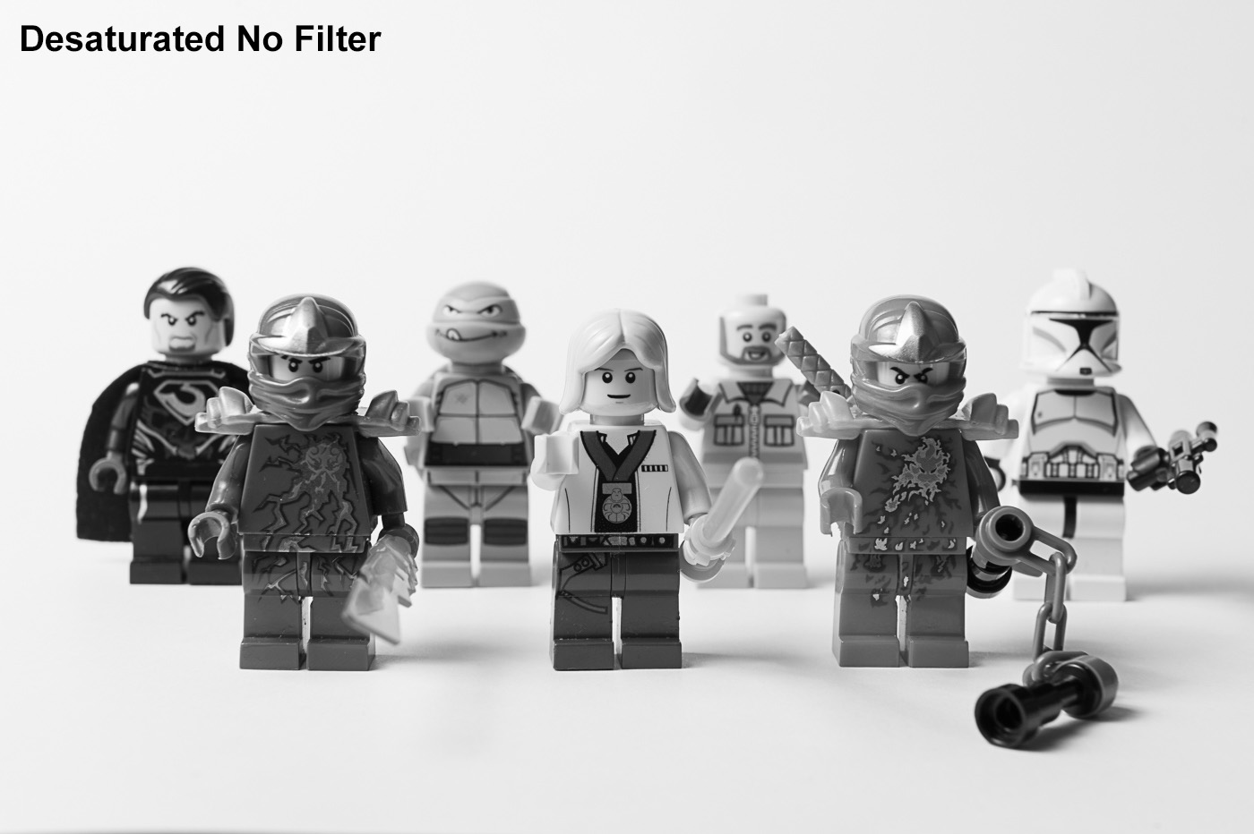
in the photograph above has simple had the saturation reduced to zero so that the tones are exactly what they would be in the original photograph but in a greyscale form.

when a yellow filter is applied the tone of the yellow figure in the middle becomes lighter as do the green, red and orange filters. I was expecting to see a darkening of the blue figure but in this case it has stayed roughly the same.
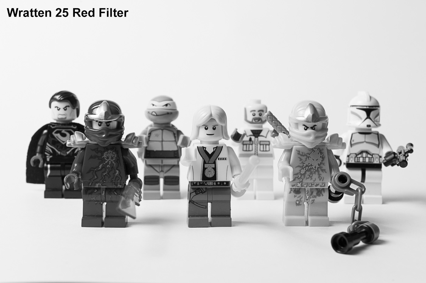
when the Red filter is applied the red yellow and orange figures are lighter in tone than in the desaturated image. the green figure is pretty much the same and the blue figure id darker. this is because the red filter is letting moire red light through whilst blocking the blue.

with the green filter. red and orange figures are much darker and the green figure is much lighter in tone.

With the blue filter above the blue figure is considerably lighter in tone whereas the red figure is almost black the yellow and orange figures are also considerably darker. it is worth noting that the black and white figures did not change in tone throughout the exercise, nor did the grey chain on the red ninjas nunchucks. A summary matrix on the effects of coloured filters on the tones of black and white images can be seen below as can the setup used to capture the original image.


Reflection.
I have made a bit of progress on the colour part of the course in the last week. I realized that instead of procrastinating and complaining about colour perhaps I should actually try learning something about the subject. This has helped me a lot in understanding colour and how we perceive it. Learning about colour has had the effect of making me less reticent to explore this part of the course and given me more confidence that I can actually carry complete the colour assignment.
As I started to work through the exercises I have become much more aware of colour in my surroundings. I am not taking colour for granted but actually observing it and seeing it more clearly. I am looking for the colour in what I am seeing in a very similar way to looking for compositional elements in a scene before setting up to take the photograph.