OCA TaoP

OCA degree in photography module 1

A narrative picture essay

The aim of this exercise was to set myself and assignment and then photograph it. I chose to cover the first day of the John Hewitt summer school. Every year the John Hewitt society runs a week long  literary summer school  and cultural festival with talks from authors, workshops, art exhibitions and performances. It takes place in the Market Place Theatre & Arts Centre, Armagh, and some surrounding venues for the workshops. I wanted to try and capture the essence of the event, and give the viewer a sense of being there.

I took 300 photos and selected the following to tell the story.

AA selection small-9654 AA selection small-9650 AA selection small-9643 AA selection small-9119 AA selection small-9078 AA selection small-9076 AA selection small-9047 AA selection small-8979 AA selection small-1466 AA selection small-1462 AA selection small-1455 AA selection small-1449 AA selection small-1446 AA selection small-1440 AA selection small-1431 AA selection small-1415 AA selection small-1401 AA selection small-1395 AA selection small-1383

Part of telling the story is the layout of the photographs. I used a web version of wedding album software to do the layout  so you will see the word proof on the photos in some places where my Photoshop skills were not sufficient to remove it

003 005 007 009 011 013

The lighting angle

  The aim of this exercise was to take shots using the various lighting positions and angles belowshots


Light Level with the subject - Lit from the front (with the light next to the camera)

The lighting angle small-0637

due to the size of light modifier being used (a large soft box) it was very difficult to shoot directly from the front so there is a slight angle to the lighting in this photo. The effect of having the light level with the subject and directly in front is to give the image a very flat 2 dimensional appearance.

Light Level with the subject - Lit from the side

The lighting angle small-0640

With the light at 90 degrees to the subject the face is half in light and half in darkness. the studio wall was acting like a large reflector so the right side of the subjects face is not totally in darkness.

Light Level with the subject - Lit from behind and to one side

The lighting angle small-0644

moving the light further to the back lights even less of the subjects face but does give more of a feel to the contours of the face.

Light Level with the subject - Lit from directly behind

The lighting angle small-0648

I really like this effect.  because of the size of the soft box light is almost spilling round the subject  and emphasising the shape of the head. There is definitely a more 3D feel to this photo

Light Down towards the subject at an angle of about 45 Degrees - Lit from the front (with the light next to the camera)

The lighting angle small-0611

this is a similar setup to photo 1 except the light is above and at 45 degrees. again the top half of the subjects face is fully lit and therefore somewhat flat in appearance but the shadows below the nose and chin give a little shape to the shot

Light Down towards the subject at an angle of about 45 Degrees - Lit from the side

The lighting angle small-0618


The face is almost 3/4 in darkness and although the shadows show lots of the facial contours it is not a particularly pleasing photo

Light Down towards the subject at an angle of about 45 Degrees - Lit from behind and to one side

The lighting angle small-0623


Moving the light even further behind the lights even less of the subject and leaves the face almost in total darkness

Light Down towards the subject at an angle of about 45 Degrees - Lit from directly behind

The lighting angle small-0629

I really like the edge lighting effect in this shot and how the light falls on the subjects shoulders.

Light suspended overhead - Directly overhead

The lighting angle small-0608

I have never used lighting directly from above before and the effect was unusual again similar to photograph 5 the shadows on the underside of the nose and chin give some shape but in this picture the texture of the tee shirt is much more  emphasised.

Light suspended overhead - From slightly in front

The lighting angle small-0609

This was my favorite portrait of the day. the texture of the hair and tee-shirt are great, the subject is definitely not flat and the shadows slim the face somewhat. Light suspended overhead - From slightly Behind

The lighting angle small-0610


Again a lot of the subject is in darkness and it is not a particularly pleasing photo.

Reflection

I was surprised by the different effects created by moving the light around. I have used a single studio light many times but I have not varied the angle and position as much.  I can see by combining numerous lights and angles you could lose a day in creative lighting experiments. It was a great way to spend a couple of hours and we stayed and created a few nice portraits using a single light.


The lighting angle small-0662 The lighting angle small-0669 The lighting angle small-0681 The lighting angle small-0686 The lighting angle small-0687 The lighting angle small-0626 The lighting angle small-0635


Softening the light

The brief for the exercise was as follows Set up a still-life arrangement, with any object or group of objects. The lighting direction will depend on your subject, and you might like to experiment but, if in doubt, fix the naked lamp more or less overhead, pointing down. (I am assuming that the camera is aimed at a slight angle downwards.)

Using a diffused light source to soften the shadows and highlights take two photographs, one with just the naked lamp, the other with the translucent material held between the lamp and your subject (but out of view). The two exposure settings will be different.

Look at the results, and write down exactly what you see as the differences. Look, for instance, at the strengths (blackness) of the shadows, their extent, and the hardness of their edges. Look also at the highlights, and at the contrast. Finally, was the diffusion an improvement? Record your answer.

To carry out the exercise I hired some time in a studio. I rummaged around the studio to find Items i could use in a still life and then used a single light from above at a 45 degree angle.  To soften the light I shot through a translucent reflector  the results can be seen below.

Softening the light Small-0550 Softening the light Small-0552


I should point out that one thing I did wrong was not having the camera on the tripod, this would have eliminated any doubt that differences in the photographs are down to differing camera angles.  The first photo is the "un-softened" direct light shot.  We can see that the the shadows are darker and more defined and also the colours are more saturated than in the second shot. In short the first photo has more contrast.

"A light source has high contrast if its rays all strike the subject from nearly the same angle. Light rays from a low-contrast source strike the subject from many different angles. Sunlight on a clear day is a common example of a high-contrast light source." (Hunter, Fuqua and Biver, 2012, p19). The unmodified light source has a more direct rays off light than the diffused light source. It is not only the shadows which are affected by introducing the diffuser, the reflected highlights also differ between the photographs, in the second shot they are larger and with less defined edges.

I have included a shot of the setup (NB offspring make excellent reflector stands)

Softening the light Small setup-9450

Variety with a low sun

The first requirement for this exercise was to shoot when the sun was low in the sky, this is commonly known as golden hour.

Golden Hour is quite simply when the sun is low in the sky. The end-points are sunrise and sunset, but the maximum height is a little vague. It’s when the sunlight in clear sky is yellow-to-orange, and that’s approximately below 20º above the horizon. (Freeman 2014, p. 94)

The second requirement was to produce an example of front lighting, back lighting, side lighting and edge lighting.

For my subject I chose ‘The Gleaner’ sculpture by John Knox which stands in the grounds of Stormont Estate. I chose her because she is gloriously lit by the setting sun on a clear evening and there is 360 degree access to shoot the the sculpture enabling me to use a single subject for all 4 lighting techniques.

Front Lighting

This is an example of axial lighting where the direction of the light aligns to the lens axis. This is achieved by ensuring the sun is directly behind the camera during golden hour. Axial lighting can be achieved in the studio by using a ring flash.

The characteristics of a photograph shot in this type of light are :-

  • There are no shadows present.
  • Strong light reflected directly back at the camera.
  • Flat 2D appearance

You will notice in the photograph below, there are shadows present on the woman's hair, arm and dress. This is due to the sun not being exactly aligned to the cameras axis. One of the difficulties of this lighting method is the potential for the photographer's shadow to appear in the photo, and the lower the sun, the more this becomes a factor. To avoid this I moved slightly to the right until my shadow was no longer striking the sculpture but this in turn created the shadows seen in the photo(my shadow could also have been eliminated by using a longer lens and moving back from the sculpture, thus allowing me to re-align for true axial lighting)

Low sun ex small-1001

Side Lighting

In the photo below the subject is lit from the left. Roughly half of the subject is lit and half is in shadow. Choosing the correct exposure becomes a balancing act of trying not to lose detail in the shadows whilst not blowing out the highlights on the lit side of the subject. Shooting shortly before the sunset means that the light is less intense and therefore reduces the dynamic range. The direct lighting gives sharp edges between the light and dark areas of the photo leading to an image with more contrast.

Low sun ex small-1002

Back Lighting

In the photo above, the subject is back lit, in other words the subject is between the light source and the camera. One of the problems of shooting into the sun is the high dynamic range between the sun and the shadows in a photo. This can cause sensor clipping at the top end of the dynamic range (sometimes know as blown highlights) and loss of detail in the shadows at the lower end. To avoid this I have obscured the sun with the subject and by doing so have reduced the dynamic ange that the camera has to deal with.

This is a somewhat softer photograph than the previous two shots because the subject is lit from various directions by the reflected light of the sun.

Low sun ex small-1003

Edge Lighting

To achieve edge lighting you shoot towards the sun (light source) but keep it outside the frame. A dark background is also desirable as it enhances the highlighted edge.

Low sun ex small-1004It is also worth noting that the intensity of light has an effect on how you expose for an edge lit photo and consequently how that  final photograp looks. If the light had been brighter the exposure would have been shorter and there would have been more of a halo effect and a distinct loss of detail in the shadows similar to the image below.

Processed edge small-1030

Reflection

This exercise has expanded my knowledge of lighting. One of the first pieces of advice I was given when I started to learn photography was get a 50mm prime lens as it will teach you to zoom with your feet. The idea behind this was that by limiting yourself to one focal length it would make you move and explore to get the best shot. Similarly here the light source was fixed, as was the subject so I had no alternative than to move the camera to get the required lighting effects.

We are exploring a three dimensional world and creating two dimensional images of it and the position of the camera has an effect on the visual relationships between the objects in the flat image we produce (Shore, 2007). In the photographs above we can also see that there is a relationship with the objects in the frame and the light source and how we position the camera has a huge bearing on the final image (when we are using a light source which we cannot move).

In the world there are an infinite number of places to position the camera therefore it is worth putting some thought into where you should shoot from and experiment with various viewpoints.

Judging Colour Temperature 2

In the previous exercise we discovered that the colour of light changes throughout the day and is also dependent on your surroundings. This exercise explores the effect of the cameras white balance (WB) setting on colour temperature. Most photographic film was balanced for "daylight" (ie 5500k on the colour temperature scale) therefore similarly to ISO, once you had your film in the camera you were stuck with that setting for the 24 or 36 frames on the film. This was not a huge issue if you were shooting in daylight but when shooting in a room lit by tungsten bulbs photographs would have a yellow cast (Freeman.1990).  This could be overcome by using tungsten balanced film (eg Kodachrome 40) but you would be locked to the tungsten "setting" for the remaining frames on the film.

Freeman (2013) tells us that the colour of an object  is a combination of the colour of the objects  surface and the colour of the light hitting that surface. Therefore if we can control the colour of the light we can more faithfully reproduce the colour of the object/scene that we are photographing.

This exercise illustrates that concept. Modern digital cameras have the ability to set the colour temperature on individual photos if desired using the settings seen below. The custom white balance setting will allow the user to apply an individual setting on the colour temperature scale. The auto setting will attempt to automatically select the correct white balance value . As camera technology improves, the algorithms used to calculate auto white balance become more accurate. The auto white balance on my phone is incredibly accurate when taking photographs.

White_Balance2

For this exercise I was to repeat the previous exercise of taking photos in midday sun, shade and sunset using the "daylight" white balance setting, but I was to also shoot on the "Shade" and "auto" white balance settings.  the results can be seen in the matrix below

Face Matrix labeled

it is immediately apparent that regardless of the the WB setting, the photos taken at sunset, have a very yellow/orange cast . I would have expected the auto WB setting to be more accurate but perhaps as I have a slightly older camera (D700) its white balance features may not be as advanced as some of the newer models. I also noticed that because of the different backgrounds, in some cases,  it was hard to judge the colour of my skin from photo to photo so I cropped the photos to show an area of my forehead from each shot.

Skin Matrix Labeled

What stands out in these shots is the variation in the auto white balance column. The three photos go from white to grey to orange. The other stand out is that, the photo taken using the sunlight white balance setting in direct sunlight and the photo taken using the shade white balance setting in the shade are virtually identical in hue and tone. which tells me that my cameras calibration is good even if the WB auto detection is not.

There is another element to compensating for white balance. Your digital camera has a processor onboard that takes the raw data hitting the sensor and processes it into a .jpeg file that is a common file format which can be read by computers (or phones and tablets) without the need for specialist proprietary software. In short it makes it easy for you to view and  share your photographs. However there is a down side to allowing your camera to produce the .jpeg file. The settings are baked in and cannot be changed so if you shoot at the wrong white balance setting, or as in the case of the d700 the auto white balance is not incredibly accurate, you are stuck with it.

Many cameras will allow you to save your photos in RAW format ie record the raw data produced by the sensor which can then be processed on a computer (using specialist software) to produce the finished photograph. The workflow is comparable to shooting film and then producing negatives in the darkroom. RAW files are sometimes referred to as “Digital Negatives”.

Using a proprietary software such as adobe lightroom, apple aperture, darktable, lightzone, rawstudio, capture NX or one of the numerous other programs, you can make adjustments to your photographs before producing a final .jpeg image. One of the adjustments you can make is white balance. You can see in the 2 versions of the photograph below I have made WB adjustments to give myself a much more natural skin tone.

Rawsmall-1015 Rawsmall-1014

Reflection

I am most at home on this course when I am doing a technical exercise and on the face of it that’s what this was. I got to wax lyrical on settings, software, colour temperature and cameras, But underlying all this techno babble this there is another lesson to be learned from this exercise.

Light has varying colours depending on the time of day and this can be used to embue your photos with feeling and atmosphere. The yellow orange light of sunset can give a photo warmth as Renoir did with Le déjeuner des canotiers. The blue grey light produced by the shade gives a coolness think of Van Gogh’s self-portrait 1889. I am in no way comparing my work to these great artists but merely stating that the colour of light (and consequently the ability to adjust for it using white balance settings or software) is another way to express yourself in your photography and convey a message or feeling to the viewer.

I am learning that many of the things that we strive for when we start to learn about photography (e.g. perfect exposure, perfect composition, pin sharp focused photos, correct white balance. faithful colour reproduction) are part of photography craft. They are actually subjective and can be manipulated to communicate with the person viewing the photograph and produce photographic art.

Judging Colour Temperature 1

This exercise was to illustrate the effect of the colour of light on a photograph. I was to take 3 photographs of the same subject with the cameras white balance set to daylight:

  • Photo 1: in full sunlight during the middle of the day.colour of light small-1001
  • Photo 2: in shade during the middle of the day.colour of light small-1002
  • Photo 3 : when the sun is close to the horizon.colour of light small-1003

there are obvious colour differences in the three photos. In the first photo my skin is at its most natural given that the colour of light in the middle of the day (on a clear day) is white. in the shade my skin appears more blue-grey and at the sunset i am almost umpa lumpa orange.

When I was taking these shots I don't remember my skin colour changing to this extent. This because our eyes adapt to the colour of light and things appear to be lit neutrally. it would be more correct to say that our brain adapts to the messages being sent to it by the eye and so we perceive colours in shade (or in some cases in artificial light) somewhat closer to how they would look if they were lit by a white light.

the skin colour in photo 1 is a little more yellow than I expected to see and this could be down to several factors.

  1. The photos were taken in winter sun which is lower than summer sun
  2. The camera's "Daylight" white balance is not perfect
  3. The monitor on which I am viewing the photos is displaying the photos with a slightly yellow hue (I do regularly calibrate my monitor)
  4. I am actually yellower than I think I am
  5. a combination of the first four factors.

By using a single white balance setting this meant that any changes in colour between the photos was based on the quality of the light.

(Freeman:2013) tells us that, on a cloudless day,  light is made up of around 85% direct sunlight. The remaining 15% is made up of diffuse sky radiation which comes from the sky reflecting the blue wavelengths of sunlight. Therefore by standing in shade (ie cutting out the direct sunlight) I am lit by the blue light and some light reflected bu my surroundings.

Reflection

I am back in my comfort zone with these technical exercises. they do force me to ask questions and research the answers. I had no idea why there was a blue hue to photos taken in shade for instance. I have covered the colour of light before on different courses and thought I knew all about it but this exercise has proved me wrong. Many of the tasks on this course are deceptively simple yet guide you to a way of thinking more deeply about the subject.

Colours into tones in black and white

So the idea behind this exercise was to show the effects on tones in black and white by applying colour filters. The image below contains strong representations of red green blue yellow and orange.    In (Freeman, 2013) proports that the colour that we perceive is made up of 2 factors (a) the colour of the object and (b) the colour of the light that is reflected off it ( or in the case of a trnasparent object transmitted or allowed through it). White is considered to be the the absences of colour and tone and black the absence of light and tone therefor I have included black and white figures as "Controls" to show that any change in tone is based purely on the interaction between the colour of the Lego figures and the colour of the filters used. the same lighting setup was used for each photograph to remove the colour of light as a variance factor in the resulting photographs With a film Camera this exercise would have been carried out with colour film, then black and white film and adding coloured "Wratten" filters infront of the lens. The same lighting setup would be used for each photograph to remove the colour of light as a variance factor in the resulting photographs.

In the case of the photographs below I used a single digital photograph and edited it in lightroom to manipulate the image to replicate the effect of a the wratten filters. For this I used lightroom presets downloaded from the web.


original small-3008

so above you can see the original photograph with primary colours Red, Yellow, and Blue in the front row and a couple of secondary colours and black and white in the back row.

No Filter small-3008

in the photograph above has simple had the saturation reduced to zero so that the tones are exactly what they would be in the original photograph but in a greyscale form.

Wratten 15 Yellow small-3008


when a yellow filter is applied the tone of the yellow figure in the middle becomes lighter as do the green, red and orange filters. I was expecting to see a darkening of the blue figure but in this case it has stayed roughly the same.

wratten 25 Red small-3008

when the Red filter is applied the red yellow and orange figures are lighter in tone than in the desaturated image. the green figure is pretty much the same and the blue figure id darker. this is because the red filter is letting moire red light through whilst blocking the blue.

wratten 58 Green small-3008


with the green filter. red and orange figures are much darker and the green figure is much lighter in tone.

wratten 47 Blue small-3008


With the blue filter above the blue figure is considerably lighter in tone whereas the red figure is almost black the yellow and orange figures are also considerably darker.  it is worth noting that the black and white figures did not change in tone throughout the exercise, nor did the grey chain on the red ninjas nunchucks.  A summary matrix on the effects of coloured filters on the tones of black and white images can be seen below as can the setup used to capture the original image.

black-and-white-filter-effects


setup-3008

Reflection.

I have made a bit of progress on the colour part of the course in the last week. I realized that instead of procrastinating and complaining about colour perhaps I should actually try learning something about the subject. This has helped me a lot in understanding colour and how we perceive it. Learning about colour has had the effect of making me less reticent to explore this part of the course and given me more confidence that I can actually carry complete the colour assignment.

As I started to work through the exercises I have become much more aware of colour in my surroundings. I am not taking colour for granted but actually observing it and seeing it more clearly. I am looking for the colour in what I am seeing in a very similar way to looking for compositional elements in a scene before setting up to take the photograph.

Primary ands Secondary Colours

The aim of this exercise was to find scenes or parts of scenes that were dominated by the primary and secondary colours shown on the colour wheel below. Primary - Red, Blue, Yellow

Secondary - Green, Orange, Violet

printable-color-wheel-secondary-colors

The idea was to find the colour and then alter the exposure to match the primary/ secondary colour as closely as possible.

the results can be seen below

Primary and secondary colours small-3015 Primary and secondary colours small-3014 Primary and secondary colours small-3012 Primary and secondary colours small-3010 Primary and secondary colours small-3009 Primary and secondary colours small-3008


Reflection.

This exercise was difficult for a number of reasons :-

  • its hard to match a colour its either too light, too dark, too vivid, too dull or the wrong hue (an  orangey red or a purpley red for example)
  • Its not easy to find naturally occurring examples of these colours without turning to flowers and producing a seed catalogue.
  • I am very much out of my comfort zone here and I feel I am floundering through this part of the course mechanically completing the exercises but without a real insight into what am supposed to be doing or producing.

One thing that I am noticing is that I am becoming more aware of colour in everyday life. I am looking at colours and asking myself where they fit on the wheel and are they bright vivid dull dark deep etc

Controlling the Strength of a Colour

For this exercise I was to find a strong bold colour and photographs it at varying exposures, from bright to dark, varying the aperture by have to stop each time. The results of this can be seen below Controlling the srength of a colour small-3008 Controlling the srength of a colour small-3009 Controlling the srength of a colour small-3010 Controlling the srength of a colour small-3011 Controlling the srength of a colour small-3012

As you can see from the progression of the images, as the aperture gets smaller,  brightness reduces leading to the colour deepening, darkens. There is no effect on the hue (ie the red does not change to a different value on the spectrum) or saturation (ie the red does not move closer to monochrome)

Reflection.

Colour on the face of it is simple. It is something that we learn in nursery school and have pretty much mastered by the age of three. Except it isn't that simple. There are so many factors that will affect the quality of a colour and how it looks to the viewer. For instance computer video hardware is categorised be the “millions” of different colours it can display so think about the Mk1 analogue eyeball and how many more colours it can send to your brain.

Since I began studying photography I have struggled with the concept of colour at every level. Some people seem to just have a knack for it and how to use it in their images. As I go through this part of the module hopefully something will snap into place and I will start to feel more comfortable with the subject.


Curved lines

The aim of this exercise was to look for and take four photographs using curves to emphasise movement and direction. small Curved lines-3018

In this first photograph I like the way the curved white line cuts neatly through the maze of shadows on the ground created by the tree branches. This line guides the viewer through the photograph and around the bend as it guides the runner in real life. The fact that the runner is off the ground and casting a strong shadow is reminiscent of the photograph of a man jumping over a puddle (Cartier Bresson, 1932)

small Curved lines-3010

In the second photograph the movement is more gentle. The old couple are pictured slowly ambling over the humpback bridge crossing the canal the curves of the bridge are reflected in the water of the canal. The curved contrast nicely with the rigid horizontal and vertical lines of the loch in the centre of the photograph and the anarchic undergrowth at either end.

small Curved lines-3016

This photograph doesn't quite meet the brief of the exercise there is motion generated by the runner, and it will follow the gentle curves of the fence background, but the median curves represented by the ribs of the bridge holding up tons of steel and concrete, their sturdy and strong appearance allowing the runner to pass under with confidence.small Curved lines-3015

My final photograph is of a statue in Belfast called "'beacon of hope". In Belfast we have a tendency to ignore something's official name and bestow our own nicknames, consequently this statue is known as "The Thing With the Ring", "The Doll on the Ball" and " The Nula With the Hula". The reason I chose to use this sculpture in the exercise is because there is not a single straight line on it. The myriad of curved metal bars emanating from the single curved spine (although traditionally spines are at the back of a figure) combine to make up the figure of a woman holding aloft "the Ring of Thanksgiving".  So essentially, thanks to its design, it would be impossible to take photograph of this sculpture without capturing curves.

Reflection

Was I wrong to include two photographs which did not specifically meet the brief of the exercise over two photographs which would have met the brief but were of much lower quality? Of course the ideal answer is that I should have strived to create two more high-quality images that met the brief. This failure was due to my approach to this exercise. Instead of sitting down and thinking about how to create images I just grabbed my camera and went out looking for images.

For instance in the last five minutes reflecting on this exercise it has occurred to me that instead of dismissing light trails as clichéd I could in fact have tried playing with long exposure and light painting, perhaps a runner with a head torch or several runners. Or perhaps swinging or throwing balls of fire. It does show that a little pre-thought could have made this exercise a lot more interesting and a lot less difficult.

Multiple points

The aim of this exercise was to set up a still life by combining an unfussy background with 6 to 10 similar sized objects. A fixed camera on a tripod and shot down at the background. The idea was to control composition by arrangement and recording the still life as each element was added. You can see the results below

multiple points-042 multiple points-043 multiple points-044 multiple points-045 multiple points-046 multiple points-047 multiple points-048 multiple points-049 multiple points-050 multiple points-051

This was much harder than I had imagined. I had several false starts and I am not hugely satisfied with the end result. The main challenge was to arrange the still life in an interesting way without forming a regular pattern. I did enjoy setting up the shoot.  I made the decision to shoot tethered. This gave me the opportunity to view each frame before placing the next berry.

The second part of the exercise was to draw a sketch, indicating the ‘lines’ that relate the objects, and any basic shape or shapes that they form.

line 2 line 1 line 4 line 3

Reflection

I am somewhat perplexed as to the artistic merit of still life photography. When I encountered  Peter Fischli and Davit Weiss work “Quiet Afternoon” (Cotton, C 2004: P114) I was outraged. The question “how can fine art be precariously staking vegetables and then taking a photograph of it?” kept bouncing around in my head and enraging me. This made the exercise even more difficult for me because I really didn’t like the pictures I was producing. They reminded me of more of Fischli and Weiss’s work “The Sausage Photographs” (Tate.org.uk, 2006).  Perhaps this level of anger is generated by my logical brain trying to understand or make sense of this new language of art. Perhaps the more I learn about art and the art world, the less annoyed I will be at this type of picture.

What I can take from the exercise is not to concentrate on a single point to the exclusion of all others when composing a photograph. If multiple points are present in the composition they will exert forces on each other and may make the photograph feel awkward or unbalanced, or may draw attention away from the message you want to convey to the viewer. Conversely If you are aware of the multiple points in your composition you can use them to balance ( or add tension )  or emphasise certain areas of the photograph.


Vertical and horizontal frames

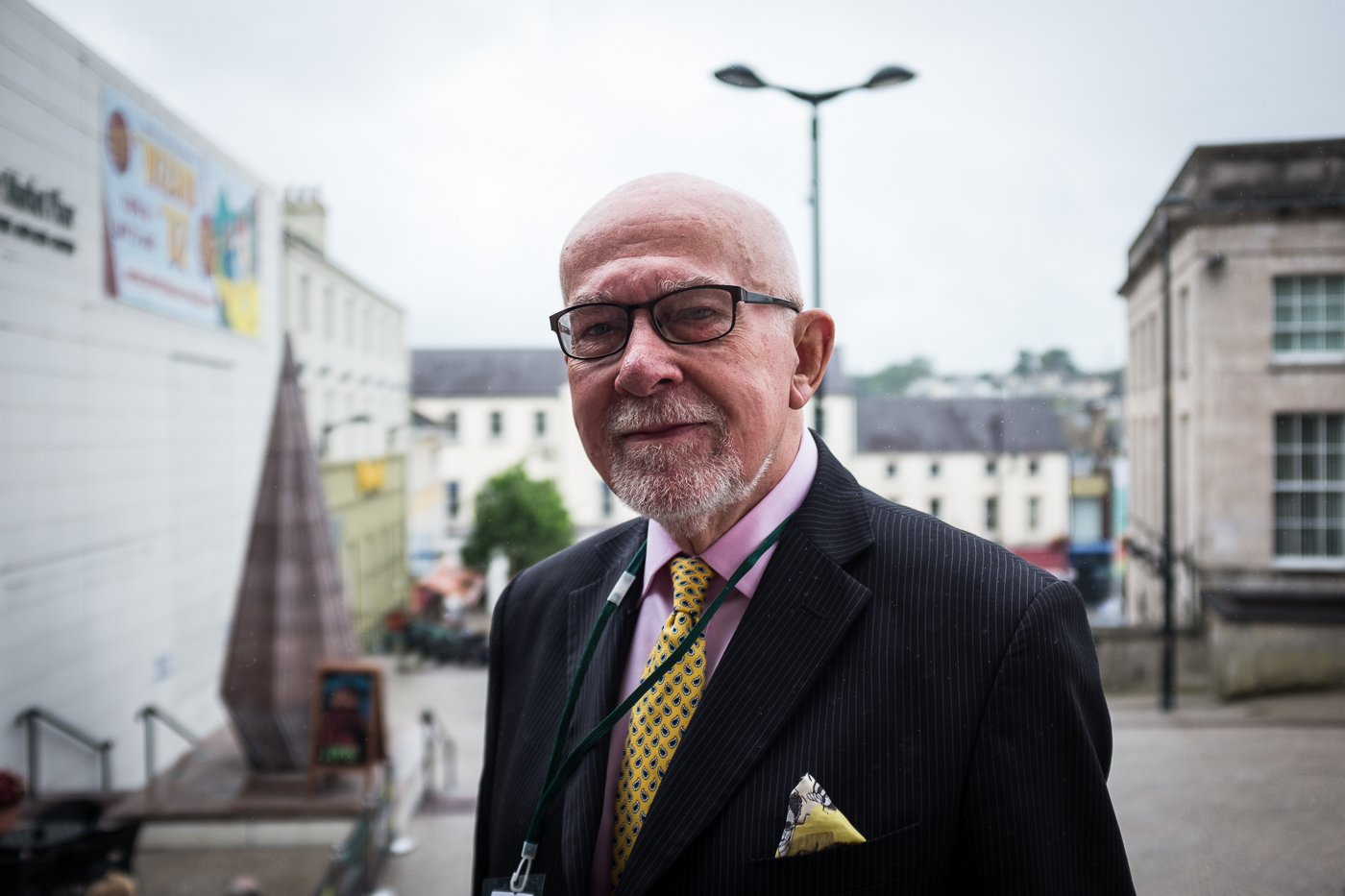
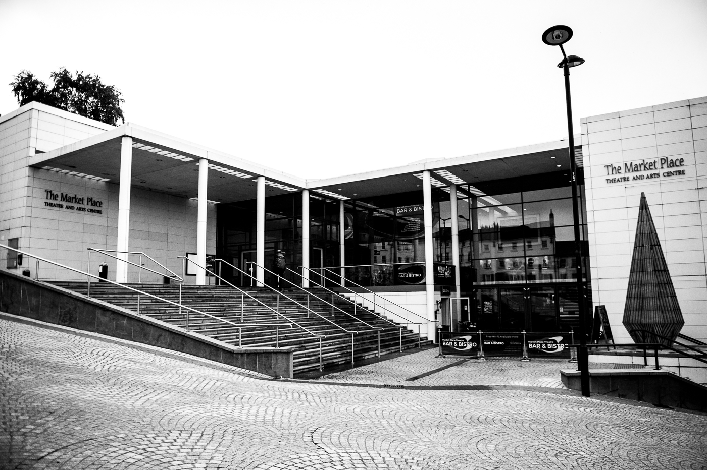
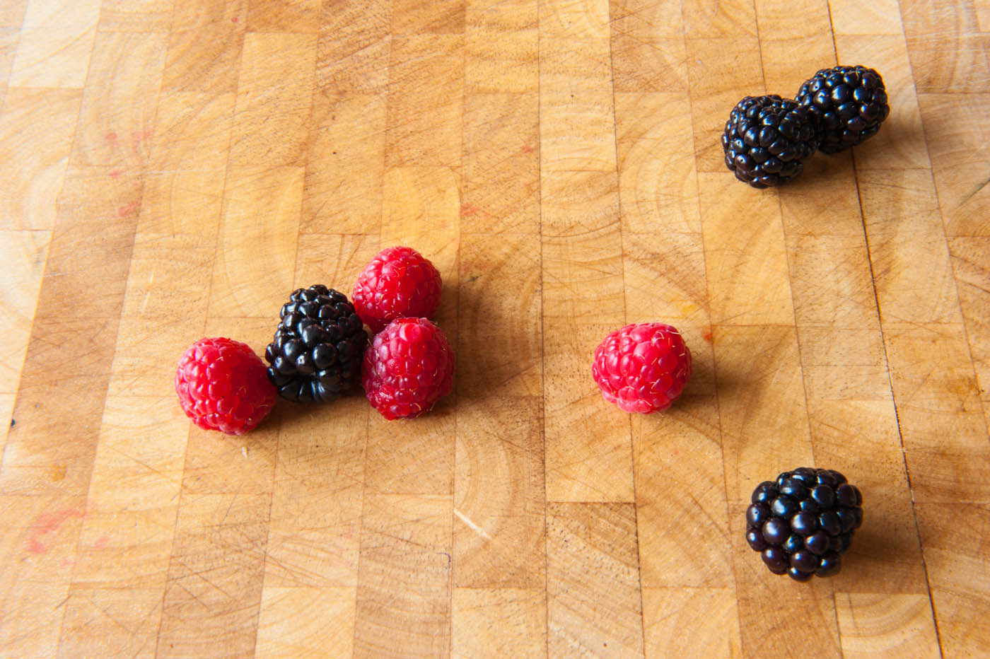
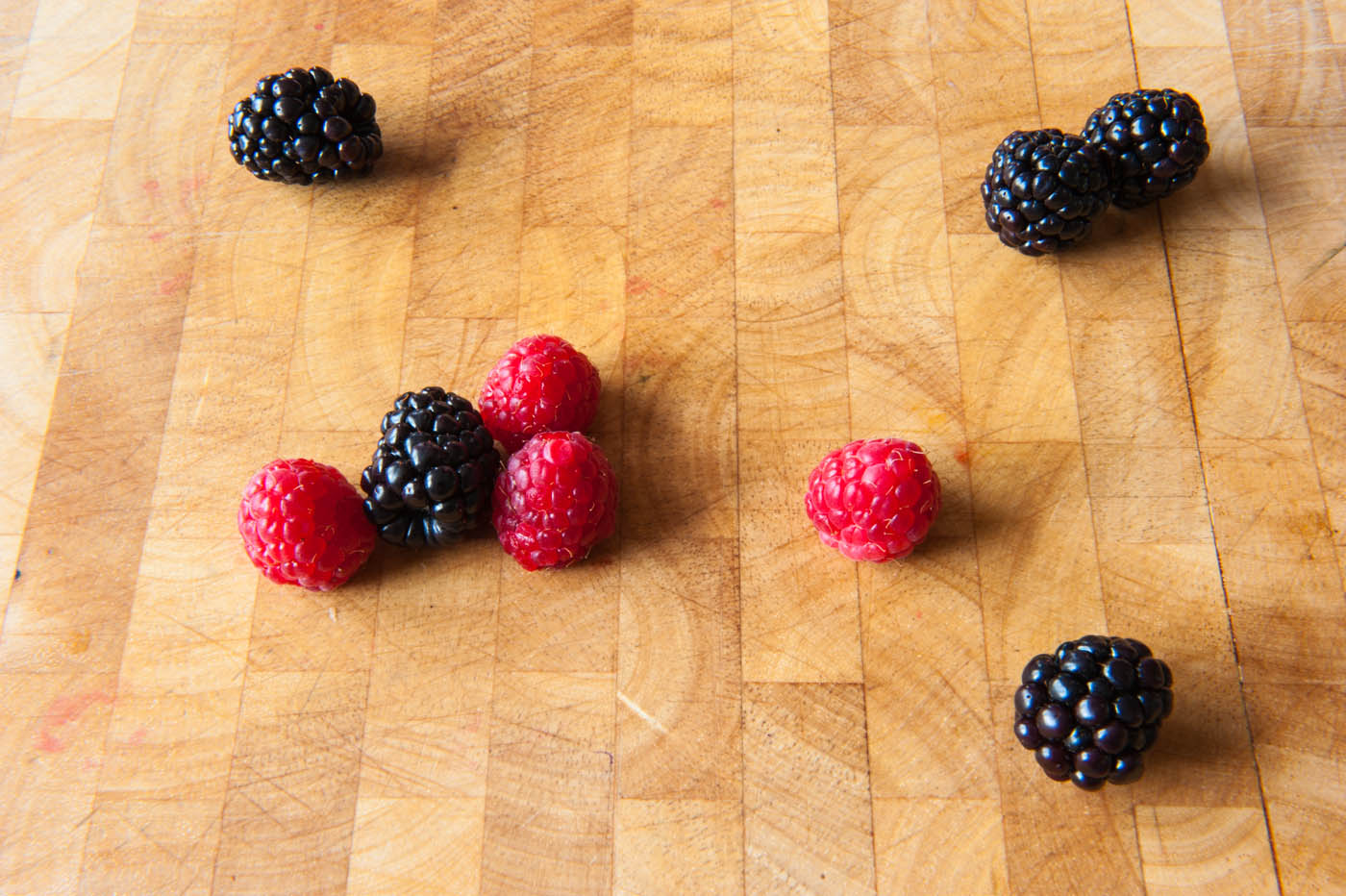
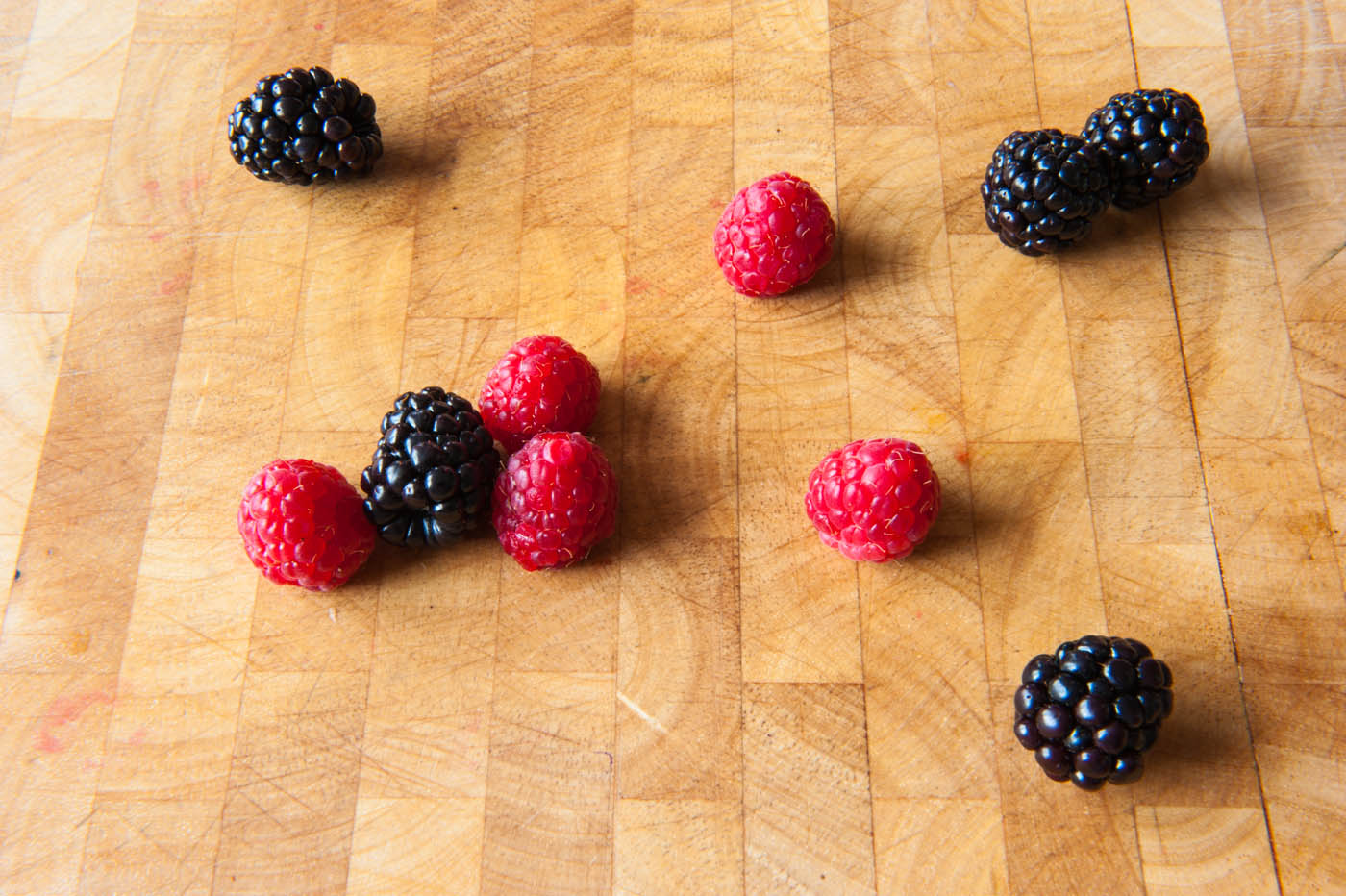
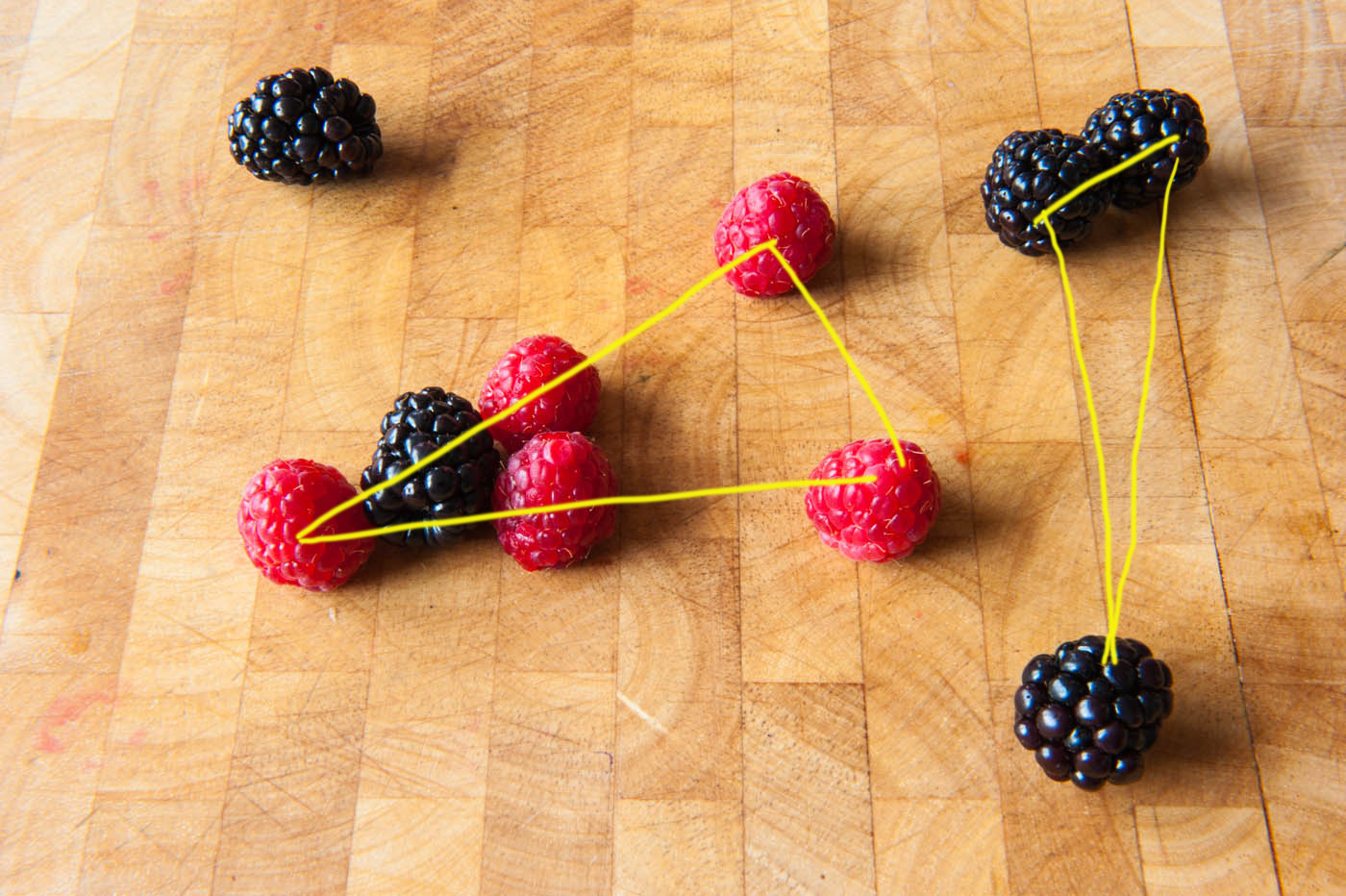
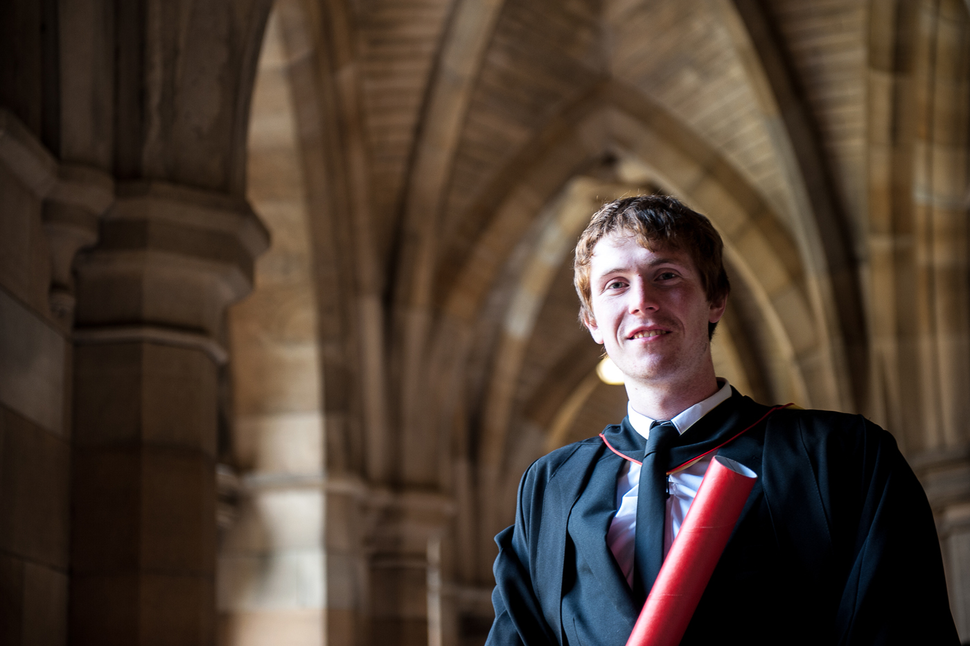
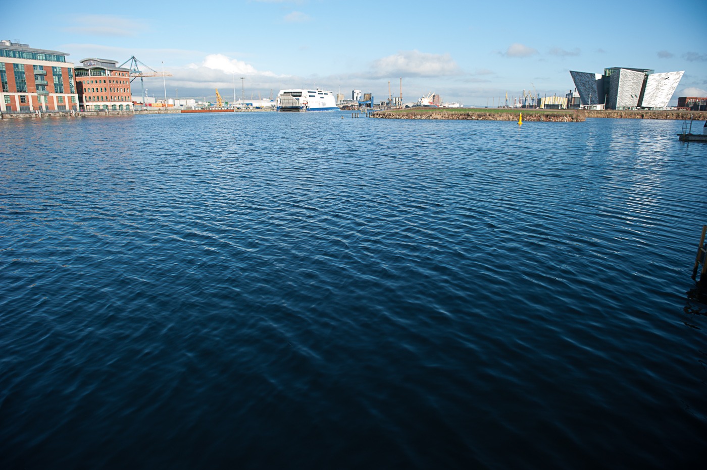
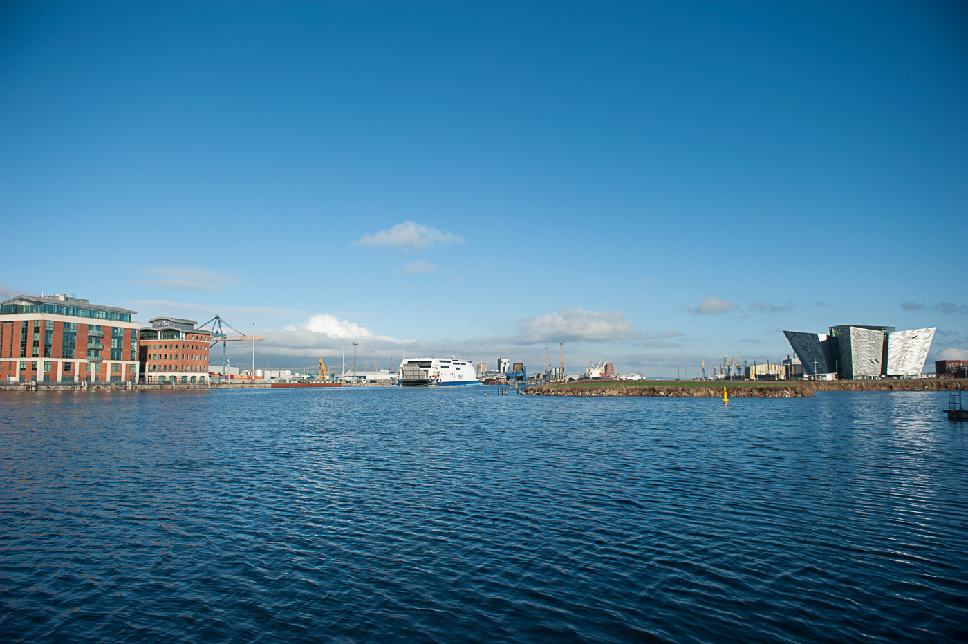
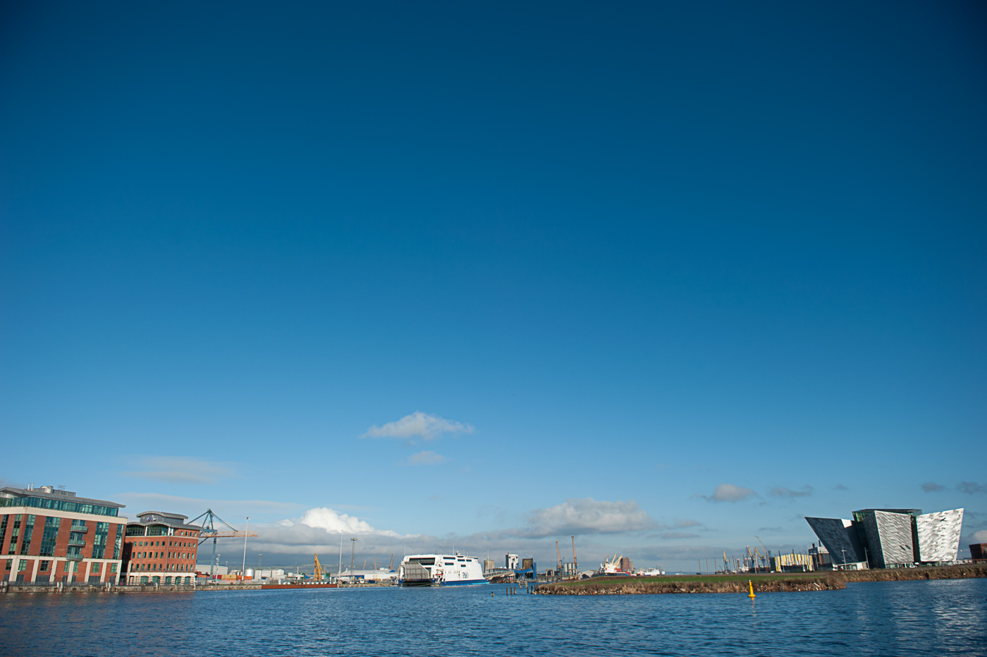
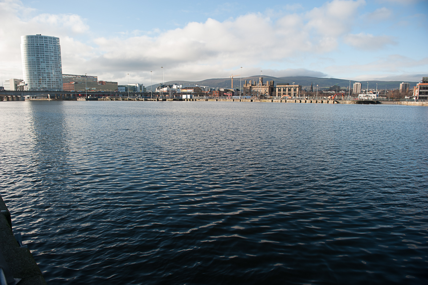
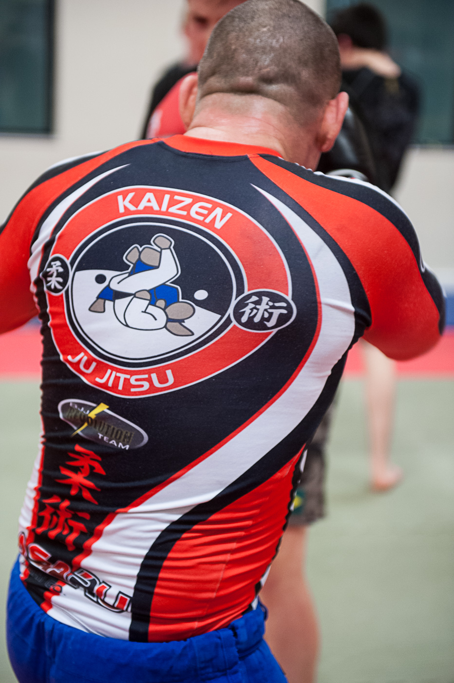
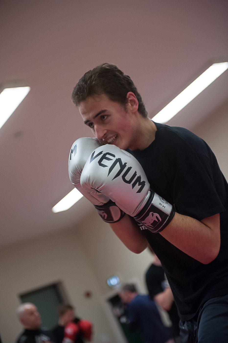
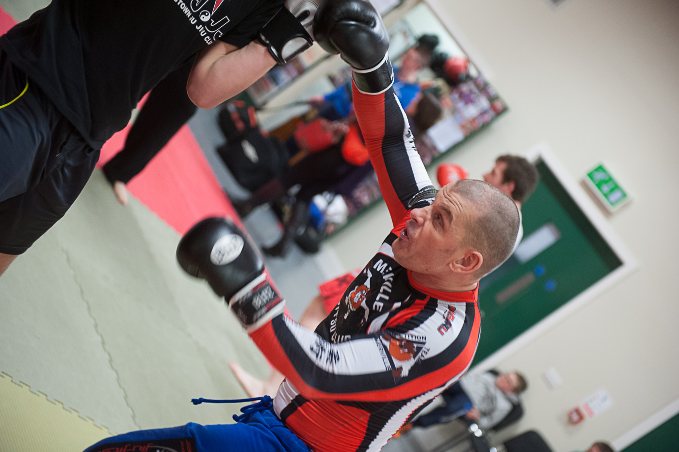
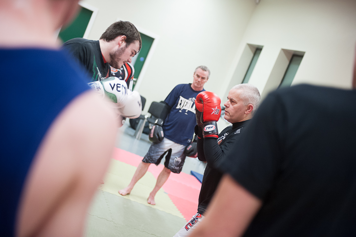
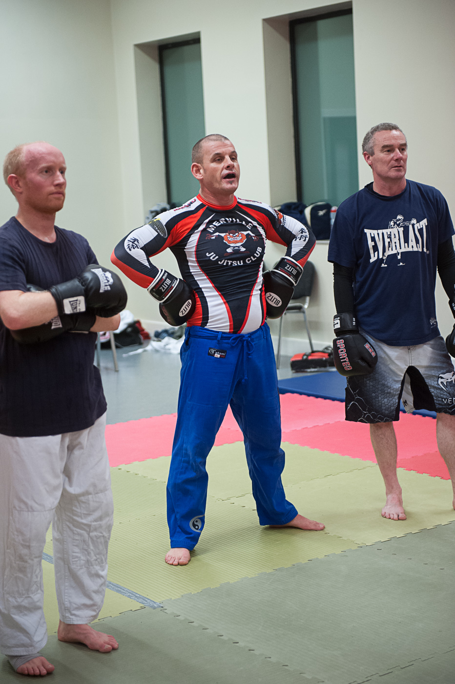
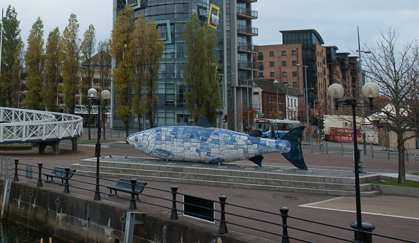
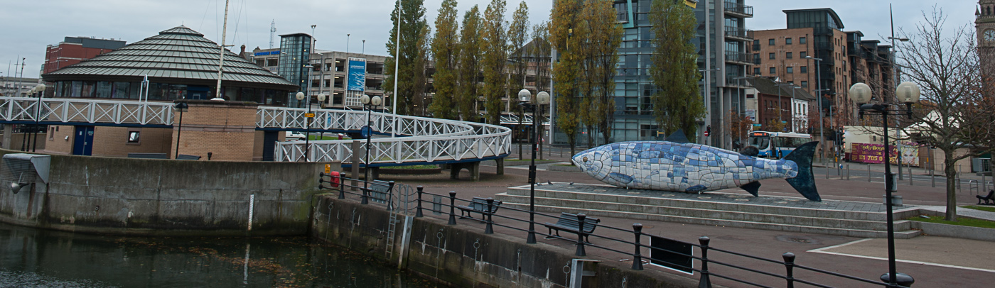
The aim of this exercise was to, in a fairly compact location, take 20 photographs in portrait format. Then another 20 shots, by shooting a horizontal version of every vertical composition. You can see the results below.

small LanPor -3027 small LanPor -3026

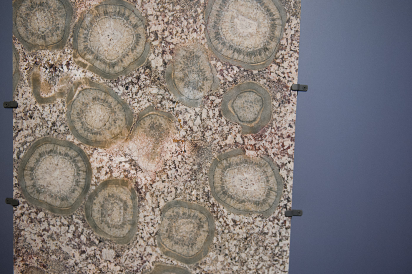
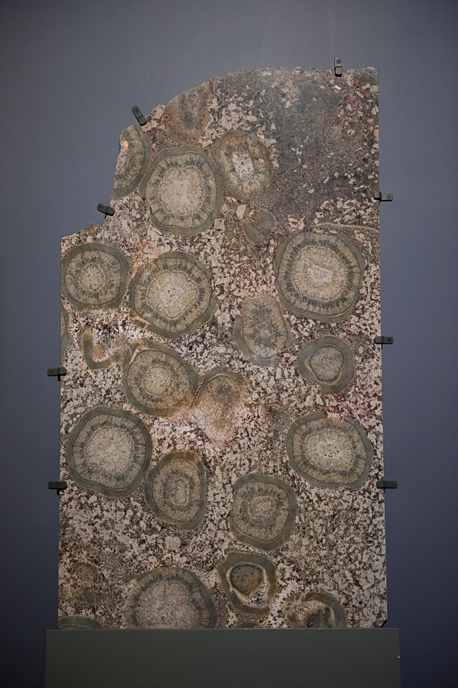
This was definitely a subject best shot vertically. One a came to shoot it horizontally I was torn between this eccentric composition or filling the frame with the pattern of the fossils. On hindsight I should probably have went with filling the frame.

small LanPor -3025small LanPor -3024

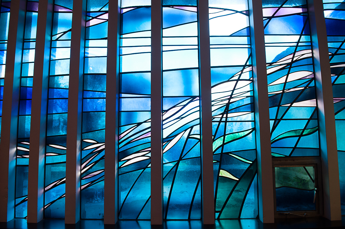
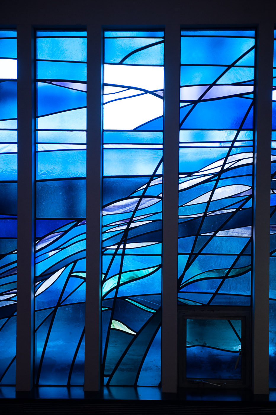
As these windows run vertically I assumed that they would be ideal for a vertical shot , but as you can see the horizontal shot is a much more satisfying image. The sloppy composition of the vertical shot probably has an impact on this also.

small LanPor -3023small LanPor -3022

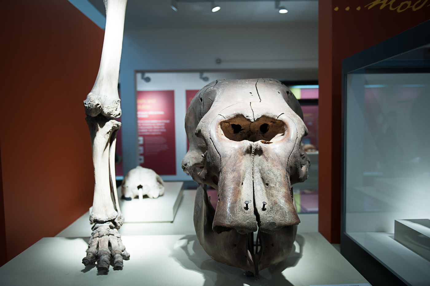
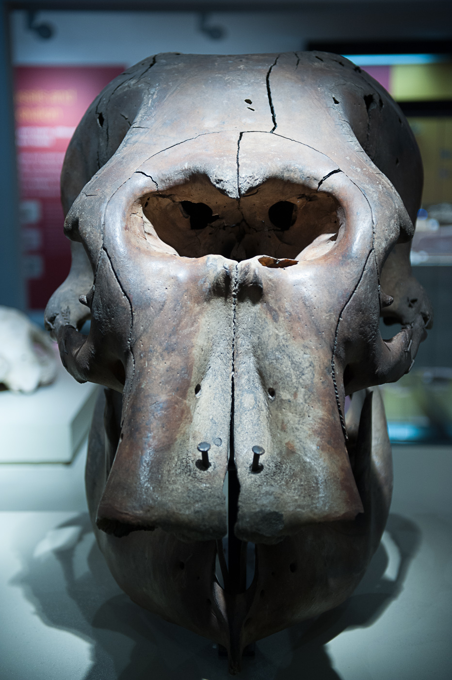
The big skull is much better vertically because the photograph has symmetrical balance whereas the horizontal framing is unbalanced with a display case on the right adding an unpleasant tension to a photograph. As with so many of these vertically composed photographs, when I returned to shoot the horizontal composition it was difficult to find a satisfying composition.

small LanPor -3021small LanPor -3020

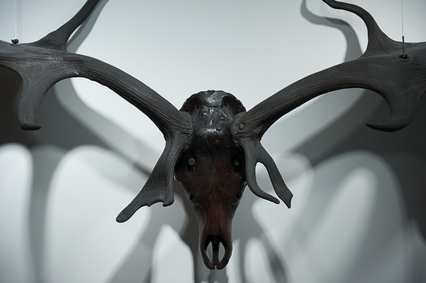
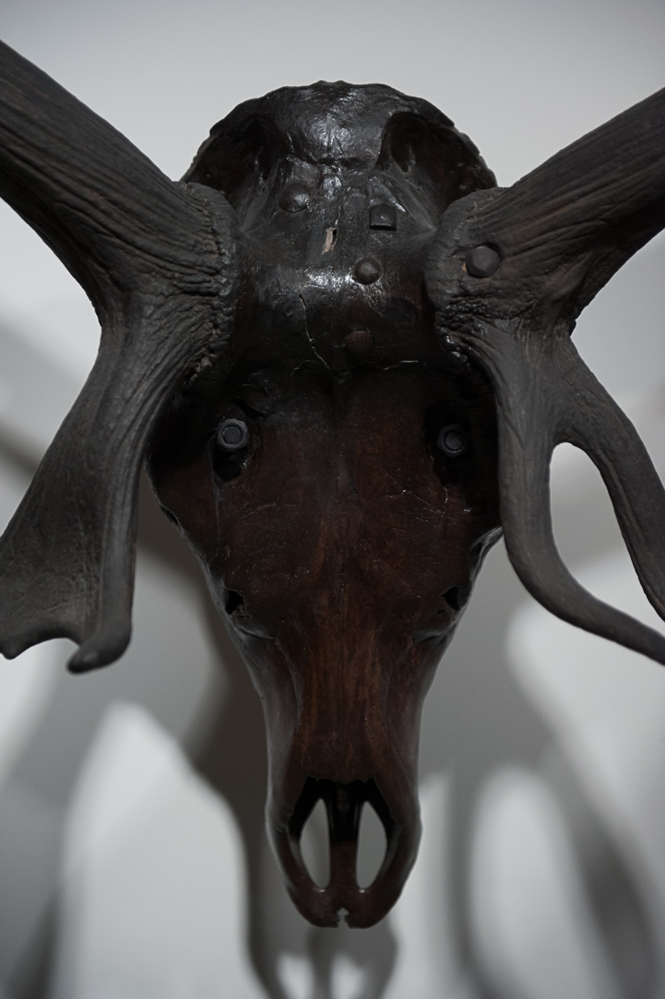
With the stag’s head, the vertical composition creates an interesting photograph which is not instantly recognisable as a stag and in fact seems almost insectlike. When I returned to compose horizontally I was able to include much more of the antlers giving the viewer understanding of what they are looking at. This is one of the powers of photographs were I have trouble deciding which is the better composition. I like the unsettling effect of the vertical photograph, but I also like the cemetery afforded by the extended antlers in the horizontal photograph.

small LanPor -3019small LanPor -3018

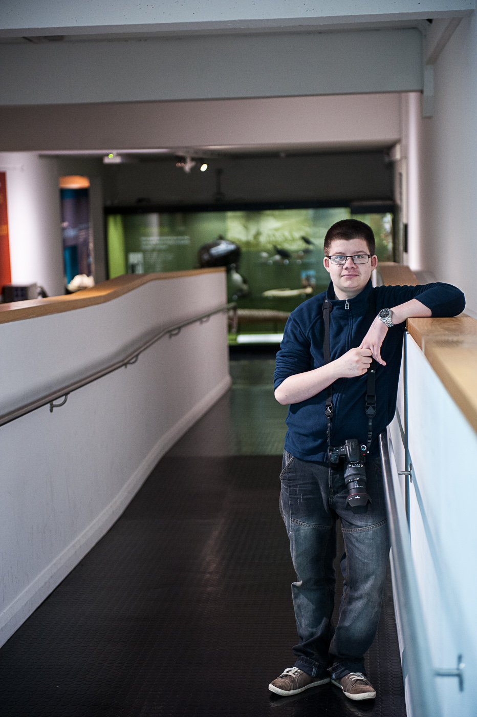
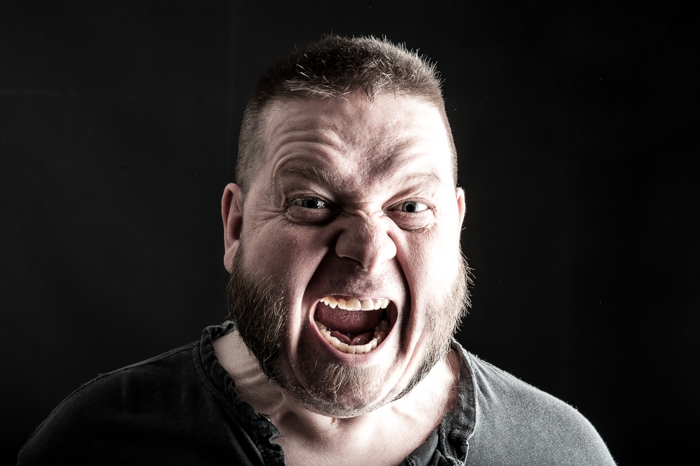
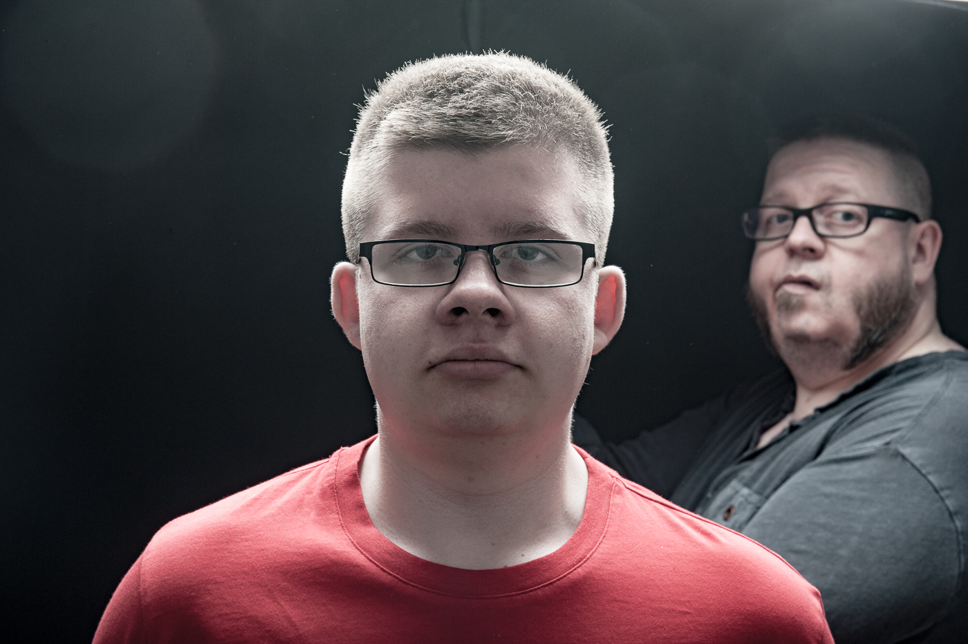
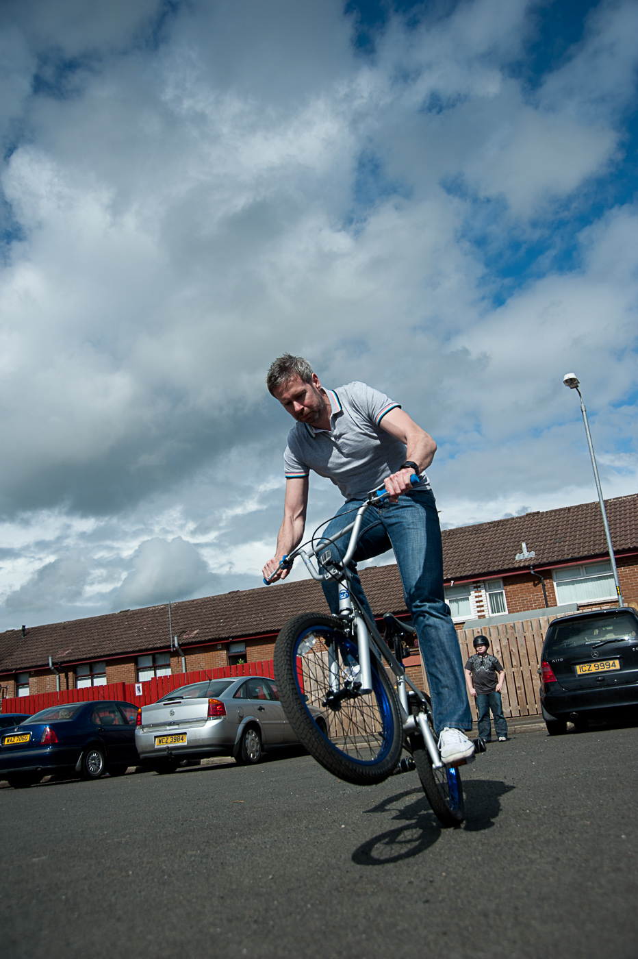
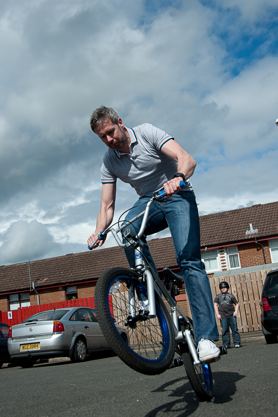
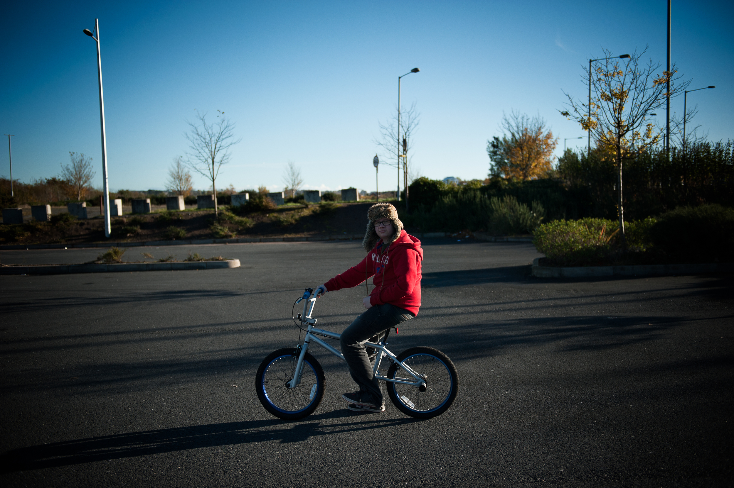
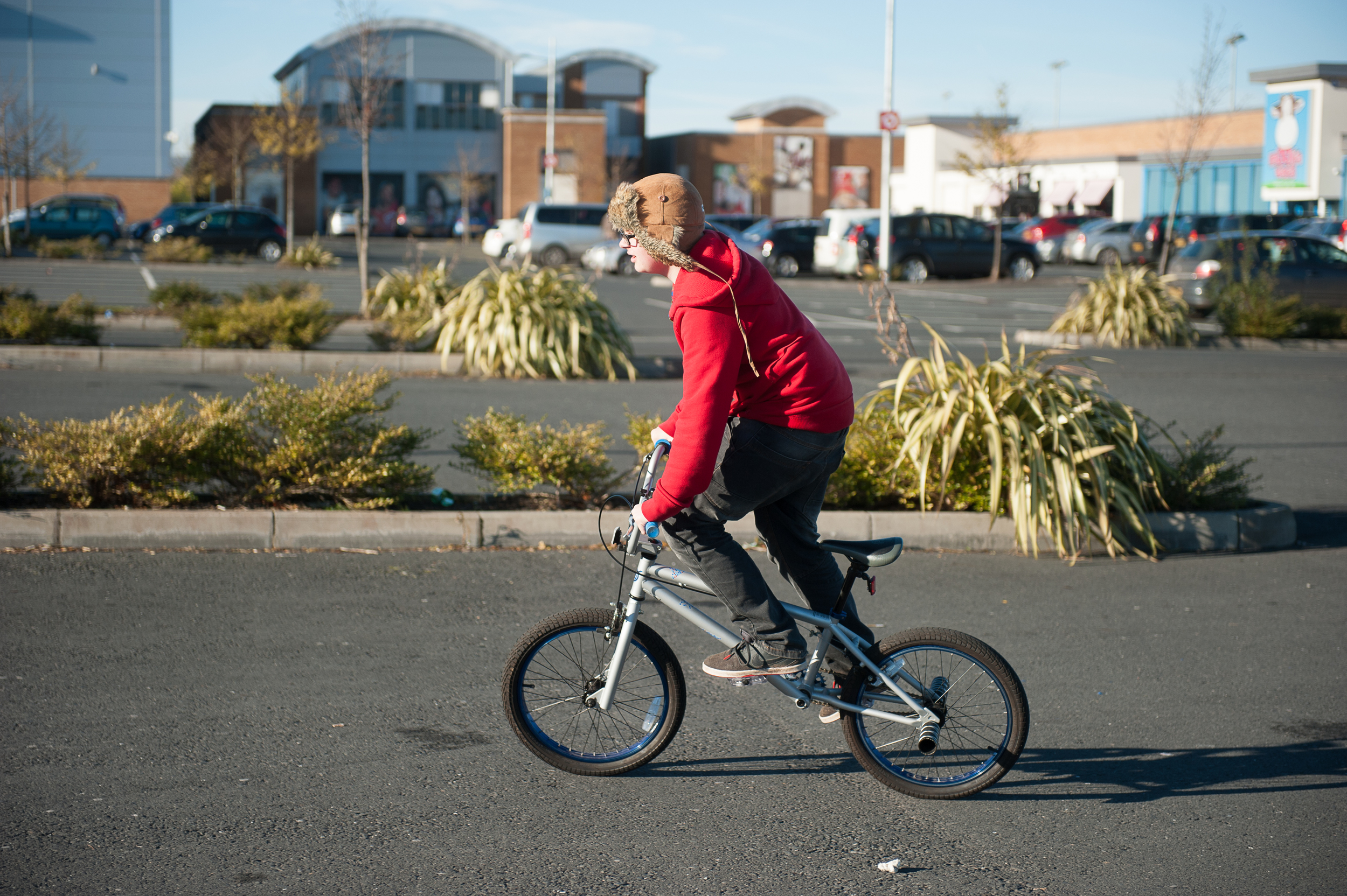
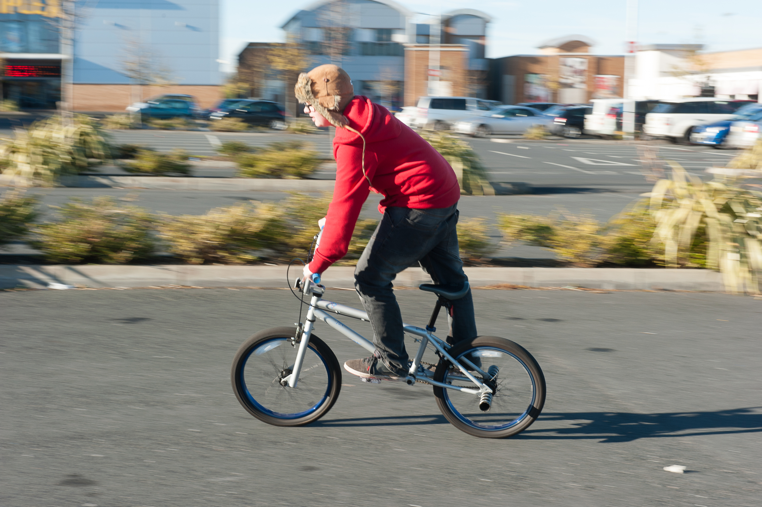
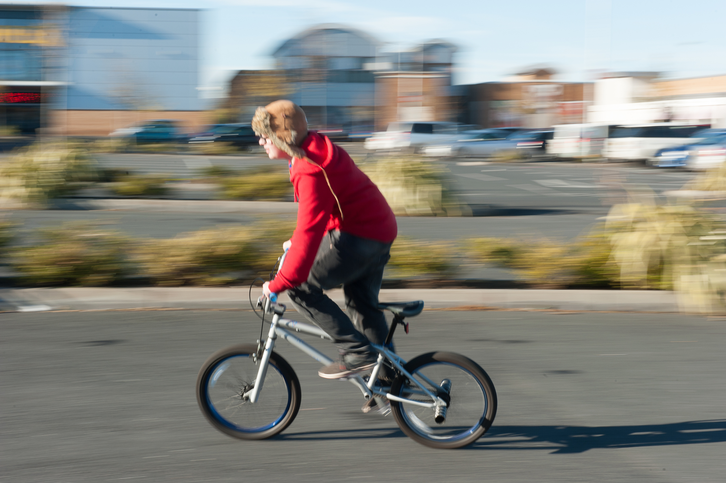
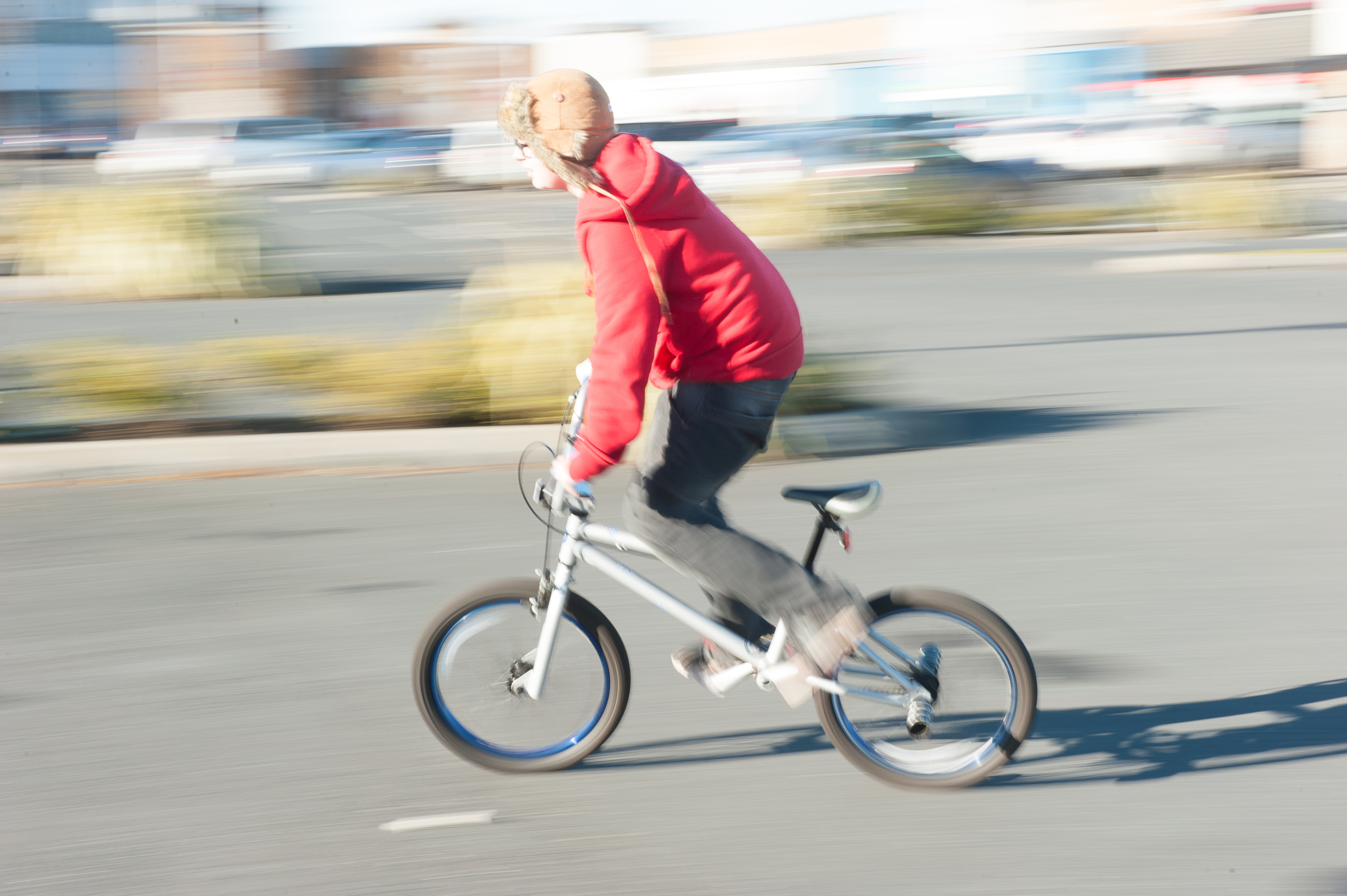
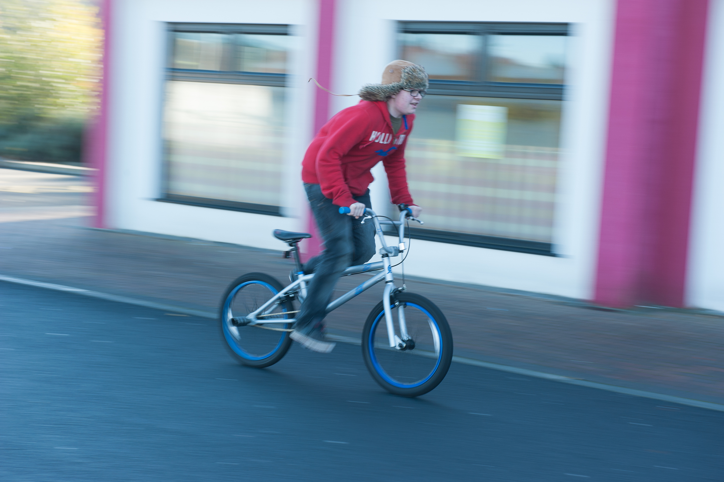
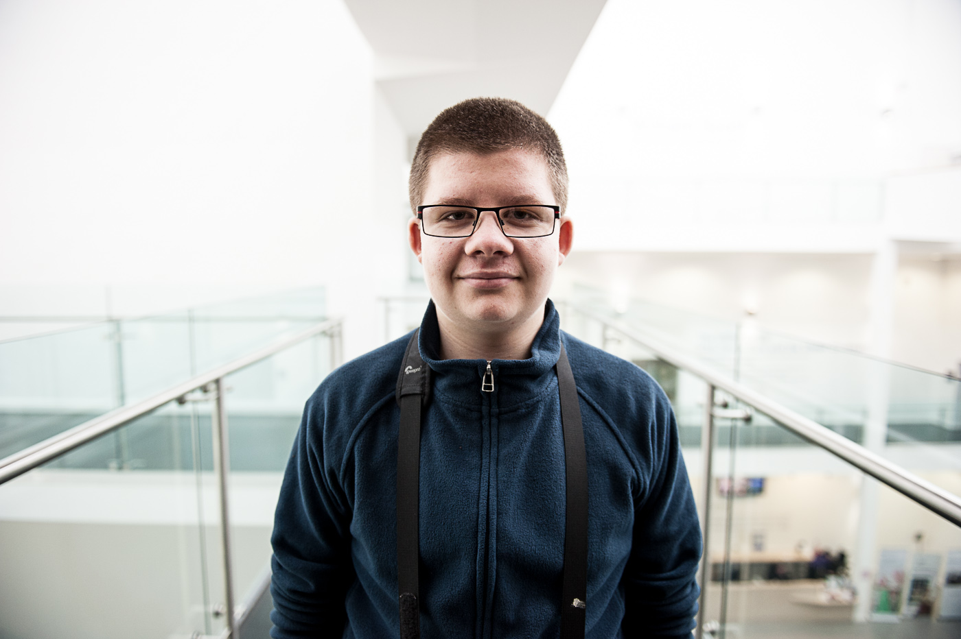
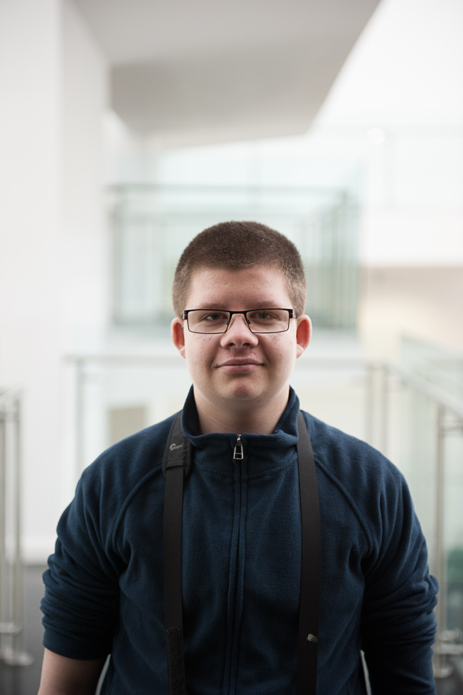
In this pair of photographs the subject (my son Jacob) is undeniably vertical so you would expect the vertical composition and vertical frame to be the better picture. In fact the opposite is the case. With a horizontal composition here we have a stronger leading wine on the right-hand side bring in the viewer’s eye to the subject and the framing of the subject by the room in the background of the photograph is more symmetrical and gives a much better balance to the horizontal image.

small LanPor -3017small LanPor -3016

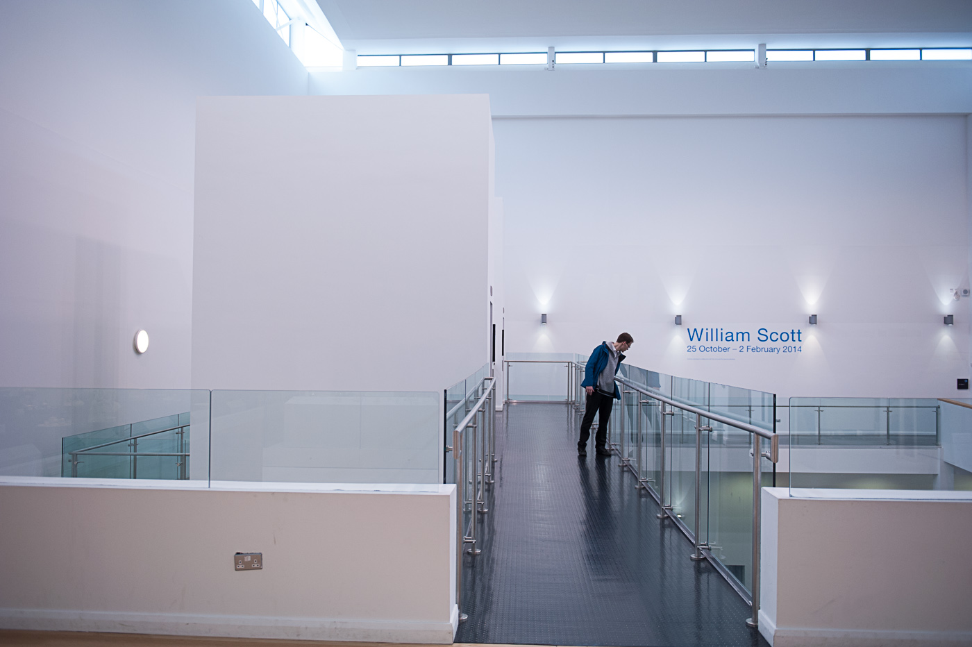
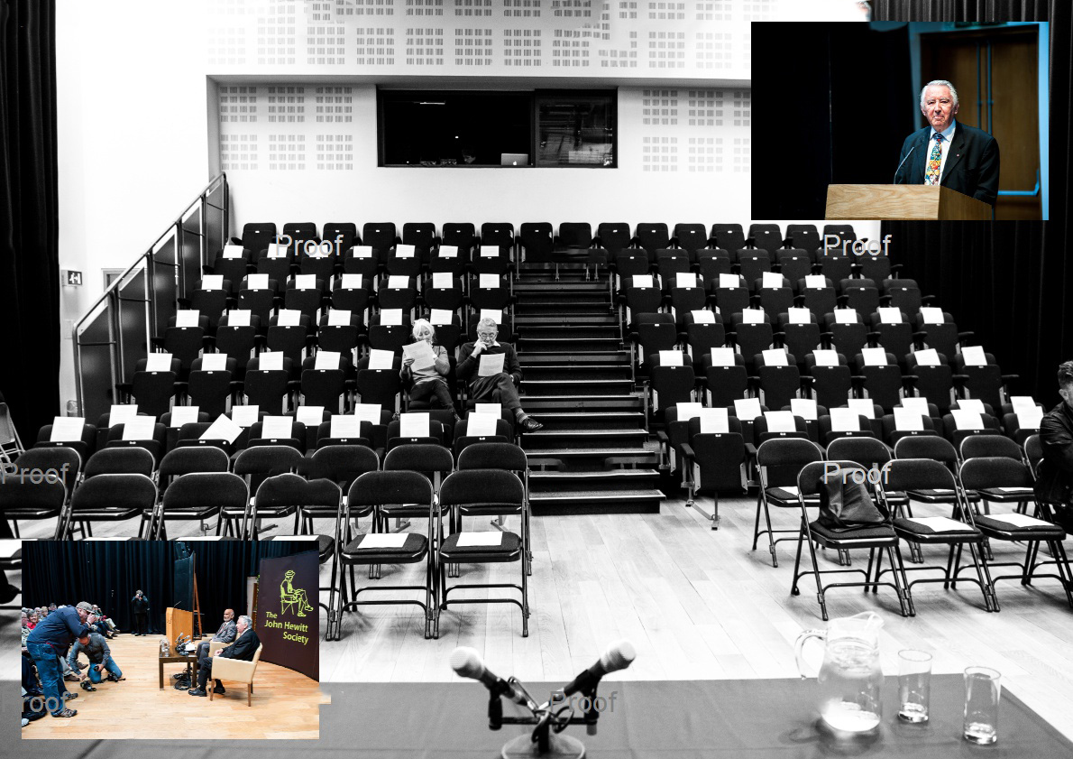
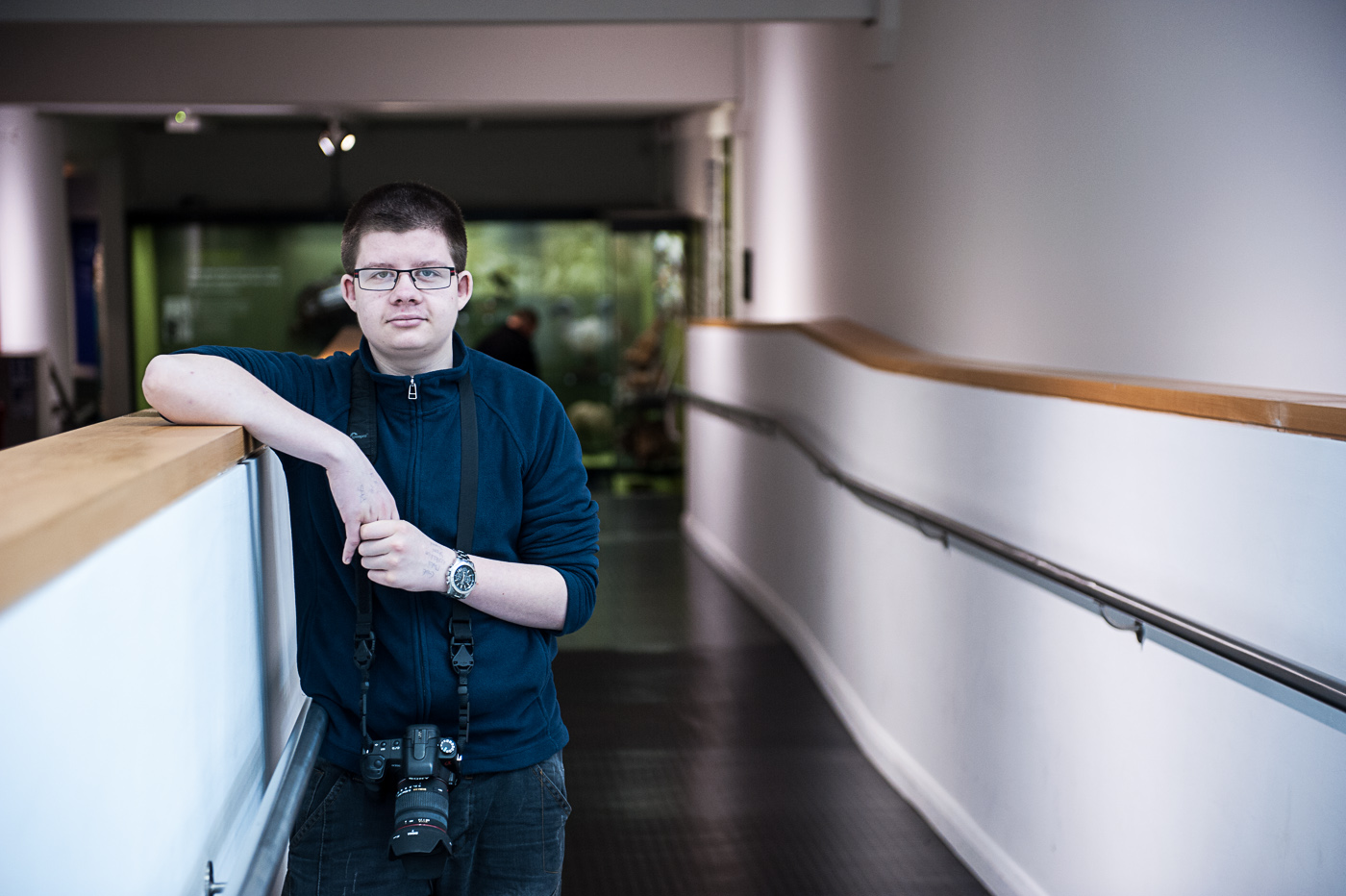
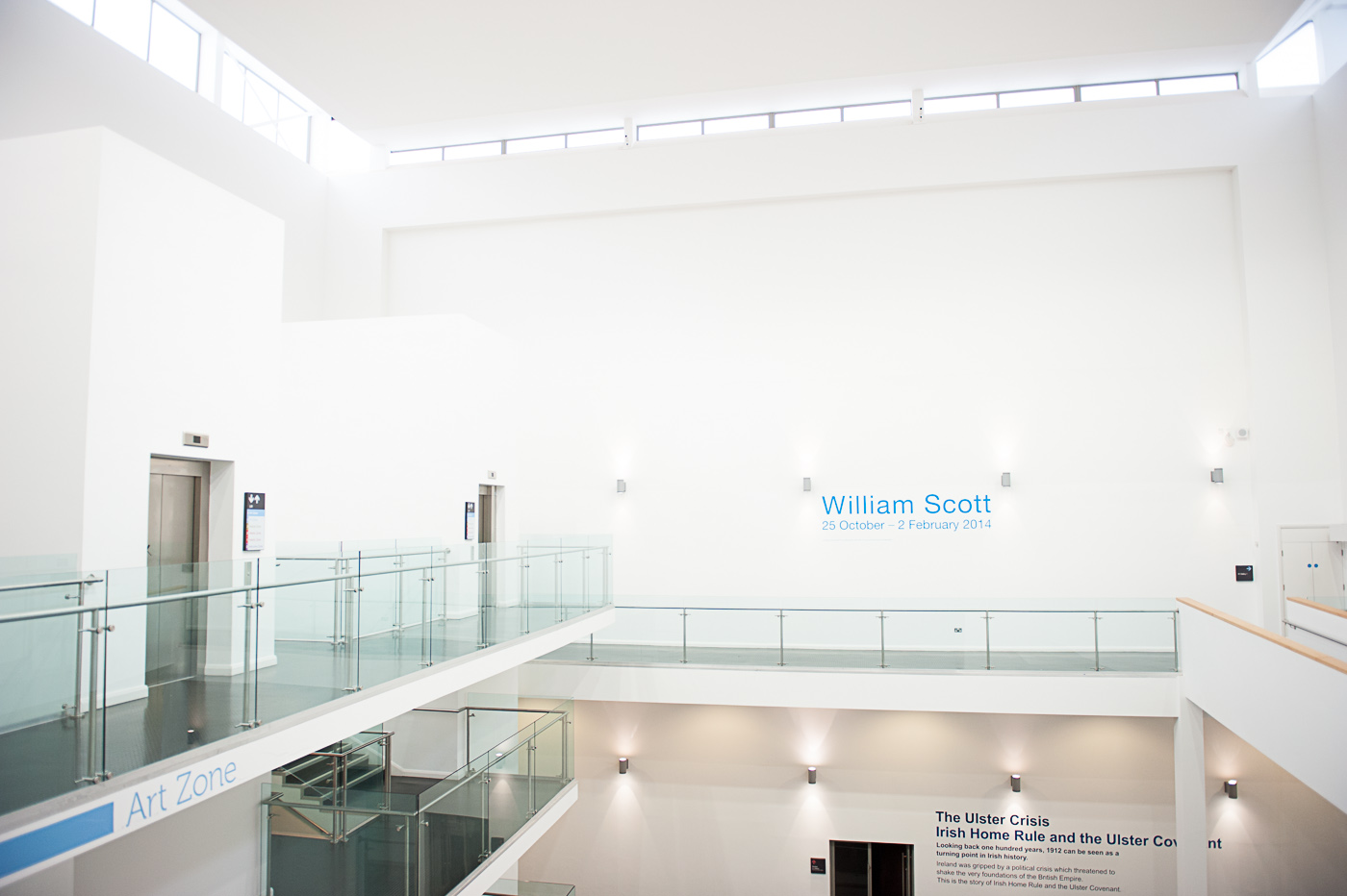
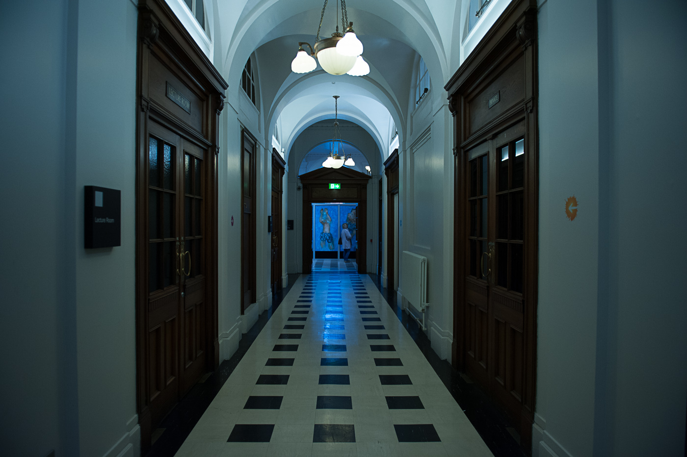
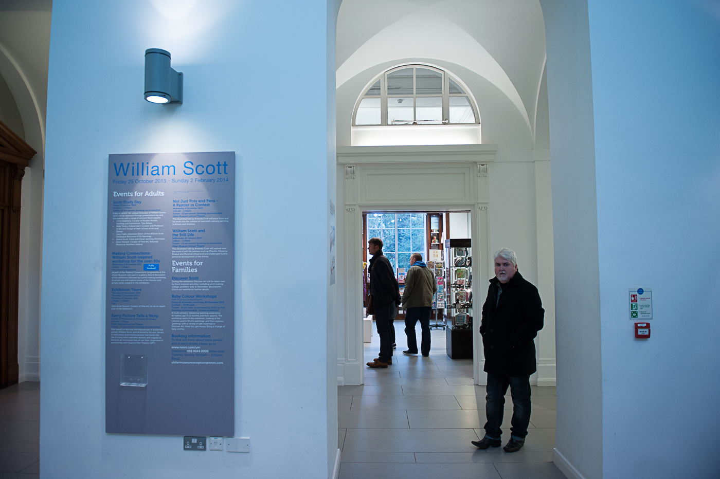
In this photograph of the museum walkway I prefer the vertical composition. Although there is more of interest in the horizontal photograph (i.e. the human subject and the William Scott sign) the vertical image has more pronounced lines and shapes making it a stronger and bolder photograph, and the exclusion of any people makes the viewer struggle a little bit for context in the picture.

small LanPor -3015small LanPor -3014

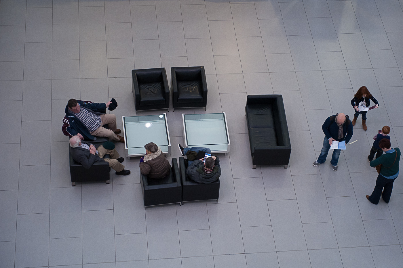
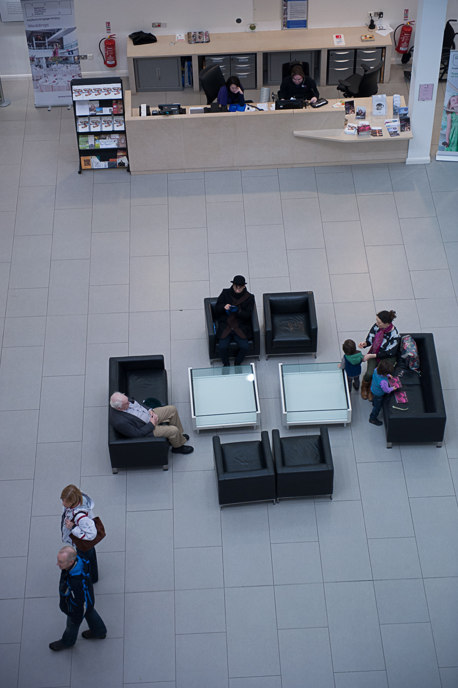
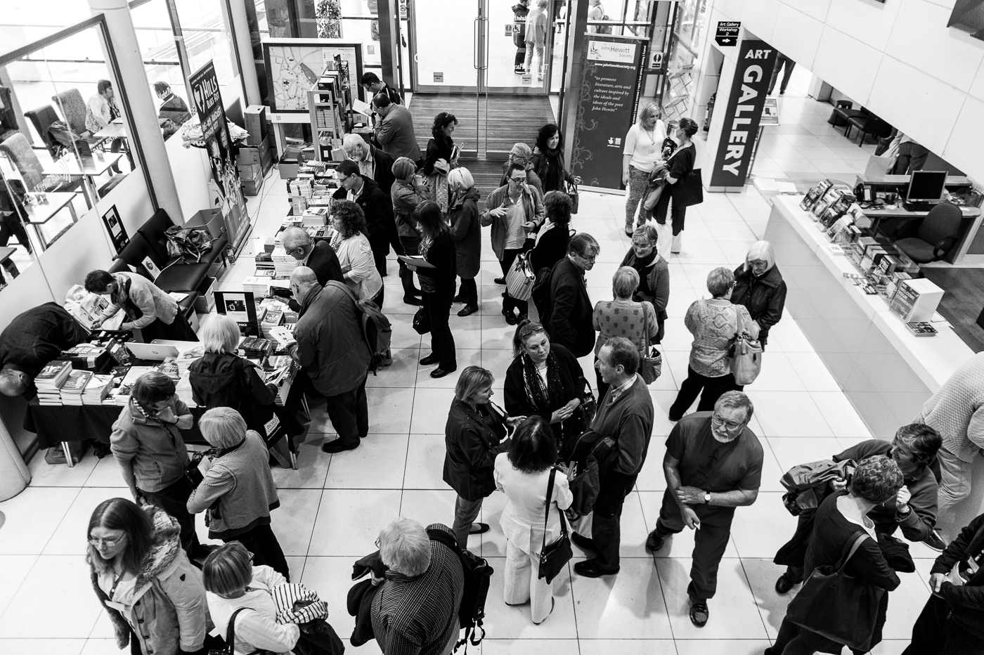
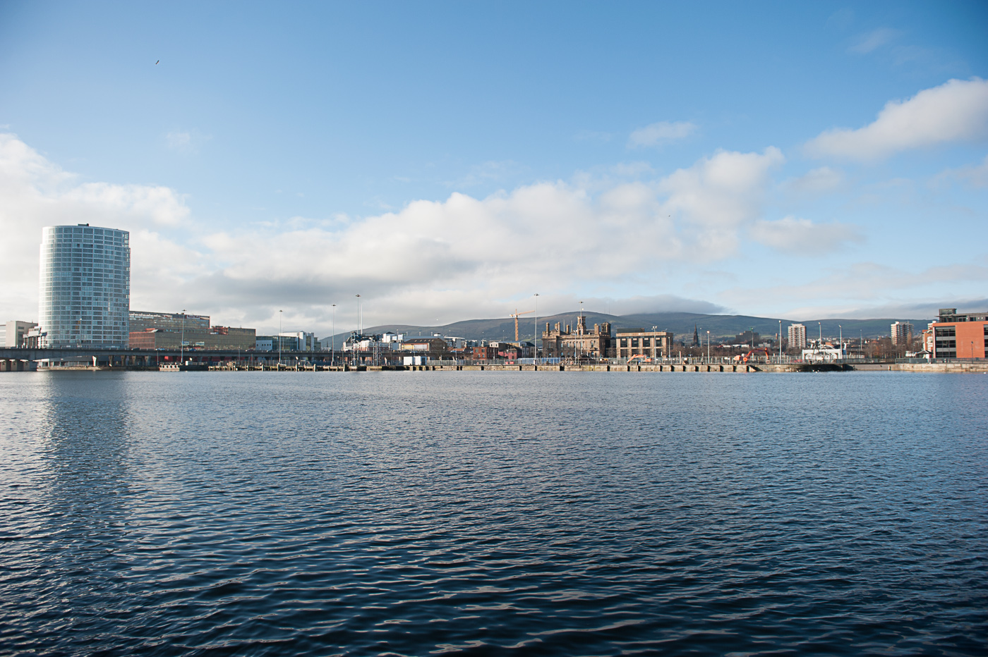
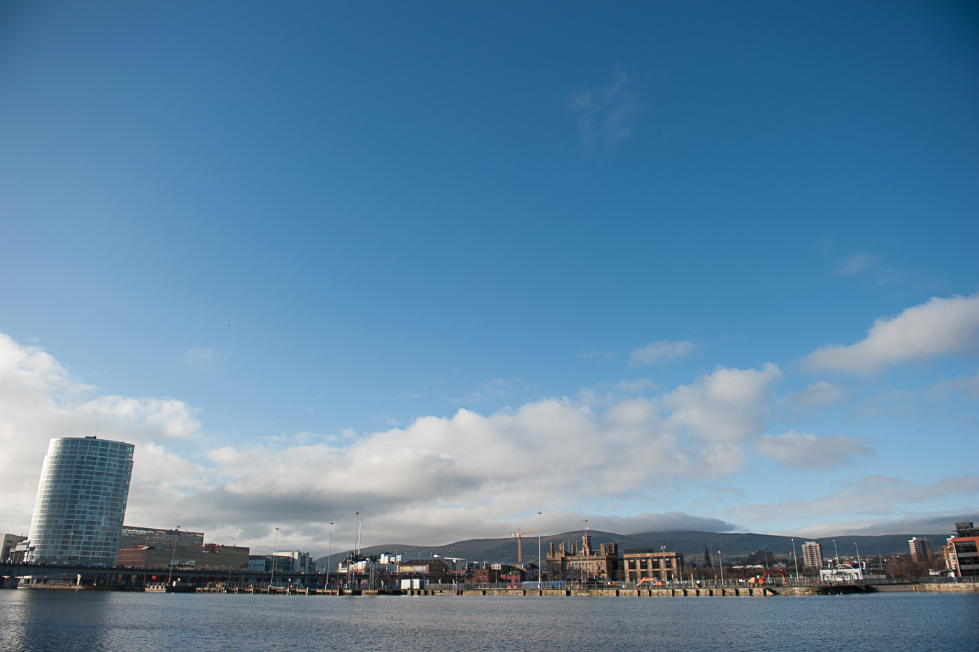
The pair photographs above were taken from a vantage point roughly 20 m above the subjects and this has the effect of day leading the difference between vertical and horizontal. The photographs look like different crops of the same shot.

small LanPor -3013small LanPor -3012

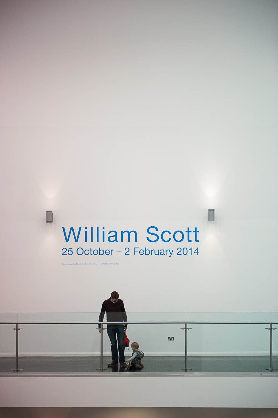
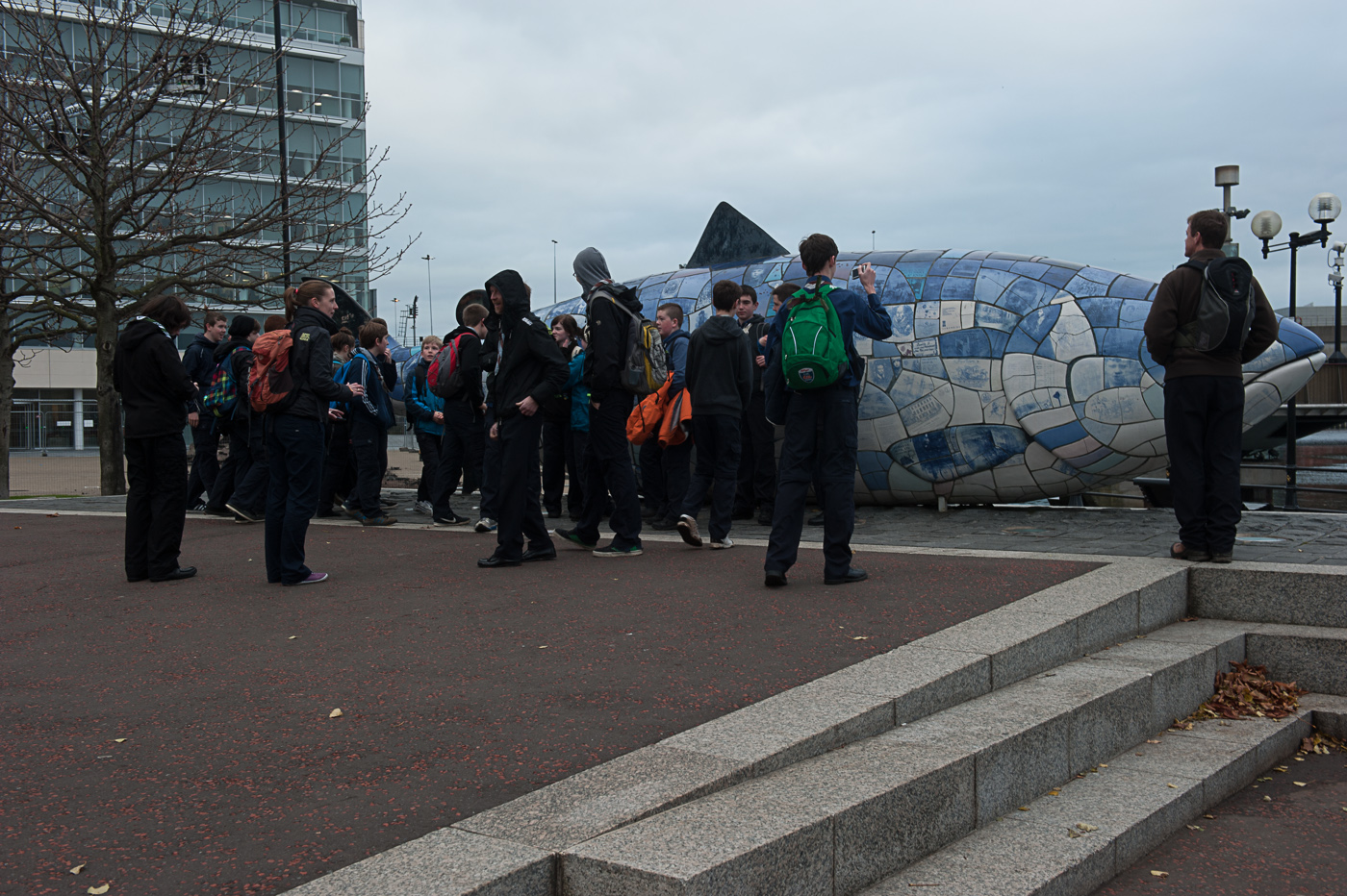
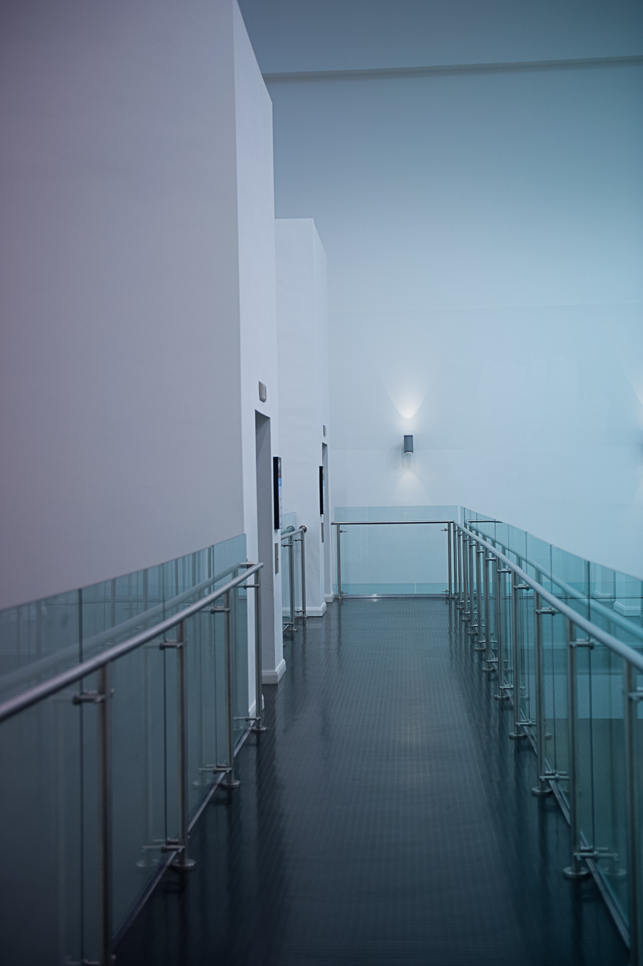
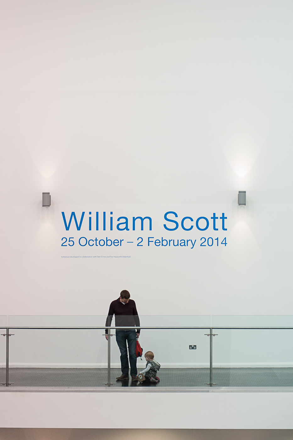
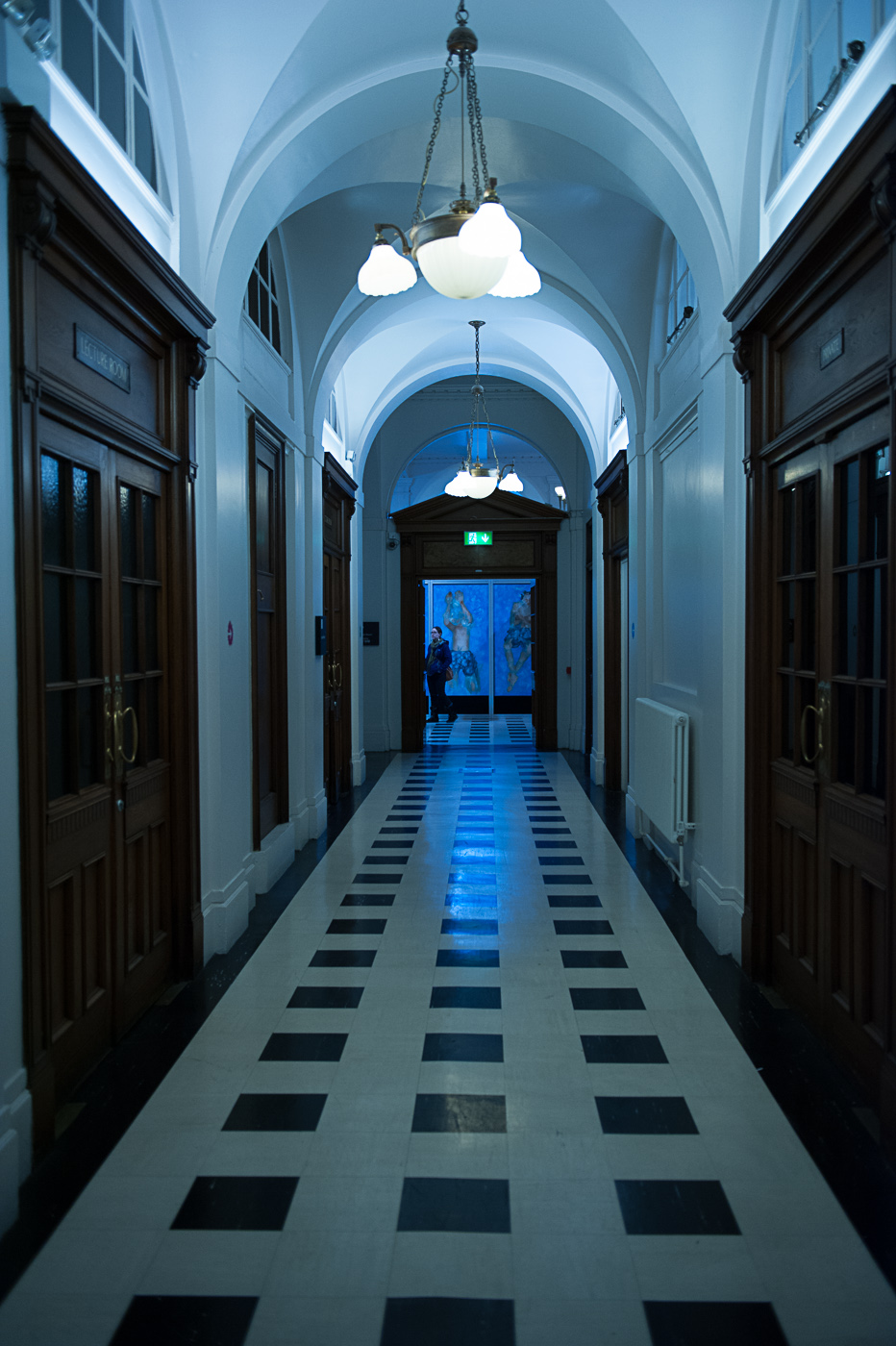
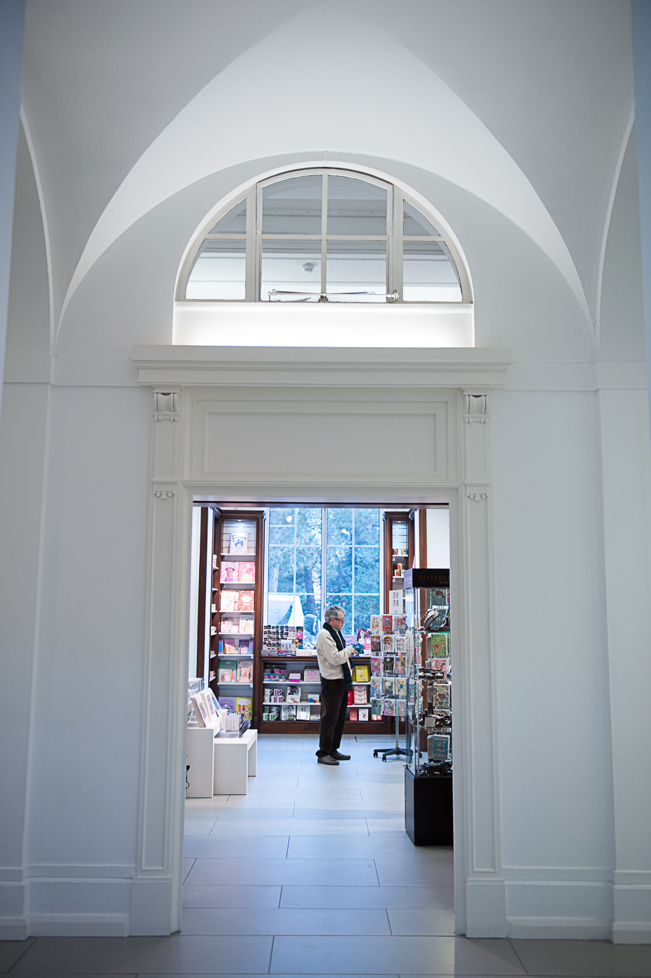
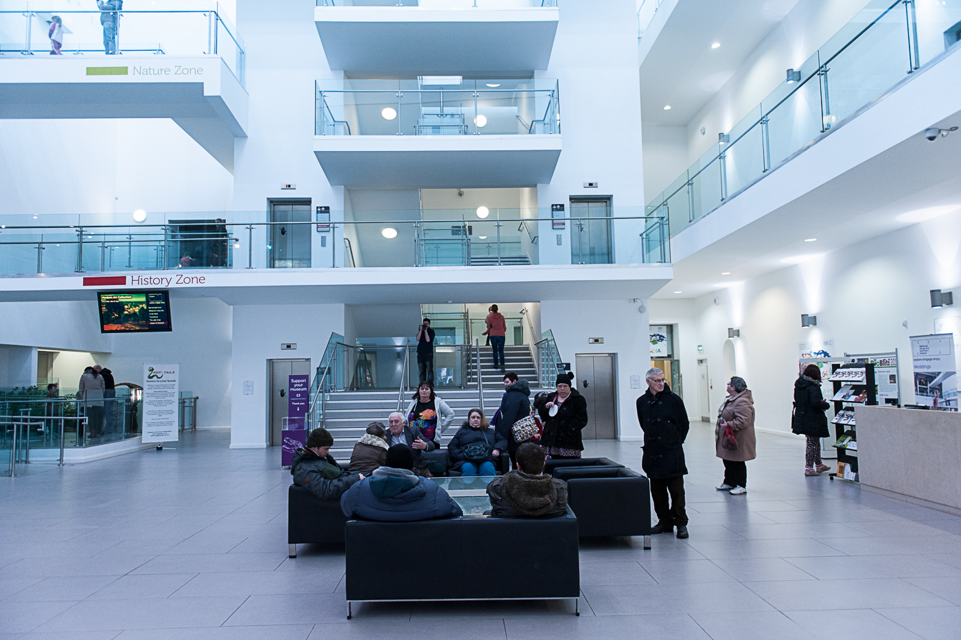
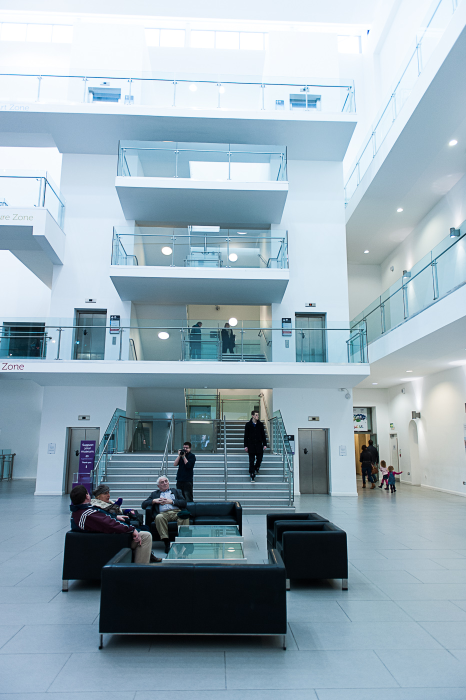
Here again we have two views of the museum walkway. The vertical image is the stronger of the two. Vertical asymmetry and use of negative space at the top of the photograph make it more pleasing than the wide angle horizontal image and in this case the addition of people adds some much needed context to the photograph in fact without the people there would be no sense of scale and we would simply be looking at a name and some horizontal lines. One thing that lets the photograph time is the true composition (i.e. the placing of the subjects within the frame is not truly symmetrical). This was annoying me so much that I had to crop the image to improve the symmetry as can be seen below.

small LanPor -1008

small LanPor -3011small LanPor -3010

small LanPor -3009small LanPor -3008

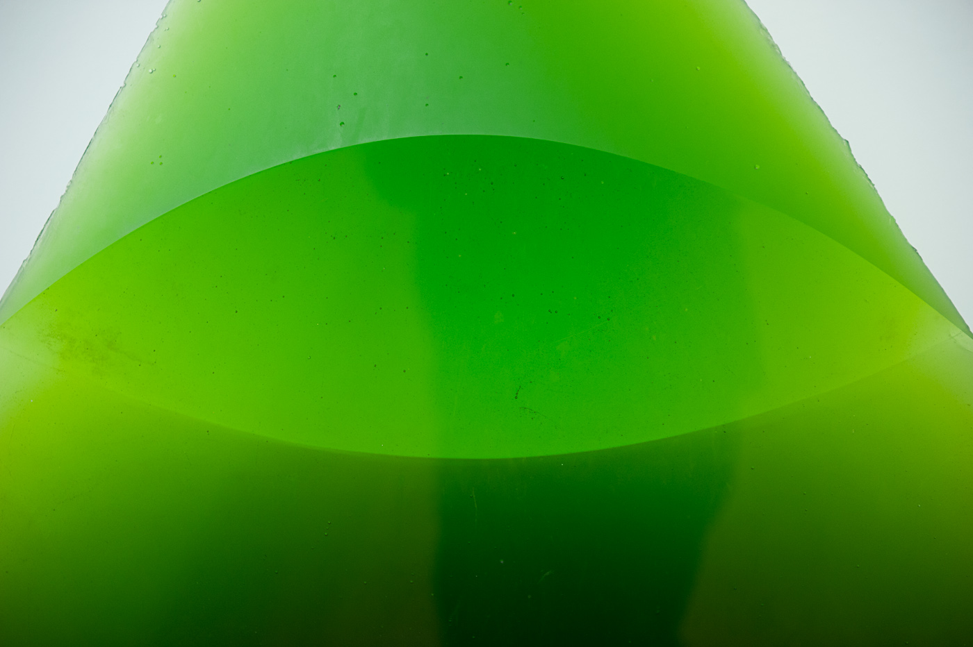
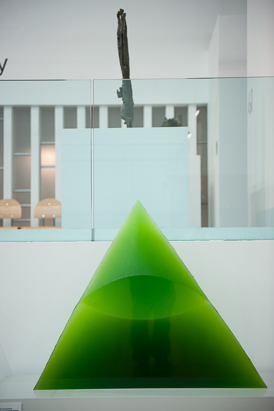
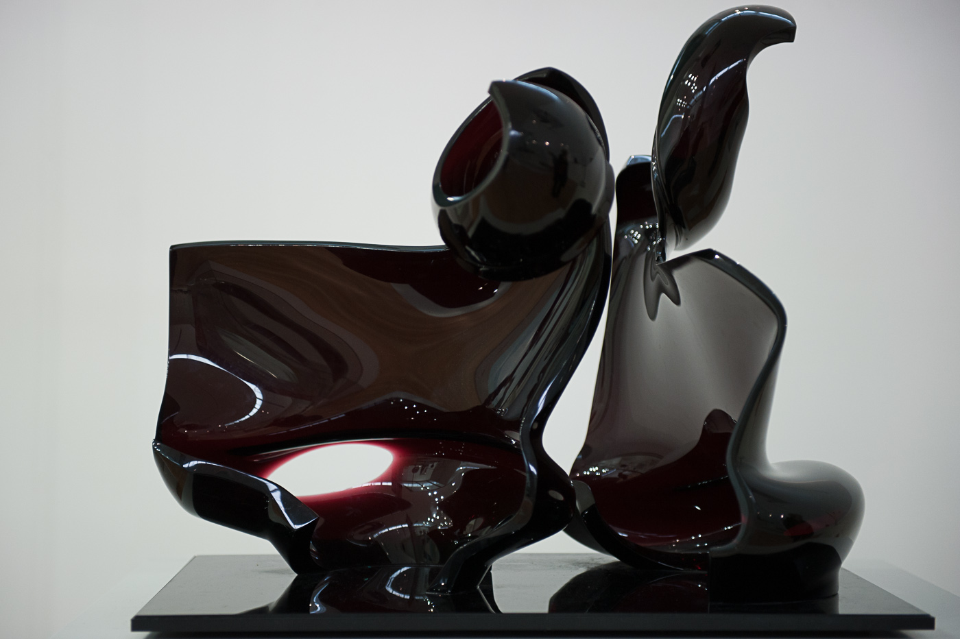
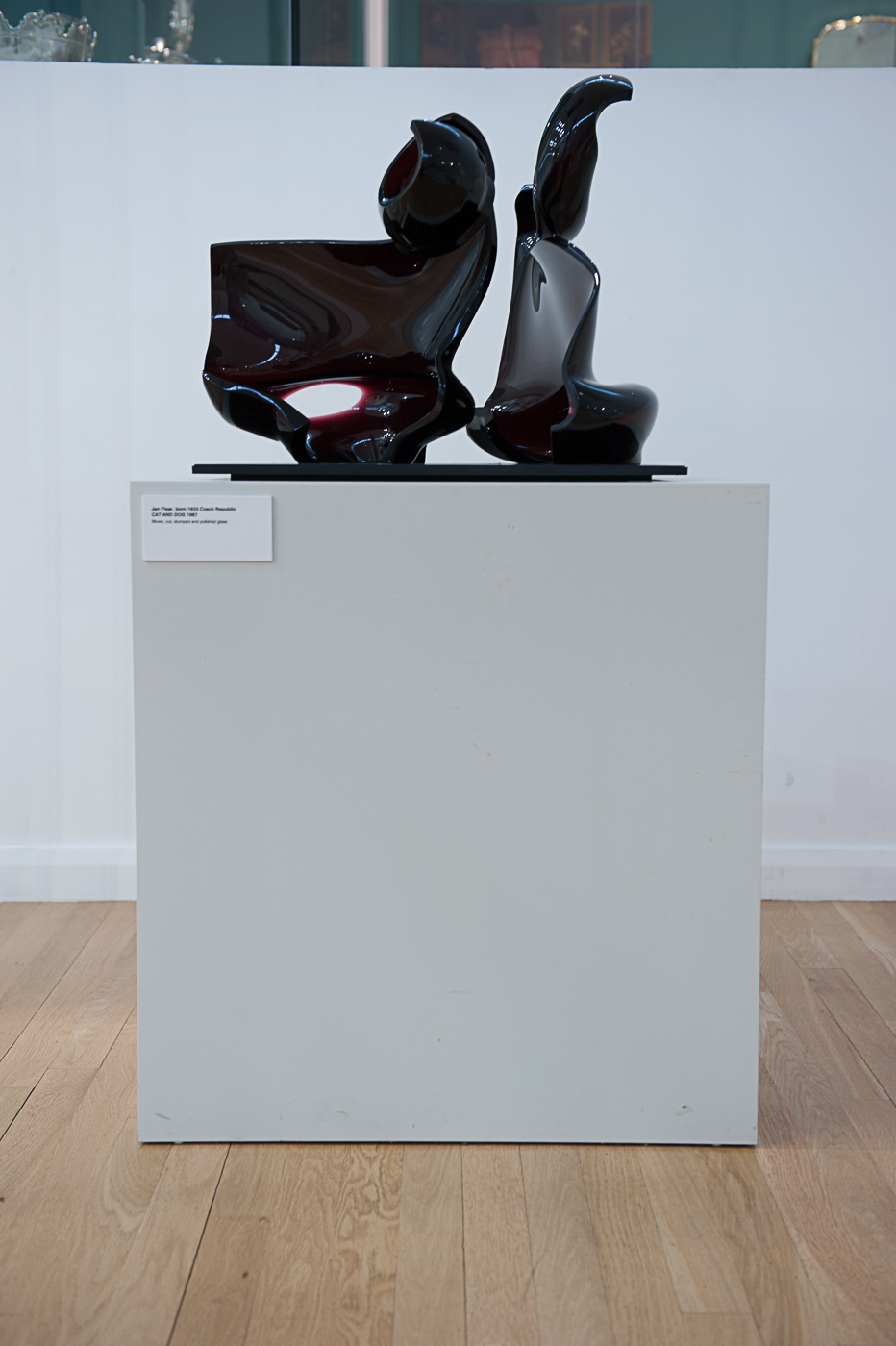
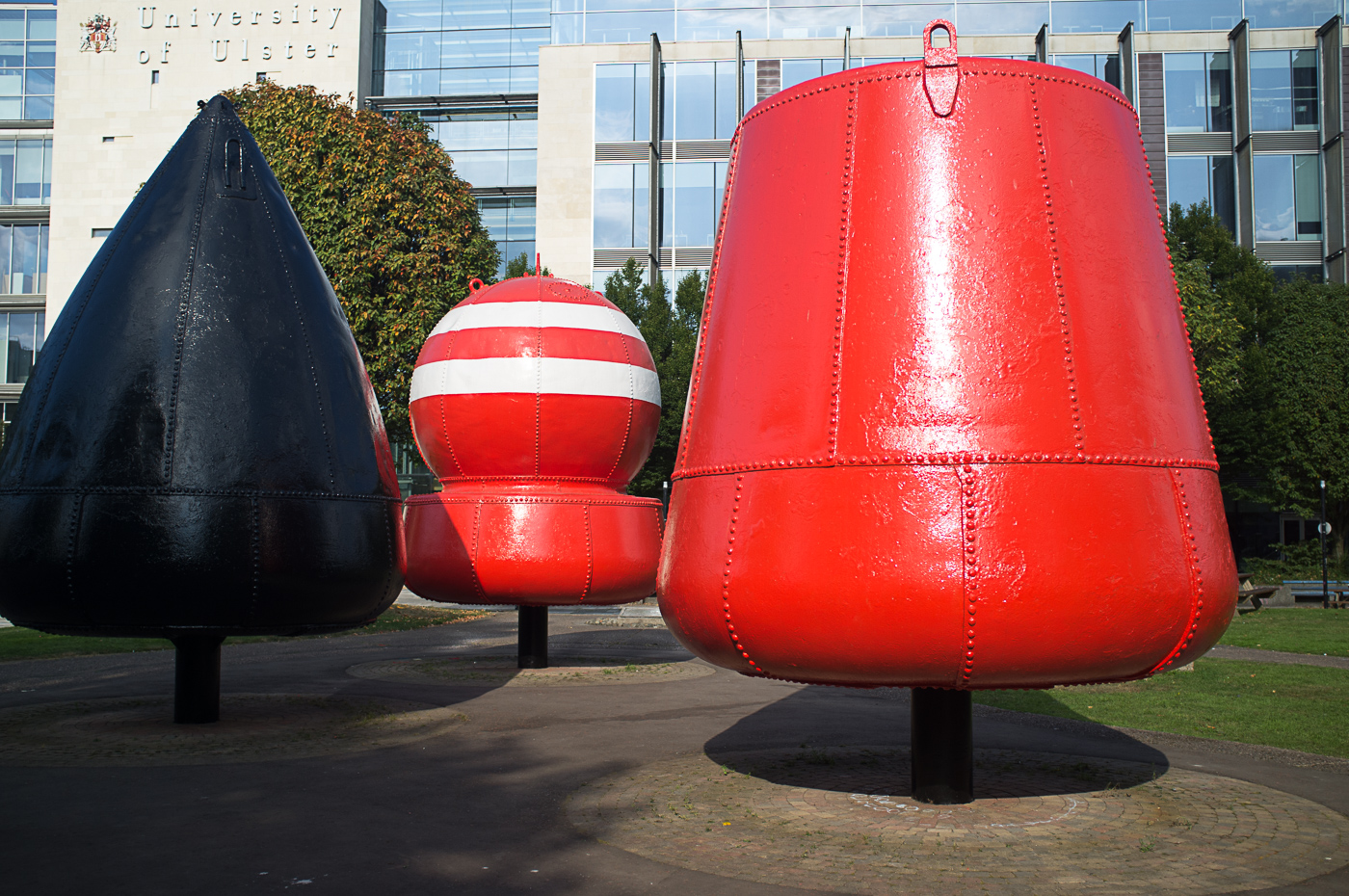
In the four photographs of the sculptures above I applied the same composition for both of the horizontal photographs but positioned the triangular sculpture in the bottom of the frame for the vertical image. This composition doesn’t really work for the green sculpture because it is not a long and all subject whereas the purple sculpture and its plinth make a cute vertical subject and it is a much more comfortable photograph to look at

small LanPor -3043small LanPor -3042

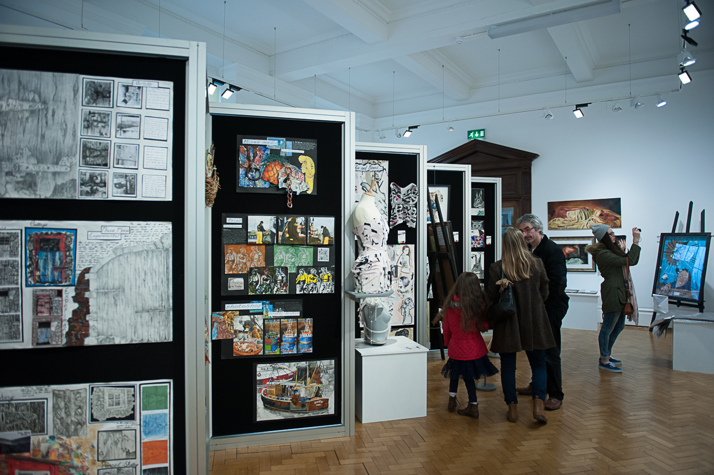
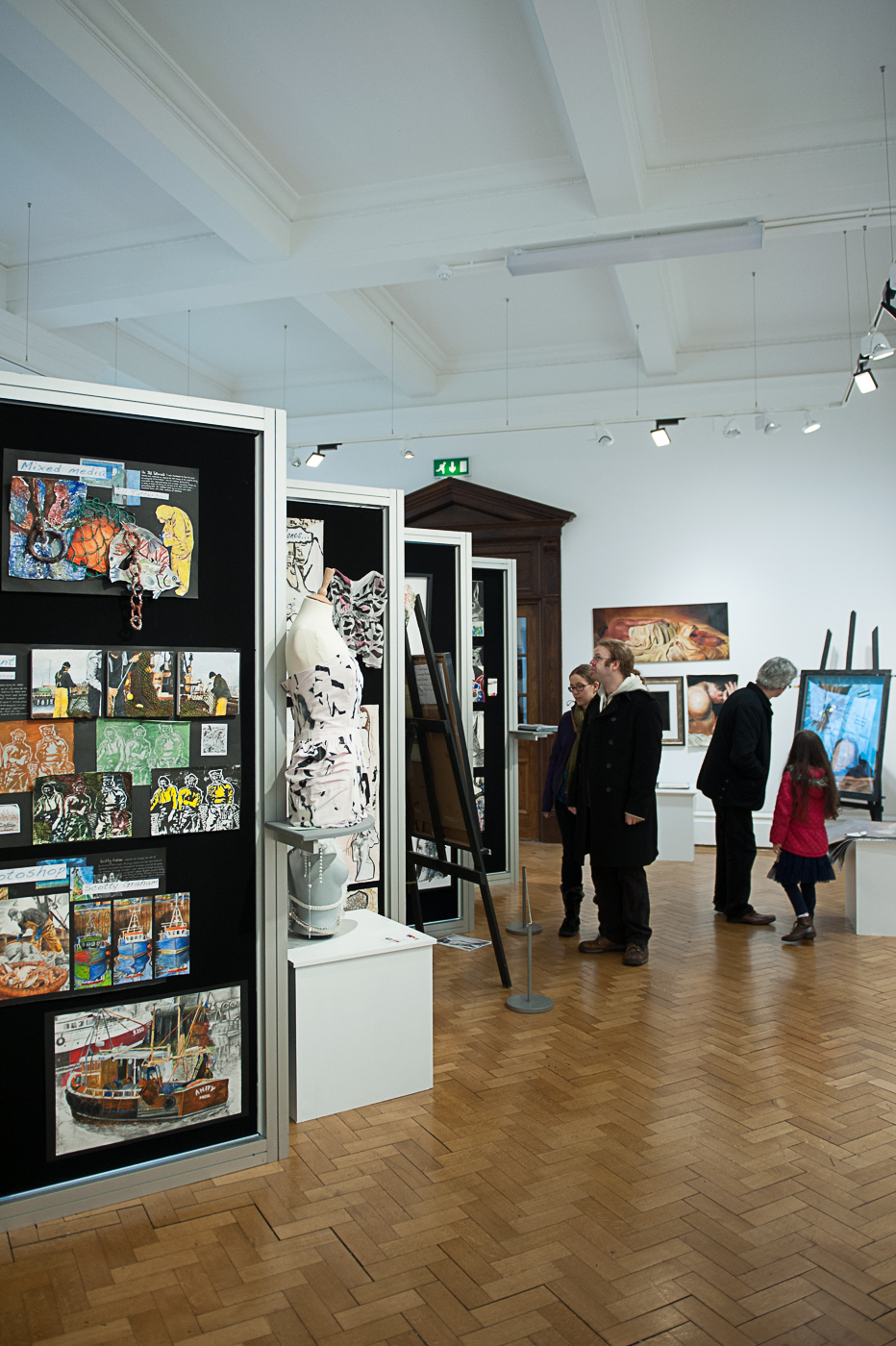
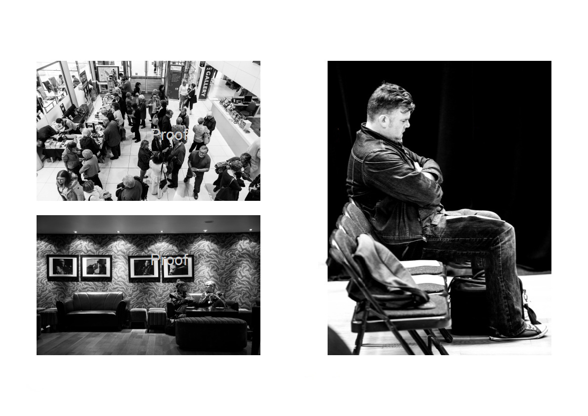
At this point in the exercise I was becoming a little tired and I was losing focus. this is evident in the photos of the gallery above. I was trying to shoot a vertical Image splitting the gallery vertically but it didn't quite come off.  In the horizontal composition the boards lead the viewers eye to the people viewing the art. and the large boards balance the smaller people on the right of the image.

small LanPor -3041small LanPor -3040

small LanPor -3039small LanPor -3038


small LanPor -3037small LanPor -3036

I started to focus on vertical composition again and out of the six images above, the vertical compositions are much stronger than their horizontal counterparts.

small LanPor -3033 small LanPor -3032

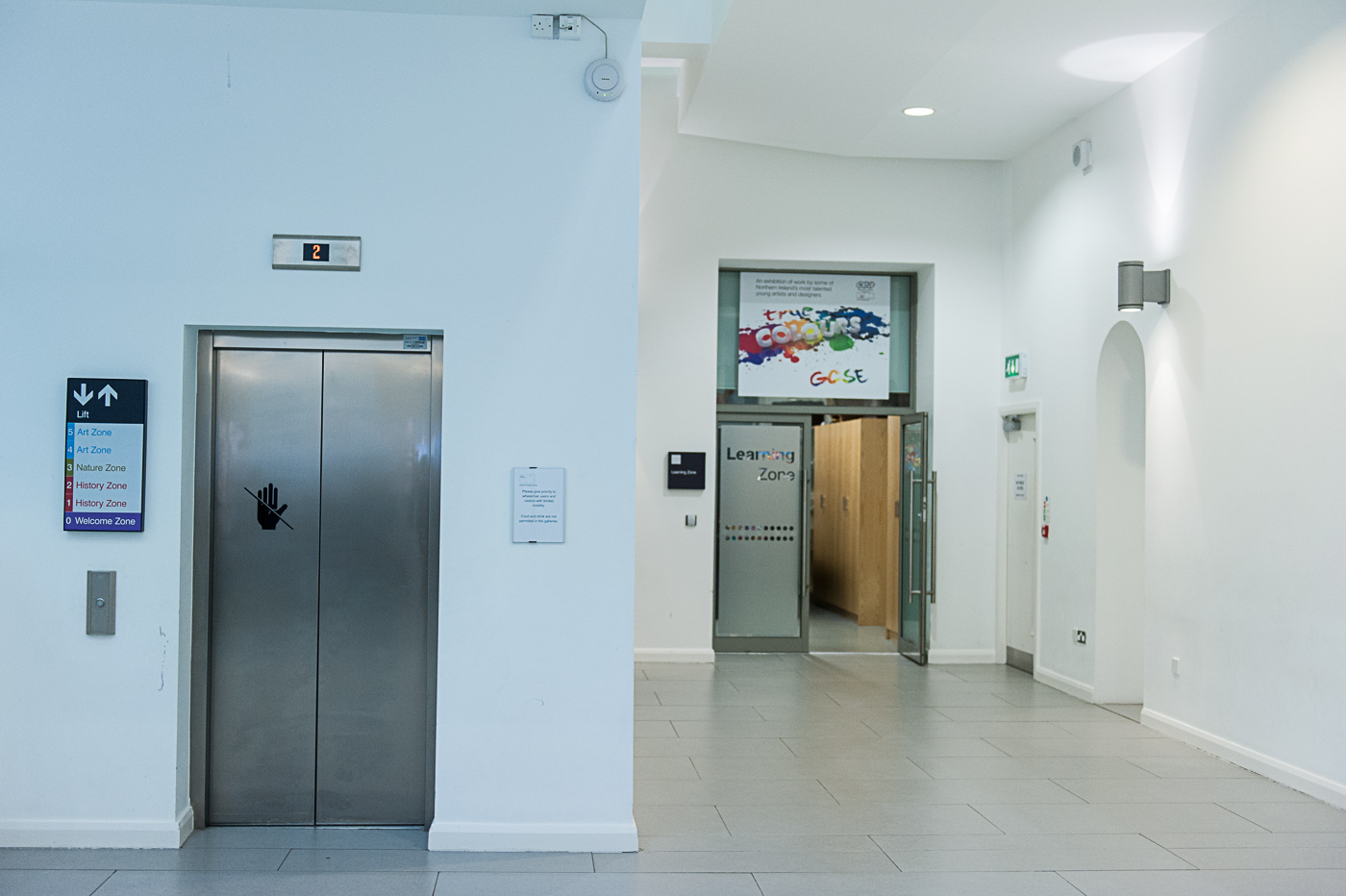
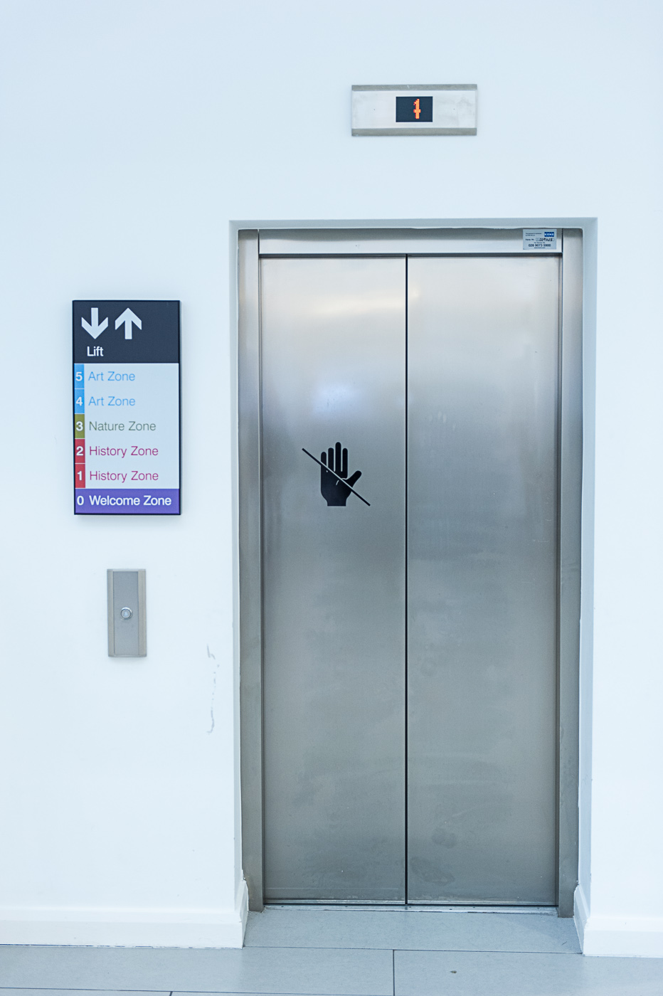
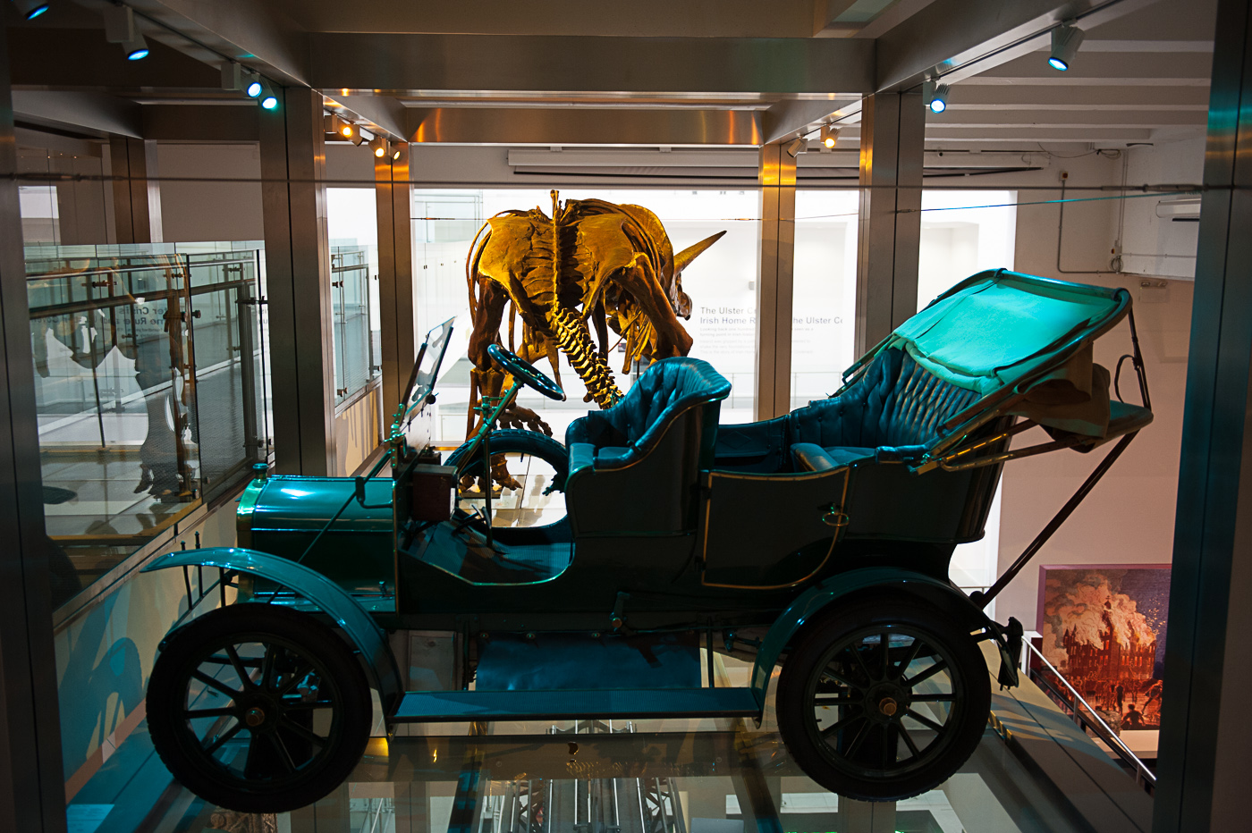
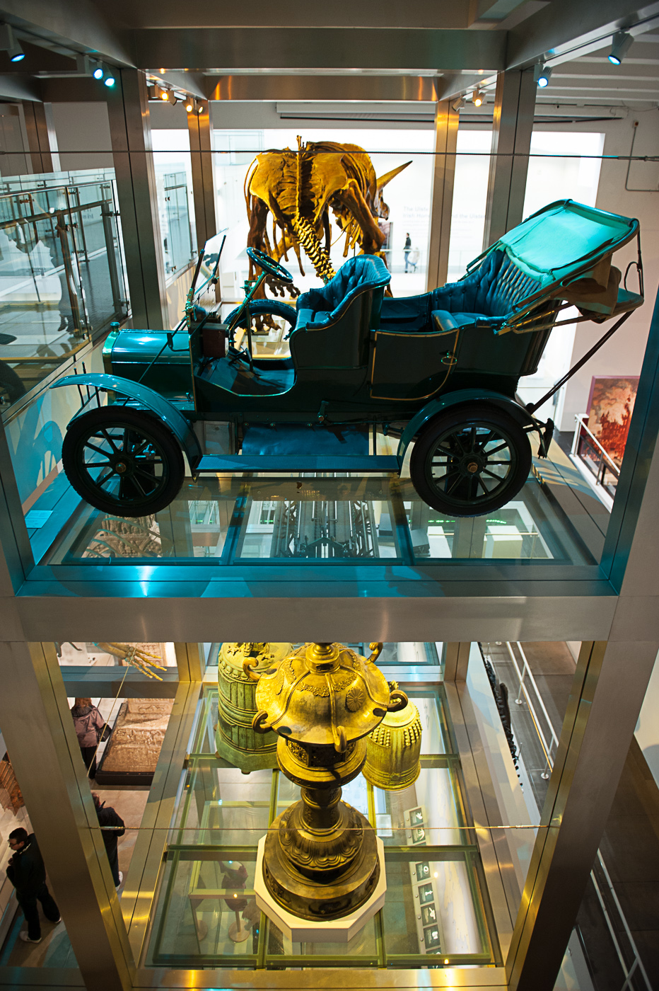
The vertical elevator photograph photo is a nice arrangement of four rectangles. This arrangement is lost in the chaos of the wider angle horizontal image.

small LanPor -3035 small LanPor -3034small LanPor -3031 small LanPor -3030small LanPor -3029small LanPor -3028 

In the last three sets of images the there is no clear winner between the vertical or horizontal images in my opinion.

Reflection

I thoroughly enjoyed this exercise. I was surprised how challenging it was to compose the horizontal Images having firstly chosen subjects which lend themselves to vertical composition.

The exercise got me thinking not only about the orientation of the frame, but also the frame itself.

The frame allows the photographer to decide what the viewer can see in the photograph.  "a photograph has edges, the world does not, the edges separate what is in the picture from what is not"  Shore (2007 : 54). This may seem like a very obvious statement but if we consider that in the two different orientations of framing in some of the photographs above, inclusion of additional content made the photos feel different even though they may have been taken in exactly the same spot.

For example the shot of the large skull in vertical format is without context, and because it doesn't include any superfluous detail and the viewer can concentrate solely on the subject. This was my intention on creating this image. When I was forced to compose in landscape orientation I chose to widen out the photograph to still include the full skull, but in doing this much more detail of the skull's surroundings make their way into the photograph. This serves to lessen the impact of the skull on the viewer and gives context to it as an exhibit in a museum setting.

For me this shows that there are an infinite number of photographs available to the photographer in any setting and framing is a major part of creating the best possible image.

Shore (2007:56) suggests that it is the fine framing decisions made by the photographer which resonate off the objects, people and events unfolding in front of them to create both visual and contextual relationships within the photograph.

Cropping

Cropping is cutting away, or removing, unwanted outer parts of an image. The process can be used to improve the composition of an image, remove distracting elements, change aspect ratio, et cetera. The aim of the exercise was to select and print three images, then crop them using editing software and print the images again. Then show the crops with a brief note describing why we chose this crop.

Please note that in the images below, the first image will be the original, and any subsequent images will be crops

In the original image below the portrait composition was completely wrong for the image. The motion of the strong man in is horizontal from right to left and I have no idea why I captured the image this way.

small Cropping-3010


In the crop below we get more of this sense of the event as the action is in line with the landscape composition of the picture. The competitors efforts to pull the truck seem to have more of a sense of motion when cropped in this fashion.

small Cropping-3011

In this image there is too much empty space above the model’s head, and at the bottom of the photograph the sweatshirt is baggy and quite unsightly.


small Cropping-3014

In the crop the aspect ratio has been changed fron 8x12 to 8x10, and in doing so it has given the picture slightly more balance whilst eradicating the bottom half of the problem sweatshirt. The model takes up more of the image giving her more presence.

small Cropping-3015

In the original image below I this was too far away from the chimp in the middle of the photograph to compose exactly how I wanted to. I therefore shot at the maximum zoom available to me and decided to crop the image in post processing. As it turns out I was glad I had the wider image to play around with the crop

small Cropping-3016

This first crop is how I would have composed the full rule if I would have been able to zoom tightly enough. I do believe that this crop is definitely better th this an the original image but the balance of the photograph is in quite right. The larger chimp to the right-hand side’s throws the photograph somewhat offkilter.

small Cropping-3017

I decided to play a little more with the cropping tool in lightroom and came up with the composition below. The chimp is now clearly the subject of the photograph and has more impact as a solitary form being frame by his enclosure. Although he is off centre he is nicely balanced by the buyers of the enclosure to the left-hand side. This is a much more pleasing crop (and image) than the first two pictures. The point to take away from this example is that it is worth playing around with different crops of an image to get the best result possible.

small Cropping-3018

The image below is a bit of a disaster. It is badly composed with a tilting horizon and a very boring foreground.

small Cropping-3012

With the editing software available today not only can we crop parts of the image away, but we can also adjust the alignment of the photo to straighten out sliding horizon’s as can be seen in the crop below. Although it is still not a brilliant image, there is much less tension in viewing the photograph and by removing the bottom half of the image we have given it a panoramic feel.

small Cropping-3013


In the next photograph I was lying on the ground waiting for the cyclist to go by and pop a wheelie. This was all happening relatively quickly, so it is hardly surprising that the composition was a little off.

small Cropping-3008

By cropping the photograph to fill the frame with the cyclist the photograph achieves more of a sense of movement and dynamism. The cyclist is almost on top of the viewer giving a more immersive quality to the shot.

small Cropping-3009


Anyone who has tried the photograph dogs knows that the vast majority of them do not like to set up a photograph taken especially when they are young pups like the dog on the left. This was another example of quickly trying to get the shot and deciding to tidy up the composition in post processing.

small Cropping-3022

In the crop below we have centred the dogs in the image and cut away a little bit more of the outer image to lie the subjects to take up frame.

small Cropping-3023

Cropping doesn’t always have to be rectangular or even regular in form. For example the artist Robert Heinecken used crops of pictures to produce puzzle images or colleges in his work.


Balance

What is Balance? Freeman (2007 : 40) states “At the heart of composition lies the concept of balance. Balance is the resolution of tension, opposing forces that are matched to provide equilibrium and a sense of harmony. It is a fundamental principle of visual perception that the eye seeks to balance one force with another.” This exercise in the balance of photographs is where I have struggled most on the course so far. Things like exposure, camera controls, shutter speeds, et cetera have rules which can be learned and applied. As can some of the simple composition concepts such as filling the frame or rule of thirds. I have found that this concept of balance is almost ethereal in nature, but this may be because I am very inexperienced in assessing the balance of the photograph.

The aim of this exercise is to choose six of my own photographs and decide how the balance works in each one.

The photograph below I consider to be balanced

small street-2122

We can see below that the photo is roughly symmetrical along the centre line and the two men balance each other out being at either end of the bench. This is an example of symmetrical balance.

small street-2122 m

The next photograph could not be considered balanced. The figure on the right is not balanced by by anything on the left-hand side of the photograph and this adds an element of tension (incidentally this was the effect I was wanting to produce in the photograph it is exacerbated by my uncomfortable or unnatural way of sitting on the bench)

small self-2160 small self-2160m

Below is another example of a symmetrically balanced image. It could be argued in fact that this image has bilateral symmetry as the lying the bottom of the Windows bisects the photograph is horizontally whilst the centre of the of the door bisects the photograph vertically.

small Jail-1021

Now we move to the subject of dynamic balance. To explain dynamic balance we again turn to Freeman (2007 : 40) who explains “The second kind of visual balance opposes weights and forces that are unequal, and in doing so enlivens the image. On the weighing scale, a large object can be balanced by a small one, as long as the latter is placed far enough away from the fulcrum. Similarly, a small graphic element can successfully oppose a dominant one, as long as it is placed toward the edge of the frame. Mutual opposition is the mechanism by which most balance is achieved.”

This is illustrated in the next image, the couple on the right-hand side of the image balanced out by the bird which, although it is not the same size as the couple on the grass it is further away from the fulcrum and this has a tendency to balance the photograph.

small street-2124

We can test this theory by using photo shop to remove the bird (see below) the photograph appears less harmonious as there is nothing of interest in the left-hand side to balance the couple on the right

small street-2124no bird

the next photograph is another example where the large edifice of the University building is balanced by placing a small graduate beside it.small Andrew-1120

Whereas in the example of the jail wall below there is nothing on the right-hand side of the photograph to balance its monumental we at and it feels as if the wall is about to come crashing down onto the right-hand side of the photograph.

small Jail-1018

In our next example of dynamic balance the graduate on the right-hand side is balanced out by the darker heavier column at the left edge of the photograph

small Andrew-1113


It is worth noting that balance isn’t always desired and the tension created by breaking the equilibrium of the photograph can accentuate the impact of the subject of the photograph. An example of this can be seen in the image below were the young lady seems to stand out more against a black background because of the eccentric composition.

small DSC_8548

In the image of the two girls below, because the second girl is in shadow she is not as graphically important as the girl on the right and this creates an imbalance

small model2007b

by removing her from the photograph the viewers eye is no longer in conflict trying to pick out more detail and although the photograph is still not balanced the level of visual tension is greatly reduced.


small model2007mo


Placing your subjects in relation to each other and to the frame of the photograph is not the only way to achieve balance. Balance can be achieved between areas of different tone, collar or texture in a photograph or even between the subject and the background.


Reflection


As I tackle the compositional exercises of the course I’m really starting to learn new skills and concepts that I feel will improve my photography. All of the photographs above were taken without any conscious effort being given to balance, so if any of these shots are balanced it is purely accidental (or due to an unconscious understanding of harmony within the frame when taking the photograph). I am looking forward to shooting with my new found (if somewhat raw) understanding of balance.


References


Freeman, M 2007, The Photographer's Eye, Lewes: ILEX


Positioning the horizon.

  The aim of this exercise was to find a viewpoint that had a reasonably interesting landscape in which there was an unbroken and clear horizon (this is a difficult thing to do in Belfast.). I figured my best option was heading down to the docks and using the dark as an artificial horizon.


I took two sequences of photographs placing the horizon at different positions within the photograph. The first sequence is shown below.

small Positioning the Horizon-3010


Photograph one – this is my preferred image of the three I like the tones in the water in the foreground. This large area of water gives a feeling of distance to the horizon.

small Positioning the Horizon-3008


Photograph two – here the horizon bisects the photograph centrally but doesn’t have the drama of the water in the foreground, drawing the eye up to the horizon. Also there is the difficulty of the  very bland blue sky in the top third of the photograph.

small Positioning the Horizon-3009

Photograph three – this is the weakest image in the sequence we know have over half a photograph taken up by a sky full of nothing. Anything of interest is crammed into the bottom third making for a crowded and unbalanced image.

I decided to try a different cityscape to see if the results would be the same. That sequence of photographs can be seen below


small Positioning the Horizon-3013

Photograph four – in this photograph the foreground water doesn’t seem to be drawing us into the detail of the cityscape in the same way it did in photograph one. The buildings and Clyde seem one-stop the top of the photograph and the dark side showing in the bottom left-hand corner is unpleasant distraction to the rest of the photograph.

small Positioning the Horizon-3011


Photograph five – back to central composition with the horizon bisecting the image. It’s a pretty dull photograph of some water, some clouds and some buildings. There seems to be too much water it and therefore doesn’t feel balanced

small Positioning the Horizon-3012

photograph six – although it is by no means perfect this is the best of the three images. It seems more natural to the eye than photographs four and five on the curb Clyde line makes it a little bit more interesting. The occurrence of the small wispy cloud in the otherwise empty sky makes this composition work were image three did not.


Reflection

I have been taking photographs since I was a kid and it would never have occurred to me to place the horizon anywhere other than in the middle of the photograph, yet in the two sequences above that type of central composition didn’t work. It is really surprised me that something that simple can affect the look of a photograph that drastically.

This exercise has shown me that there is no set recipe for a photograph, what works in one situation may be dreadful in another, and composition is not a set of rules to be followed but a learned understanding of how to create photographs to either please or challenge the viewer.

A few years ago, in a bid to teach myself composition, I bought “The Photographers Eye” by Michael Freeman. I had a brief flick through the book and give the idea up as a bad job. I am now discovering that using Michael Freeman's book as a text to accompany the exercises on the course is teaching me the elements of designing photograph and also teaching me how to see in a different way.


Focal Lengths and different view points

The aim of this exercise was to take two photographs using a wide-angle and a telephoto lens. The photographs would be of the same subject with the same composition (i.e. filling the frame) taken at different focal lengths. To do this we were to take the first photograph with a telephoto lens, then fit the wide angle lens and move forward until the subject filled the frame once again, and take the second shot. SONY DSC

Small Focal Lengths and differnt View Points-3012

Photograph one was shot with a telephoto lens on a crop sensor camera at a focal length of 60 mm which roughly correlates to a full frame sensor at 120 mm. The second photograph was taken with a full frame camera at 24 mm focal length so essentially 100 mm difference in focal length.

The subject of the photograph is the Titanic visitor centre in Belfast and I chose this building because it has a little bit of depth which is more prominent in the first picture as we can see the walls protruding out from the central core of the building. As I moved forward to fill the frame using the wide angle lens perspective adjusts and we can no longer see the second part jutting out behind the building at the right.

So, how do the two photographs varying character. In the second photograph the building seems larger (it seems to loom over the viewer) and the corners extend out towards the edges of the frame more prominently than in the first photograph. In the first photograph the building seems smaller, squatter, and further away. This effect is known as perspective distortion. Another indicator of this perspective distortion is the lamppost and traffic lights in the second photograph being much larger and prominent than in the first photograph even though the building is virtually the same size in both shots.

This distortion would have become much more prominent if I had been equipped with a wider angle lens and moved even closer to the building. This further distortion at wider angle is illustrated in the photo below which we shot using a 14 mm wide angle lens on a full frame camera. The model seems to elongate into the centre of the photograph and her leg appears to be stretching and enlarging towards the corner of the image.

small anna-3008

Probably the most well-known example of this effect is the dolly zoom (sometimes known as the Hitchcock zoom) and was used to great effect in Alfred Hitchcock’s movie vertigo and also the very famous scene in Jaws were Roy Schneider realises there’s a shark swimming with the tourists on the very crowded beach. The dolly shot is achieved by moving the camera towards the subject whilst zooming out. We perceive the subject to be moving closer to us (in the case of the Jaws movie Roy Schneider) whilst background seems to move further away.

Reflection

I couldn’t know what to expect from the final images for starting this exercise. If I had understood perspective distortion prior to taking shots I would have approached the building from a different angle to better illustrate the effect.

On a positive note I am starting to get to grips with the self learning nature of the course. Using this exercise an example I have gone from knowing nothing about perspective distortion to being able to review my images understand how I would go about increasing the effect of the distortion.

A sequence of composition (attempt 1)

I have labelled this blog post exercise attempt 1 because having re-read the exercise brief I don’t think I have been particularly successful in creating a sequence of composition. The idea was to record the way I approached and shot a subject from the moment when I caught sight of a possible photograph to the final best photograph make of it. I had arranged with Merville ju-jitsu club to allow me to shoot one of their training sessions. I figured this would be a excellent opportunity to shoot sequence photographs with different compositions. I soon came to realise that the action of jujitsu training was far too fast to capture the type of sequence necessary for the exercise. Although I could shoot a sequence of events of a throw or sparring bout, it happened so quickly that I could not very the composition.

I decided to use the time to work on different compositions during the class. The results of this can be seen below

jujitsu-2030 jujitsu-2027 jujitsu-2025 jujitsu-2024 jujitsu-2022 jujitsu-2019 jujitsu-2016 jujitsu-2014 jujitsu-2013 jujitsu-2012 jujitsu-2011 jujitsu-2008 jujitsu-2007 jujitsu-2004 jujitsu-2055 jujitsu-2054 jujitsu-2050 jujitsu-2045 jujitsu-2044 jujitsu-2043 jujitsu-2040 jujitsu-2037 jujitsu-2035

If I was going to pick 4 images out of this that stand out as having any interesting composition at all I would chose the following:-


jujitsu-2027jujitsu-2007 jujitsu-2044 jujitsu-2012

This exercise was harder than I first anticipated. I will revisit this exercise. My strategy will be to take a walk through Belfast and stumble upon some action to photograph a sequence of compositions.

Fitting the Frame to the Subject

I received some advice from my tutor suggesting that I should be more creative in my approach to the technical exercises. So with that in mind I headed into Belfast to find a more interesting subject for this exercise. I settled on the “Belfast big fish” as it met the requirements of the exercise (i.e. something clear in appearance and compact in shape and also accessible from close to and from a distance) whilst being aesthetically pleasing.

The first photograph below is unsurprisingly a shot of the fish, but with very little attention paid to composition or were the subject should be in the frame, essentially it’s a snapshot.Fish-1000

In the third photograph I have moved very close to the subject so that none of the edges are showing this has the effect, in this case, of masking the fact that the subject is a fish but shows the detail of the ceramic pieces that make up the scales of the fish.

In the second photograph I have filled the frame with the fish. I have tilted the camera to get as much of the fish in the frame as possible.Fish-1001

In the third photograph I have moved very close to the subject so that none of the edges are showing this has the effect, in this case, of masking the fact that the subject is a fish but shows the detail of the ceramic pieces that make up the scales of the fish.Fish-1002

The fourth photograph shows the fish in relation to its surroundings. We can see that the fish is on a plan situated near the River Lagan beside the Lagan look out and overshadowed by all large brand-new commercial building.Fish-2000

The final part of the exercise was to digitally crop the fourth image to produce new images of varying composition based on what the subject was in the frame, you can see the results below.

Fish-2004 Fish-2001 Fish-2003 Fish-2002

Reflection

What have I learned from this exercise? The most obvious thing is that composition matters. If we look at the first image although it is sharp, probably exposed, and shows the subject, it is not a good photograph. In these days of “scatter-gun digital photography” we take 1000 photographs to hopefully (and in many cases accidentally) get a good photograph and so a lot of people pay is little attention to composing the image beforehand.

Secondly I have learned that depending on the composition there are many many different photographs of any given subject. I recently attended a gallery showing the work of the Northern Irish painter William Scott. Scott’s choice of subject for his still life paintings were very limited but he managed through composition and other techniques to produce very varied work.

I have learned that context can affect a photograph. Images two and three give no real clue to were the photograph was taken and in the case of photograph three doesn’t even point to the fact that the photograph is of the large ceramic fish. My favourite photograph is the fourth image which shows the fish in context of its surroundings close to 3 Belfast landmarks.

The one major takeaway from this exercise is that it is well worth spending time planning the composition of the photograph and using the viewfinder frame to properly compose the image rather than run around taking 1000 shots and hoping that one of them will be a well composed photograph.

The final thing I learned is tourists don’t care if you’re taking photographs for your degreeFish-1005


Reflection on introduction

Jacob Cycle-1001 This is an entirely new way to study for me. I have been used to brick and mortar educational establishments, and scheduled classes. I am finding it hard to ignore the distractions and settle down to studying in the evenings.

It took me a little while to get started the introductory phase of the course. There was reticence to do these exercises because having completed the GCSE and A-level in photography it felt like repetition. But I was glad that I took the time to do it, because it forced me to re-familiarise myself with concepts such as f-stop, depth of field, motion blur, aperture, ISO etc that I take for granted when using the camera.

if I was to assess my own progress so far I would say technically competent but not artistic. I am looking forward to part 1 on composition and hope to provide more aesthetically pleasing pictures while meeting the course requirements. I find this critical self-appraisal and reflection very difficult but I understand the necessity of not only doing, but reflecting upon what has been done, and learning from it.

I have started the blog which I am really enjoying. I like the structured approach to documenting my progress through the course work and I look forward to posting about the books I am reading for the course as well as other points of research, stuff about photographer, and events I will attend. I can really see high people become addicted to blogging. I am also keeping a log book were I can jot down my thoughts on notes on the exercises and assignments, but I’m not sure I would want anyone to see it.

I feel pleased that I have come through the introduction and actually have some coherent work to show for it. But there is still a nagging doubt that I’m going about things the wrong way, or I could be doing things better. I guess this is in part down to a lack of feedback but also my lack of experience in this model of education. In my previous experiences of education the lecturer or tutor is a constant presence and feedback is timely and sometimes presented whether you want it or not. In this type of self-study I haven’t yet become comfortable with the level of contact that is acceptable to have with the tutor.

What improvements am I going to make moving forward?

  • I am going to include a paragraph asking “what could I have done better?” In each exercise
  • I am going to have a little bit more contact with the tutor (this is really rather pleasant)
  • I am this is going to throw in some supplemental blogs i.e. book reviews, et cetera
  • increased velocity on the course work

Panning with different shutter speeds

The aim of this exercise was to use a panning technique whilst reducing the shutter speed for each incremental photograph and thus showing the effect of motion blur on the background. I remember trying this when I got my first digital SLR, and being extremely disappointed with the results. Coincidentally I was using exactly the same subject for that first attempt as I used for this exercise. As with the previous exercise or movement I took around 15 photographs but I will only use four to illustrate the point.

70mm---ISO 200---f/3.2 ---1/2000

I found the tripod method very difficult as the legs of the tripod were starting to collapse so I removed the camera and carried out the exercise handheld. As you can see from the photograph above the spokes are frozen, the cyclist is frozen, and there is no motion blur in the background. There is some level of blur in the background but this is due to the depth of field rather than the motion of the camera as it follows the cyclist. For this to be motion blur we would expect to see a streaked appearance as you will see in the later photographs. Motion is frozen due to very high shutter speed 1/2000 of a second.

70mm---ISO 200---f/13 ---1/100

It isn't until we get down to a shutter speed of 1/100 sec that we start to notice motion blur and the background, it is also interesting to note that at this speed we are also getting motion blur in the subject similar to the previous exercise (this can be seen on the spokes of the wheels).

70mm---ISO 200---f/22 ---1/40

In the third photograph another element of blur is added, that of “camera shake”. This is evident due to the fact that although the cyclist’s head isn’t moving with any great speed and should be captured as sharp due as a pan, it is clearly out of focus because hand movement becomes a factor at shutter speeds of less than 1/60 of a second.

70mm---ISO 200---f/22 ---1/20

In this fourth photograph we can clearly see a very pronounced effect of motion blur on the background. You will also note that the photograph is overexposed and this is because the camera has adjusted the f-stop to the f/22 but because the shutter speed is so low more light is heading the sensor and overexposing the image. We can also see the blurring of the spokes and the reflectors attached to the spokes and the winds themselves but there are is no streaking or deformation to the shape of the wheel because the camera is panning with the subject.

So which of the photos in the series that I prefer. The answer is they are all dreadful. As I was chimping at the back of the camera I realised they were all awful and decided that I wanted something better to finish this blog post on. So we moved closer to the buildings I asked the subject to increase his speed. The result is the photograph below which is probably exposed. The subject’s head is relatively sharp because the panning is reasonably accurate. The subject's legs and wheels are blurred due to the fast motion. The leather is tie on the hat flowing out behind the subject also adds to the sensation of speed in the photograph.

70mm---ISO 200---f/8 ---1/60