What is Balance? Freeman (2007 : 40) states “At the heart of composition lies the concept of balance. Balance is the resolution of tension, opposing forces that are matched to provide equilibrium and a sense of harmony. It is a fundamental principle of visual perception that the eye seeks to balance one force with another.” This exercise in the balance of photographs is where I have struggled most on the course so far. Things like exposure, camera controls, shutter speeds, et cetera have rules which can be learned and applied. As can some of the simple composition concepts such as filling the frame or rule of thirds. I have found that this concept of balance is almost ethereal in nature, but this may be because I am very inexperienced in assessing the balance of the photograph.
The aim of this exercise is to choose six of my own photographs and decide how the balance works in each one.
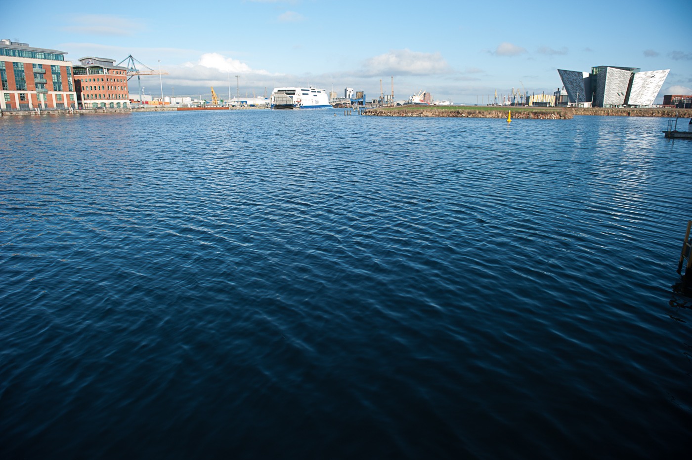
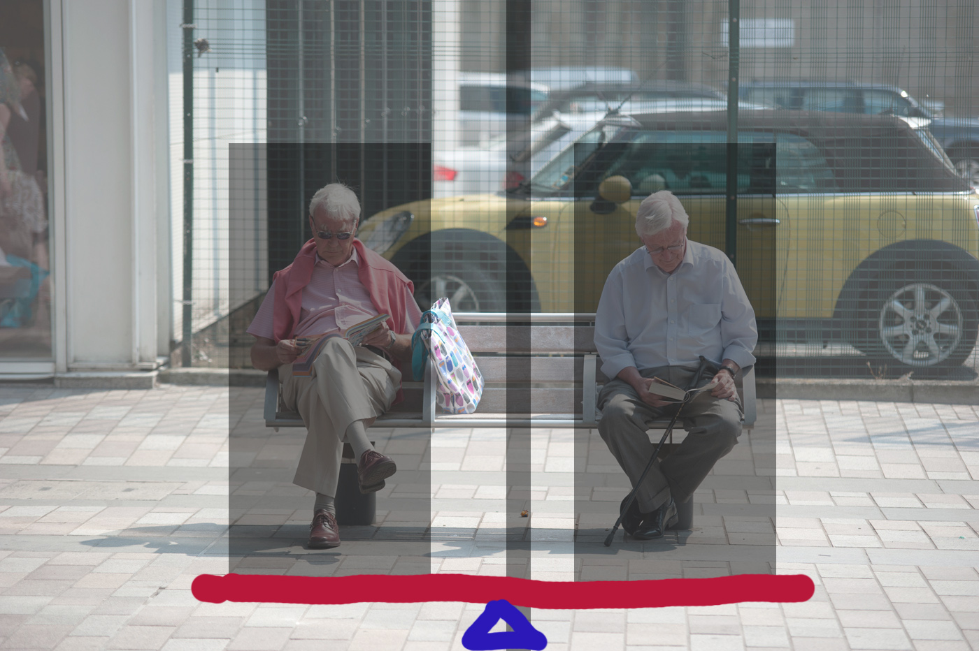
The photograph below I consider to be balanced

We can see below that the photo is roughly symmetrical along the centre line and the two men balance each other out being at either end of the bench. This is an example of symmetrical balance.
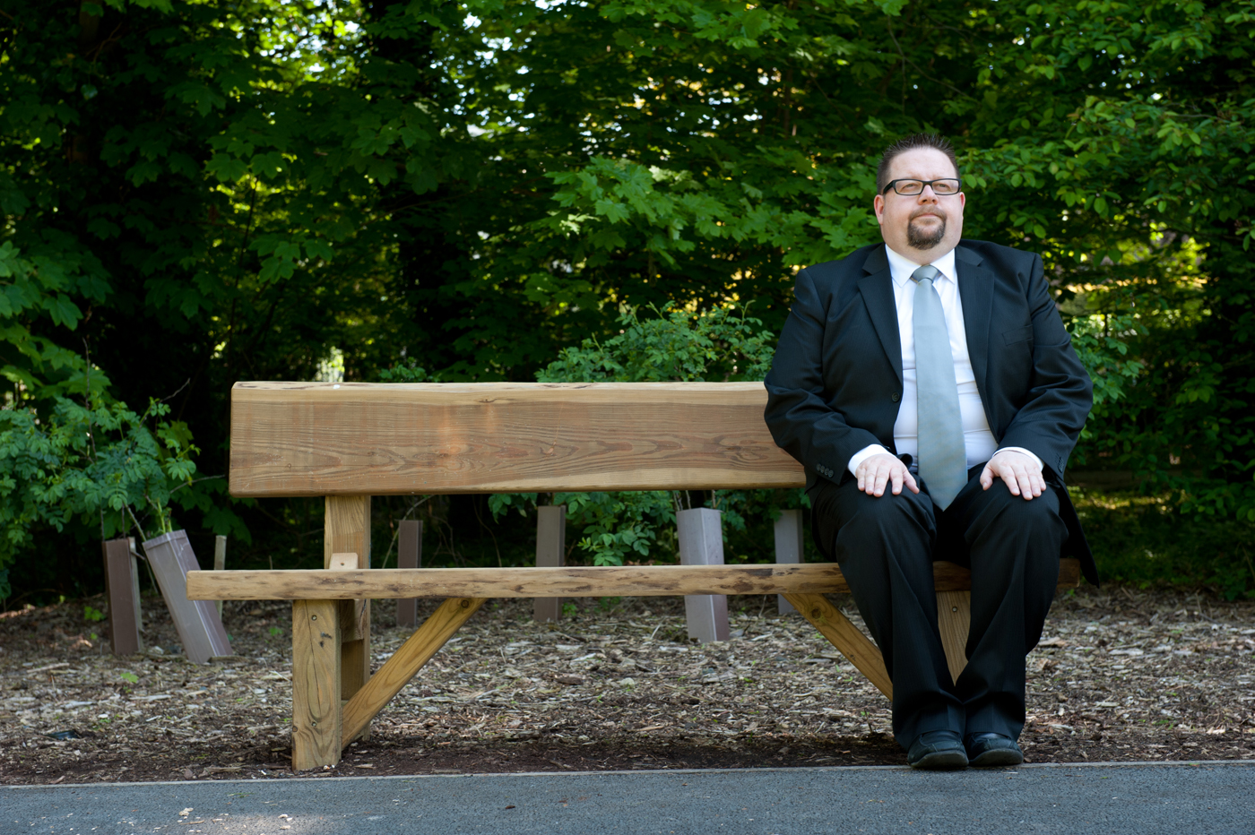
The next photograph could not be considered balanced. The figure on the right is not balanced by by anything on the left-hand side of the photograph and this adds an element of tension (incidentally this was the effect I was wanting to produce in the photograph it is exacerbated by my uncomfortable or unnatural way of sitting on the bench)

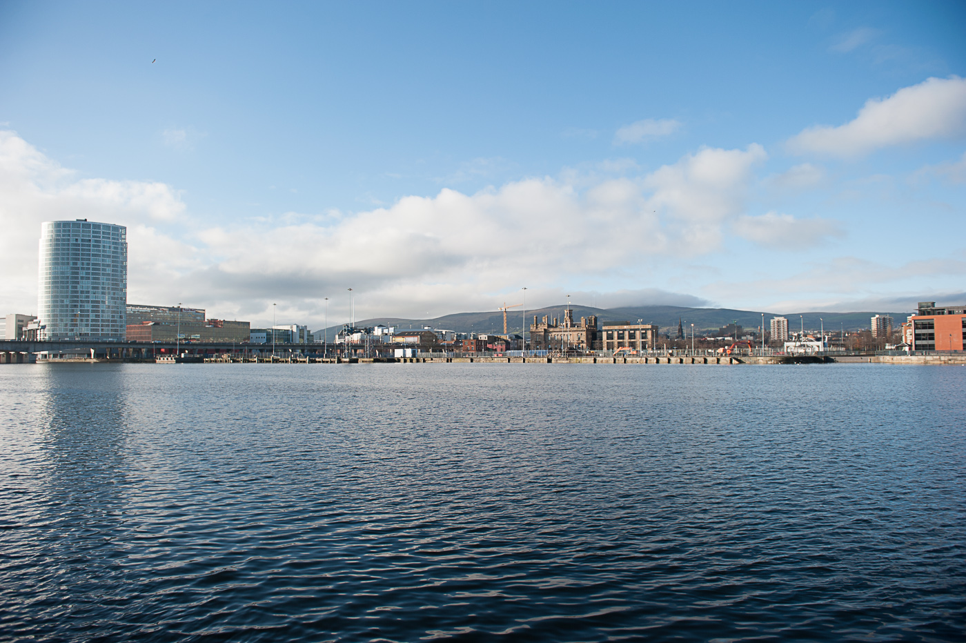
Below is another example of a symmetrically balanced image. It could be argued in fact that this image has bilateral symmetry as the lying the bottom of the Windows bisects the photograph is horizontally whilst the centre of the of the door bisects the photograph vertically.

Now we move to the subject of dynamic balance. To explain dynamic balance we again turn to Freeman (2007 : 40) who explains “The second kind of visual balance opposes weights and forces that are unequal, and in doing so enlivens the image. On the weighing scale, a large object can be balanced by a small one, as long as the latter is placed far enough away from the fulcrum. Similarly, a small graphic element can successfully oppose a dominant one, as long as it is placed toward the edge of the frame. Mutual opposition is the mechanism by which most balance is achieved.”
This is illustrated in the next image, the couple on the right-hand side of the image balanced out by the bird which, although it is not the same size as the couple on the grass it is further away from the fulcrum and this has a tendency to balance the photograph.
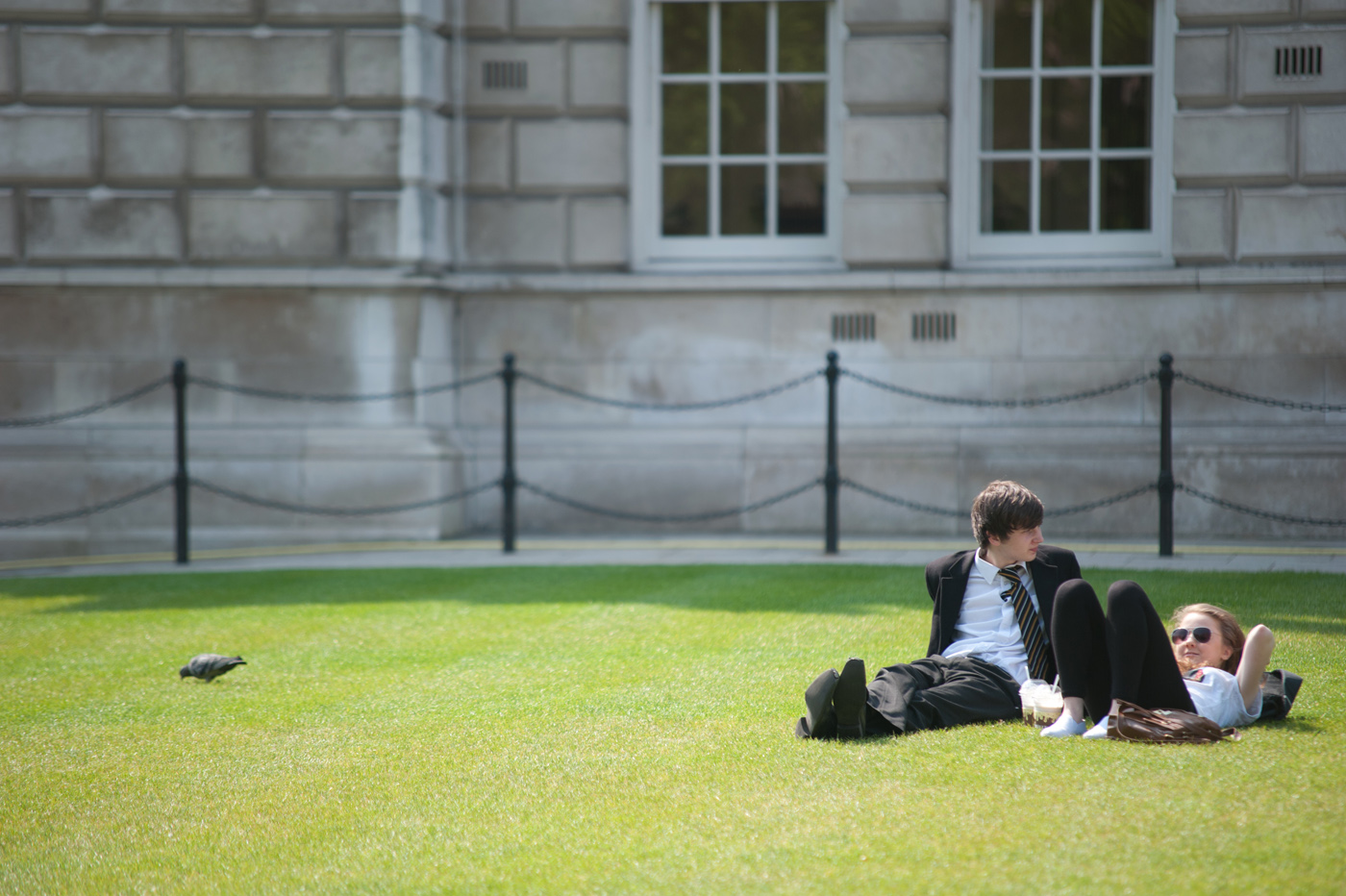
We can test this theory by using photo shop to remove the bird (see below) the photograph appears less harmonious as there is nothing of interest in the left-hand side to balance the couple on the right

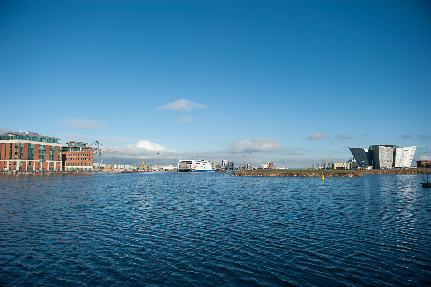
the next photograph is another example where the large edifice of the University building is balanced by placing a small graduate beside it.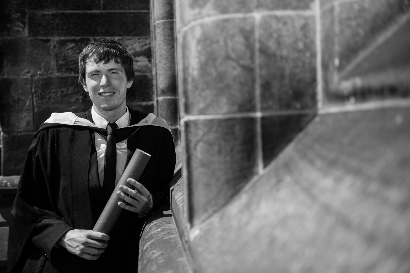
Whereas in the example of the jail wall below there is nothing on the right-hand side of the photograph to balance its monumental we at and it feels as if the wall is about to come crashing down onto the right-hand side of the photograph.

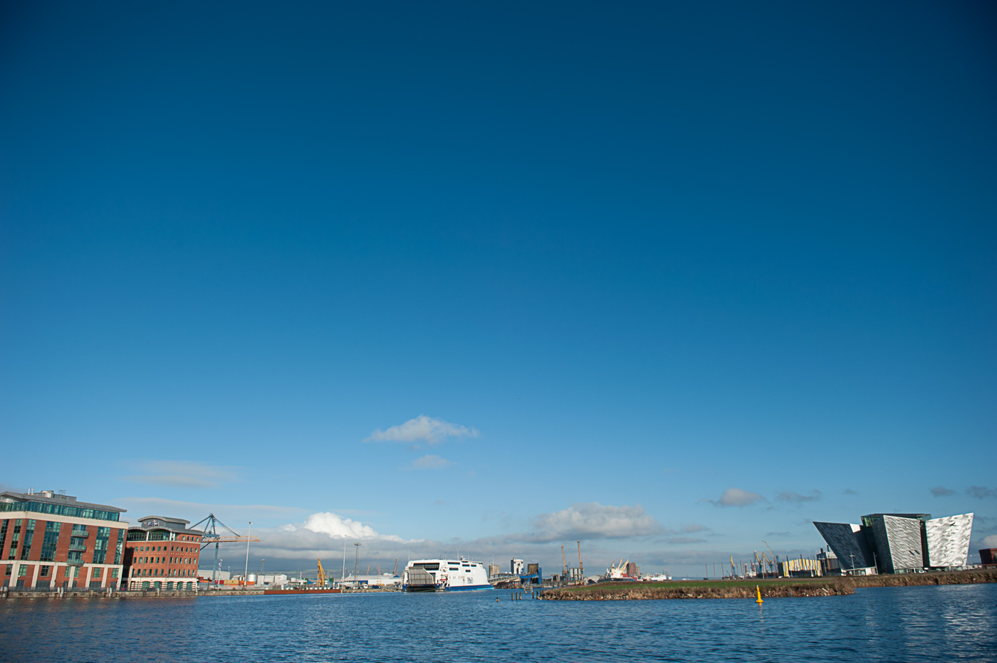
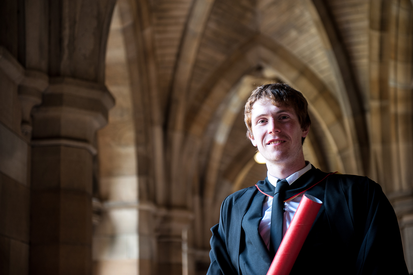
In our next example of dynamic balance the graduate on the right-hand side is balanced out by the darker heavier column at the left edge of the photograph
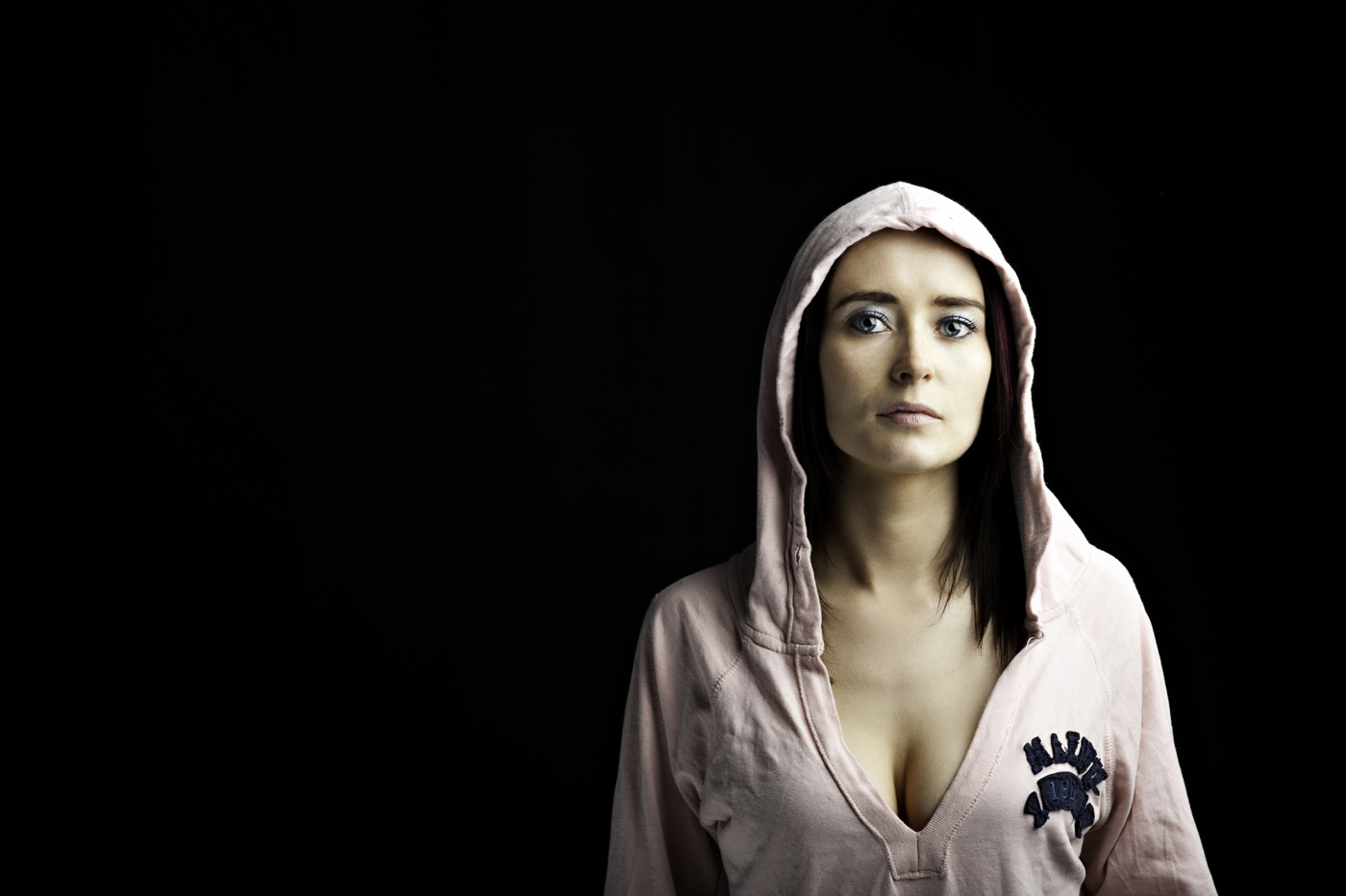
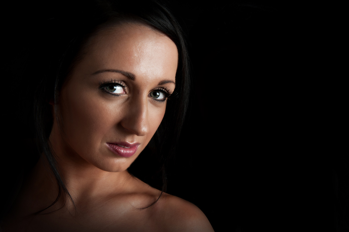
It is worth noting that balance isn’t always desired and the tension created by breaking the equilibrium of the photograph can accentuate the impact of the subject of the photograph. An example of this can be seen in the image below were the young lady seems to stand out more against a black background because of the eccentric composition.
In the image of the two girls below, because the second girl is in shadow she is not as graphically important as the girl on the right and this creates an imbalance

by removing her from the photograph the viewers eye is no longer in conflict trying to pick out more detail and although the photograph is still not balanced the level of visual tension is greatly reduced.
Placing your subjects in relation to each other and to the frame of the photograph is not the only way to achieve balance. Balance can be achieved between areas of different tone, collar or texture in a photograph or even between the subject and the background.
Reflection
As I tackle the compositional exercises of the course I’m really starting to learn new skills and concepts that I feel will improve my photography. All of the photographs above were taken without any conscious effort being given to balance, so if any of these shots are balanced it is purely accidental (or due to an unconscious understanding of harmony within the frame when taking the photograph). I am looking forward to shooting with my new found (if somewhat raw) understanding of balance.
References
Freeman, M 2007, The Photographer's Eye, Lewes: ILEX