OCA TaoP

OCA degree in photography module 1

Reflection on Tutor Feedback on Assignment 2

Having read through the tutor feedback on my second assignment there are a couple of areas that require reflection. The one comment that really stands out is

“Instead of a technical approach to ‘make the images more interesting’ spend some time thinking about what the images say, the message they impart, not just the technique they demonstrate. Exploring the ideas around the context is also a good way to begin thinking.”

Up until now, my view of photography (excuse the pun) has been all about the aesthetic. When I got my first decent camera my main aim was to take “good photographs” and back then my understanding was that a good photograph is one which is aesthetically pleasing. This understanding  informed the photographers in whose work I am interested i.e. David Bailey, Annie Leibowitz, Rankin, Helmut Newton, etc. These photographers produce beautiful photographs of beautiful people wearing (or almost wearing) beautiful clothes. These images are commercial work that they are commissioned to do by magazines or fashion houses.

In most cases, I think Newton might be the exception, these photographers also produce more meaningful work. David Bailey has carried out personal projects in Afghanistan, India, aboriginal Australia, and Papua New Guinea. He creates an almost anthropological record of the different tribes he encounters (the British army in Afghanistan could be considered a tribe). In Rankin’s recent project “alive” he explored the subject of mortality by producing a series portraits of terminally ill people. After the death of Annie Leibowitz’s partner Susan Sontag, she put together a show and a book entitled "Pilgrimage"  in which she photographed places that had personal meaning for her.

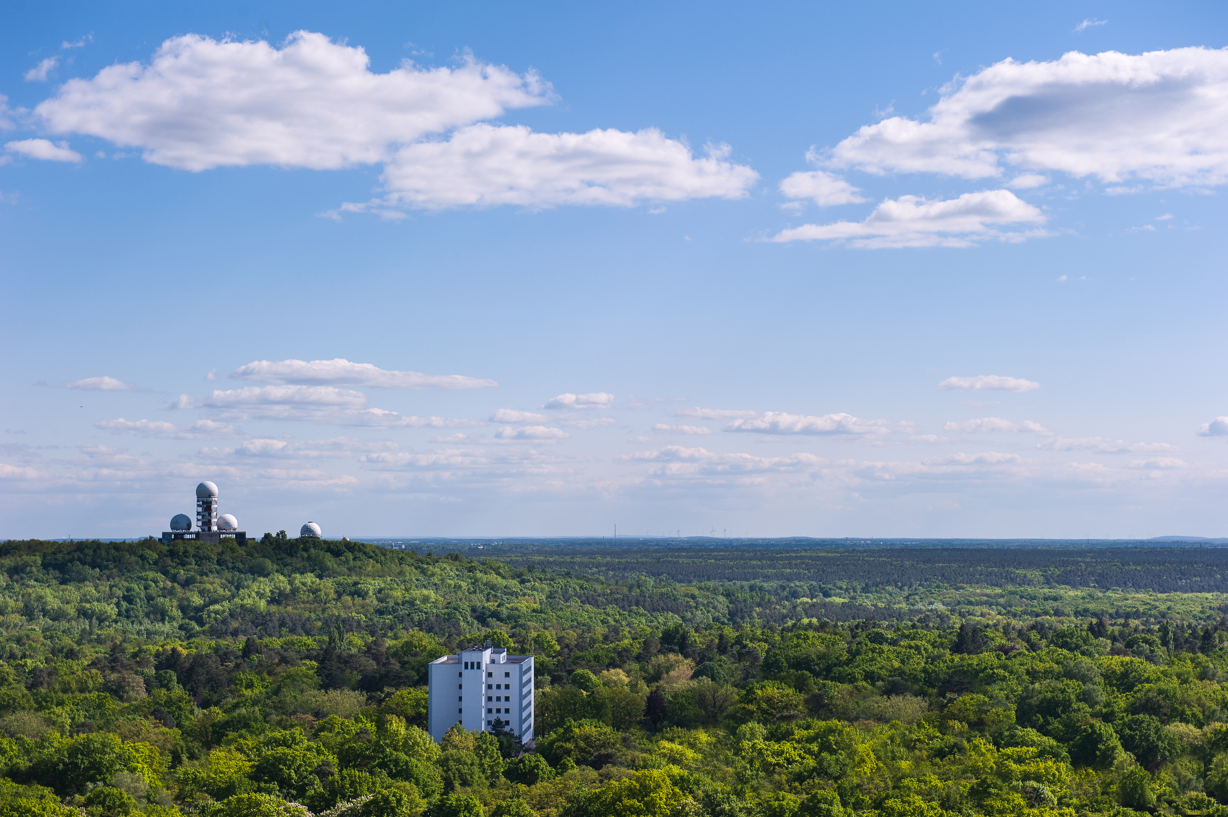
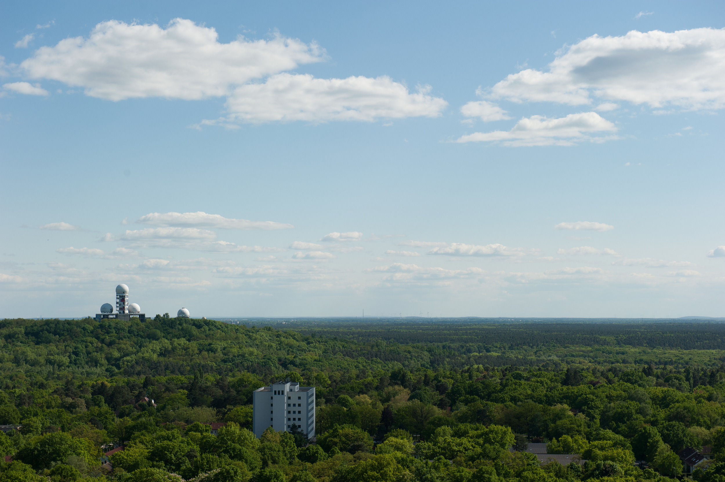
I attended the degree show at the Glasgow School of Art recently and one of the images that stood out for me was a shot of a small clearing in a wood by a graduate called Kevin Boyd. On initial examination the photograph is well a composed image of a green area which could be seen almost anywhere in the UK but on closer inspection, rusting cans of 528 contact adhesive can be seen in the grass. We are not just looking at a tranquil little clearing, this is an area used for glue sniffing, and this gives the photograph context and meaning. The photograph actually shocked me because I had no idea that people still sniffed glue. I had thought the practice had died out in the early 90s. Kevin also produce some still life photographs using the rusted cans.

The question for me as I progress through the course will be “how do I imbue my images with meaning?”.


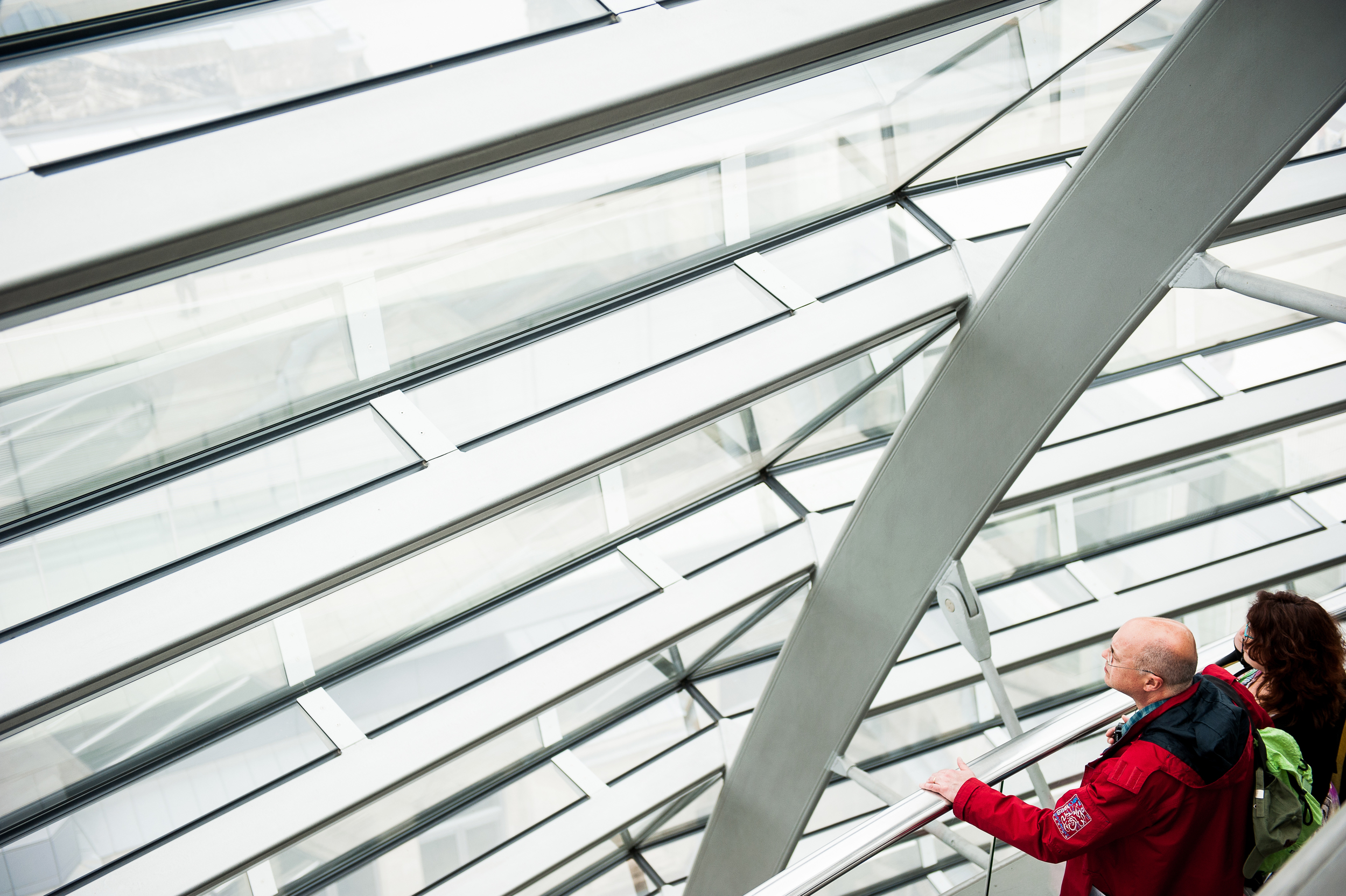
The tutor made the following comment “in reference to the photograph below “The online and print images are both over exposed and detail is lost. I also want to know why this is black and white, what is your intent by creating this?” and I believe this is linked to one of her initial comments “You need to discuss the editing decisions you make in more depth, this is to help me understand why you have made the choices you have as you obviously to have good reasons for these decisions.”

5 Curves


Below you can see the original image. There were a couple of factors that had an impact on my editing decisions to produce the final photograph above:-

  1. In the course material Freeman suggests working in black and white because “Lacking the overlay of colour, this now-specialised medium of photography has the great advantage of focusing the attention on precisely those parts of a picture that concern us here: the graphic elements.”
  2. In my involvement with camera club competitions I discovered that one of the many things that a photograph can be marked down for is “blown highlights” or “lack of detail in the shadows” and this rather arbitrary ruling just raised my hackles to the point where the curmudgeon in me likes to produce photographs incorporating both of these elements. Pushing the contrast so that the photographs are made up of only black-and-white rather than shades of grey
  3. As a kid I loved science fiction and comic books. When I was 8 years old a new comic called 2000 A.D. was introduced and it was like nothing else I had seen before. It featured work from people like Alan Moore, Grant Morrison, Neal Gaimen and Mike McMahon to name just a few. These guys were able to create incredible futuristic landscapes and cities using just two colours, black and white. Looking at the inside of the Reichstag dome  reminded me of something from “mega city one” I could easily see Judge Dredd sitting on his Lawmaster motorcycle in the middle of the room dispensing justice from his Lawgiver pistol.

Big Fish-3008

To achieve the look on the final Image I used Adobe lightroom to

  1. Crop the image to remove the two heads at the bottom
  2. Desaturate the image to monochrome
  3. Emphasise the highlights
  4. Intensify the blacks
  5. Increase the contrast
  6. Sharpen

On the whole I feel the feedback was positive and reinforces my belief that I am showing improvement as I progress through the module. I will endeavor to follow of the tutors suggestion that I get over my fashion photographer fetish and widen the scope of photographers work I look at.


Tutor report on assignment 2

Overall Comments Good to see the prints from this exercise. A good exploration of the various technical approaches.


You need to discuss the editing decisions you make in more depth, this is to help me understand why you have made the choices you have as you obviously to have good reasons for these decisions.


The idea of giving yourself a theme or topic was a good start. You described how you first looked at flowers and street details but were unhappy with the result as they were not interesting. Begin to unpick why they were uninteresting, what was missing from this study? Why did the topic you actually chose work for you, what did it have going for it apart from an exotic location? Even when you thought you had narrowed it down I think you found this was still a huge area to explore visually.


The notes you made from your reading of Sontag are interesting and you have really explored them. I like that you have looked at both Sontag’s work as well as Rankin, Bailey and Newton and the differing approaches


Your standard of presentation is good and your organization helps me to follow your development.


I understand your aim is to go for the Photography/Creative Arts* Degree and that you plan to submit your work for assessment at the end of this course. From the work you have shown in this assignment, providing you commit yourself to the course, I believe you have the potential to succeed at assessment.  In order to meet all the assessment criteria, there are certain areas you will need to focus on, which I will outline in my feedback.   


Feedback on assignment

Demonstration of technical and Visual Skills, Quality of Outcome, Demonstration of Creativity


There is good evidence of your experimentation into the exercises and you have had a playful approach to seeing the various tasks. You have been honest with your reflection and have started to consider how you could have approached the tasks. Instead of a technical approach to ‘make the images more interesting’ spend some time thinking about what the images say, the message they impart, not just the technique they demonstrate. Exploring the ideas around the context is also a good way to begin thinking.


Your still life fruit images were a solid exercise and it was good to see the sketches. I think it is good to question your own approach to still life and prepare to explore this rather than be enraged! Still life does not stir everyone but it is good to see the passion that others have for it and how they discuss this.


Good use of suitable quotes within your reflection of the exercises, keep working like this. If you like some of the concepts of composition and tension in images explore the idea of the ‘poggendorff illusion’ to really get you thinking!


Single point: The single point image demonstration is a pleasing image; there is plenty of space around the figures and the light/ dark aspects of the image further emphases this. The lines, curves and repeating structures work well. The print presented is pleasing with a better balance between the light and dark areas compared to the online one.

Multiple points: Well two points! This image does demonstrate this although it does feel like something is missing, I wonder if a differently composed image would work better as there is something engaging about the two rather strange looking structures. The print is fine and a good interpretation of the online images.

Several points in a deliberate shape: This is a rather a disturbing image, it looks like lots of people with shining eyes and strange coloured hair! The print is a little darker than the online version and seems to be cropped a little harder. Consider the horizontal lines here as they are on a bit of a lean and thus distracting, I wonder if cropping the top off would be useful to concentrate the view.


Lines, Some nice examples used here, this is obviously an area you have confidence in.

Vertical and horizontal lines: This is a visually powerful photograph. There is a little loss of information in the light areas and sky that makes this a more graphic image rather than photographic. You have converted this image to black and white I would like you to reflect on your reasoning for this.

Diagonals: A nicely seen image and your exploration of seeing it in different ways is useful. The print is solid although there is a loss of detail in the highlights, keep working on seeing this. The print has been cropped a little.

Two/ three dimension reflection: This is a good discussion and a good example. Do look at the detail in the sky, the print is bold and crisp.


Curves: This image with the repeated reflection is interesting, I wonder if a vertical crop would look good too. The online and print images are both over exposed and detail is lost. I also want to know why this is black and white, what is your intent by creating this?


Irregular shapes: This is an interesting image, I really want to see more of this way of working. It is great to see an artist reducing his vision to lines and shape/ balance and composition. This is the evidence of the importance of this understanding for visual artists. I am so glad you included this image. The content of this image is very good although consider the composition of the photograph too, there are repeating rectangular shapes, it might be also interesting to have more depth of field to include the held photograph?


Train: Rectangles repeated and this demonstrates this suitably. The print is sharp and a little darker than the online version.


Stadium: Good sky detail here and the puffing clouds work well to add interest. The print is sharp and clean although a little darker in the shadow areas.


Buildings: The irregular shapes and reflections of the sky work well and the sky detail means there is an extra interest. The online version has a little more detail in the shadow areas, the print is a little blue green.


Implied triangles: This has potential as an interesting photograph but it has some issues with the exposure balance. The online version is almost sepia in tone and the print is cooler and almost green.


Urban triangle: this almost looks like an optical illusion so you need to look twice, well seen. Consider how this would have changed if you had changed your angle of view, ie higher or lower. The print is solid and there is some sky detail. Dense cloudy days are so difficult to work with as a photographer.


Train triangle: This is a well captured moment. Visually there is so much happening with lines/ triangles and the moment. The print for this is good, again there is some loss of detail in the highlights.


Rhythm: An interesting subject and the repeated photographs on the wall are well supported by the horizontal lines. I wonder if the person on the left of the frame is a little too near the edge? It does create a real tension through this imbalance.


Pattern: The change of angle of view is a great way to really see things. This is an interesting observation of pattern.  I take it looks a little murky cause it is through glass? The square format contains the shape quite well.


You have explored and questioned your approach here; your determination to explore the environment from a variety of angles and light situations is useful. I would also suggest you also explore your angle of view some more, many of your images are taken at standing height and I wonder if on occasion being low or high would further enhance your image outcome?


You have some good reflection of your progress here. You are starting to become a more considered photographer. You discuss the need for planning, this can be helpful but keep looking at how other photographers work and see they also narrow down their areas of exploration so they build up an expertise and a rhythm of approach, this means they don’t pre judge what they will be photographing but rather look into the detail of the image topic.


Prints; you presented colour prints alongside your blog. This was good to see, the print quality is good and the images are crisp.

When printing it is also good to explore the framing options of the image within the photographic paper ie have a larger border around the images. Also look at different print finishes and think about how they can support your work.


Learning Logs or Blogs/Critical essays

Context


You have explored and revisited your images, this is good practice and a good area to develop.


Suggested reading/viewing

Context

Architecture:   Candida Hofer, Joel Sternfeld

Aerial:   Yann Arthus-Bertrand


Challenging composition:   Hiroshi Sugimoto (photographer) http://www.sugimotohiroshi.com/seascape.html


Some varied approaches to still life:   Newton, K. Ralph, C (ed) (2006), Stilled: Contemporary Still Life Photography by Women, Ffotogallery.


You have been to an exhibition and this has informed your approach, do continue to be independently exploring and researching a number of approaches. This builds your own understanding of the possibilities of the photograph as a medium.


Pointers for the next assignment

Keep reflecting on your image making journey.

Do look at a variety of photographic artists to further inform you and give you examples of a variety of approaches.

Your technical approach is solid, keep experimenting with your composition and angle of view and exposure  to get the best out of your images.

Assignment 2 - Elements of Design

The idea behind this assignment was to incorporate what we have learned on this part of the course into a set of photographs directed towards one type of subject. The brief was to produce 10 –15 photographs, all of a similar subject, which between them will show the following effects: •Single point dominating the composition •Two points •Several points in a deliberate shape •A combination of vertical and horizontal lines •Diagonals •Curves •Distinct, even if irregular, shapes •At least two kinds of implied triangle •Rhythm •Pattern.

I had a couple of false starts on this assignment. The first subject I attempted was flowers and I then moved on to street details but I was really unhappy with the resulting photographs. Although they showed the compositional concepts, they were far from interesting viewing. I had the opportunity  to visit Berlin at the start of May and I felt that this trip would yield better shots for the assignment. (NB: clicking on any of the photographs in this post will take you to the full resolution image)

Single Point

1 single point

The single point in the image is the couple seated in the empty stadium. The composition is edging more to the "Eccentric" as I have placed them well away from the centre of the photograph but the colour of the lady's hand bag and the man's jeans help isolate them against them the sea of grey seats. The couple are also highlighted by the pool of sunlight and the central curved shadow points directly to them. I did experiment with cropping the photograph so that only the seats and the couple were visible but this lessened the sense of scale and space of the stadium.

Multiple points

2 points 2-2041


This wide angle landscape has 2 points as its subject. the first being the office building or apartment block in the foreground isolated against the trees, and the second being the abandoned industrial complex on the horizon. This Image has been digitally manipulated to increase the colour vibrancy and saturation, and also remove some smaller buildings. The composition remains "as shot" as can be seen from the original below.

2 points original-2043


Several Points in a Deliberate Shape

2 points shape-2040


This shot of an art installation by the music video directing duo "Alexandliane" at the Olympus Photography Playground in Berlin shows multiple points (ie wigs on sticks) which when viewed at a certain angle become the shape of a heart ( the individual points out of context can be seen here).

A Combination of Vertical and Horizontal Lines

6 Horizontal and Vertical


This shot could be considered to be a combination of horizontal, vertical and diagonal lines. These steel poles are part of a memorial to the wall which separated East and West Berlin from 1961 to 1989.  The horizontal lines are created by the shadows of the poles and the diagonals obviously are the effect of perspective.

Diagonals

2 diagonals-2043

This first shot reminds me of the cheesy world cruise  brochures  with a couple  who are looking out at the sea from whichever luxury deck they happened to be standing on at the time, the diagonal lines of the windows representing the waves. This context is imposed by the people in the corner of the photograph, if you take a piece of paper and cover the people and the hand rail, then the photograph takes on a much more abstract feel with no context of what the lines represent. In effect, this photograph could be read as a “single point” composition where the diagonals provide texture (symbolised waves).

9 shapes b-2073

“The world is three-dimensional; a photographic image is two-dimensional. Because of this flatness, the depth of the depictive space always bears a relationship to the picture plane. The picture plane is a field upon which the lens’s image is projected. A photographic image can rest on this picture plane and, at the same time, contain an illusion of deep space.” (Shore, 2009:40). The diagonals in this picture are created by the translation of a three-dimensional space into a two-dimensional image i.e. the effect of perspective. This tricks the brain into thinking that we could reach in to this photograph as if it has depth. That “depth” is the effect of the diagonal lines which are actually horizontal if viewed straight on, but there are another set of diagonals which are generated from the vertical beams of the building on the right and left hand side of the picture. These diagonal lines give the effect of the building looming menacingly over the viewer.

Curves

5 Curves

One thing this course has taught me, is that curves are much easier to represent photographically when inside the curve itself. This photograph was taken inside the Reichstag dome which was designed by the British architect Norman Foster to represent the reunification of Germany.

The presence of the curved walkway is so strong that the viewer may not notice the curve created by the wall of mirrors running from the top centre of the photograph to the bottom right-hand corner. For me the photograph is in two parts, the long flowing curves of the walkways implying movement and direction and the shattered mirror effect in which, for the most part, the people are static. The building in the background of the image outside the Dome gives us an anchor back to reality. Without it this would look like some kind of science fiction movie set.

Distinct, even if irregular, shapes

In January of this year I visited an exhibition of paintings by William Scott at the Ulster Museum. Scott’s work is all about shape.  The older and more experienced Scott became the simpler and more abstract his pictures, until in his final years the paintings consisted mainly of coloured shapes. (Examples of his work can be seen here).

More recently I visited the painter Paul Walls (Examples of his work can be seen here) to talk about art. During this discussion Paul took me into his studio and showed me how he begins a painting. Walls works from photographs, identifying shapes within the photograph and drawing or painting them to become the basis of his final painting as can be seen in the image below (please note this image is supplementary to this text and not one of the images to be considered for the assignment).

Paul-3030

For both artists shape is incredibly important. For Walls the shapes formed the basis of the paintings which he can then layer in complexity to produce a heavily textured final image,  Whereas Scott deconstructed his view of the world into simple shapes and colour. This part of the assignment was closer to Scott’s way of working, I found myself looking at the world to find shapes which would stand alone as the subject of the images.

8 shape -2044

The photograph above is a symphony of rectangles. The doors and windows of the train are rectangles. The train itself forms two separate rectangles and even the platform and the gantry above the train, constrained by the frame of the photograph also form rectangles. The gantry railings are subdivided into rectangles, and even the advertising and stickers on the train are rectangles. If you look closely into the windows of the train, the yellow safety rails inside appear to further subdivide the windows into smaller rectangles. In fact the only thing that isn’t a rectangle in this photograph is the slightly bemused passenger watching me take thephotograph. This photograph could also be considered as a candidate for rhythm

9 shapes c-2053

This is the roof of the Berlin Olympic Stadium but the shape we are looking at, the large oval, is formed by a distinct lack of roof. If the sky here was pure blue this would be an incredibly boring photograph but the clouds create enough tension and sense of movement (we are all familiar with how clouds travel across the sky) to make this image pleasing to the eye. If you consider the lighter areas of the photograph as a single shape (i.e. the oval and rectangle below it) it is reminiscent of the pots and pans that William Scott included in many of his paintings. This is a conceit observed after the fact and the photograph was not composed to reference Scott’s work.

9 shapes

The last photograph in the “shape” section could be considered a repeat of the stadium shot but with an irregular shape. One element that sets this photo apart from the previous image is the reflections in the windows of the buildings which give a more pleasing level of interest to the darker areas of the photograph.

Implied Triangles

3 Implied Triangle

In the photograph above the implied triangle is formed by the heads of the performers and the lines are reinforced by the "eye lines" of the guitarists.

1 diagonals

Here a small patch of green forms the inverted triangle in this urban scene.

4 Implied Triangle

This is one of my favourite photographs from Berlin and contains several triangles :-

  1. The structure at the top of the photograph forms a triangle with its apex pointing down towards the commuter
  2. The sloping fronts of the trains coupled with the horizontal line of the station windows forms another inverted triangle
  3. The side windows of the trains are triangular
  4. The commuters legs form another triangle

Rhythm

I find rhythm to be one of the more difficult compositional elements to grasp. Michael Freeman states “When there are several similar elements in scene, their arrangement may, under special conditions, set up a rhythmic visual structure. Repetition is a necessary ingredient, but this alone does not guarantee a sense of rhythm.” (Freeman, 2007: 48). I have found it incredibly difficult to pick out scenes which would be considered to have rhythm.

Rhythm seems to follow from left to right through photographs. This may be because in the west we are conditioned to read from left to right top to bottom and perhaps someone who is used to reading Hebrew or Arabic (read from right to left) may see rhythm differently in images.

In the image below we first encounter the woman who is looking at the portraits. The rhythm then builds as we move from left to right through the photograph encountering the portraits as she would. There is also a sense that this wall of photographs continues far beyond the constraints of the frame.

7 Rythm 2-2043

Pattern

Our presence as human beings on the earth produces patterns on its surface but because of the scale of these patterns they cannot easily be seen from the ground. The Magnum photographer Donovan Wylie realised this when he decided to do a project on the British Army’s watchtowers in Northern Ireland. His solution was to shoot from a helicopter at roughly the same height as these watchtowers were placed on hillsides. (An example of this work can be seen here).

The further we get into the air the more obvious the patterns become. The aerial photographer Alex McLean has spent years documenting the patterns created by our homes, our recreational areas, our farms, our transport systems, and our waste. (examples of this work can be seen here).

7 pattern

The photograph above shows the patterns created by houses and gardens in the suburbs of Berlin. Unfortunately I did not have the luxury of controlling the aircraft’s position, afforded to Wylie and McLean, to emphasise the patterns in the composition.

Reflection

There may be a question  regarding  whether  I have met the brief of this assignment. In the instructions we were asked to incorporate what we have learned on the elements of design part of the course into a set of photographs directed towards one type of subject. I found this brief to be very restrictive and it did not allow me to produce the quality of photographs that I would be satisfied to submit for assessment. By choosing the city of Berlin as the subject did I corrupt the spirit of the assignment?

I think the answer is no for the following reasons

  1. I have met all of the compositional goals of the assignment
  2. The photographs are varied but are essentially photographs of the city.
  3. This is my third trip to Berlin but by looking at the city through the photographers eye it was a completely different experience. To trot out a cliche “it was like I was seeing Berlin for the first time”
  4. I was more inspired to produce better photographs shooting a city than if I was shooting flowers in a forest.

In short I would rather stray a little from the brief if that leads to better images

In this assignment I believe I have demonstrated the required compositional skills whilst showing the development of a different way of seeing the world (i.e. as a photographer) and developing an understanding of how, what I am seeing in three dimensions, will translate to a two-dimensional image.

I feel with every exercise and assignment that I complete, I am showing improvement in the images I produce.

Bibliography

Freeman, M 2007, The Photographer’s Eye, Lewes: ILEX

Shore, S 2007, The Nature of Photographs: a Primer, 2nd ed. London: Phaidon