OCA TaoP

OCA degree in photography module 1

Reflection on Tutor Feedback on Assignment 1

Reflection

It was very encouraging to get positive feedback from the tutor on the assignment. I was a little concerned that by stepping away from the literal meanings of the words defining the contrasts I was moving away from what was required to successfully complete the assignment. Much to my relief, it turns out this was the right thing to do. The tutor did give me some areas to improve upon: –

  1. Clean my sensor - something I have neglected to do for a few months and will probably leave the camera in to my local camera shop to sort that out.
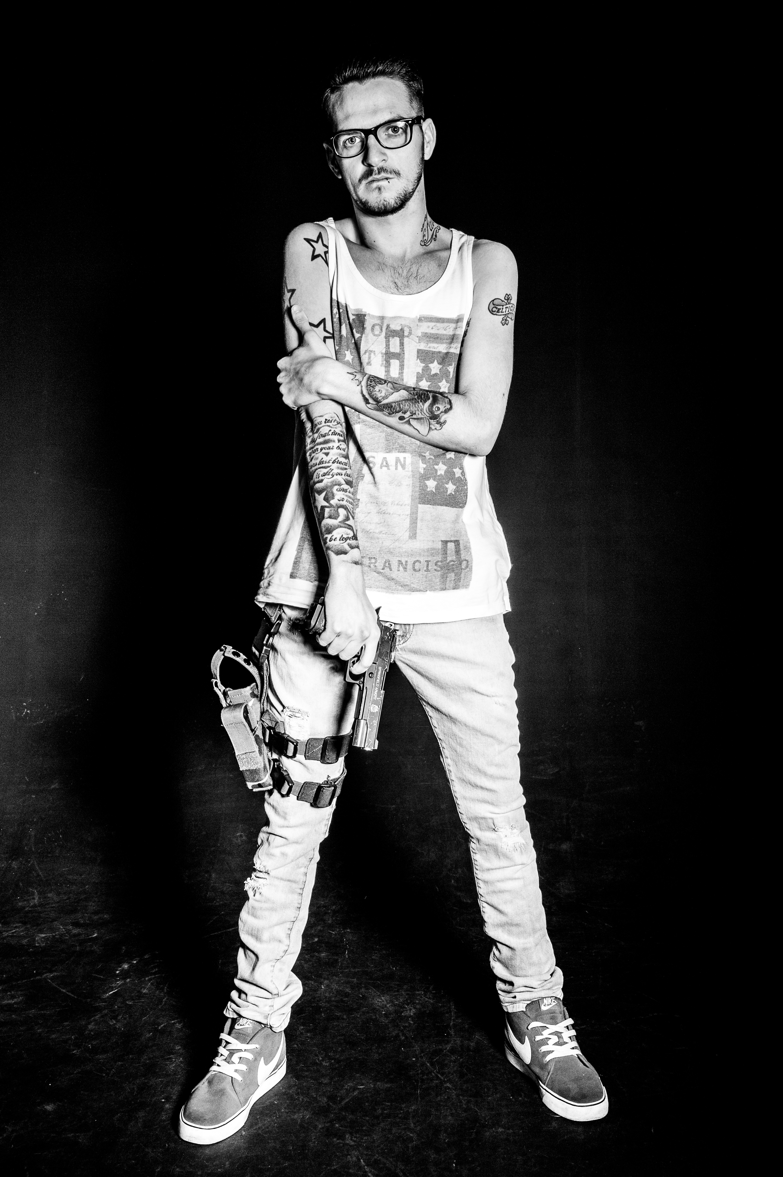
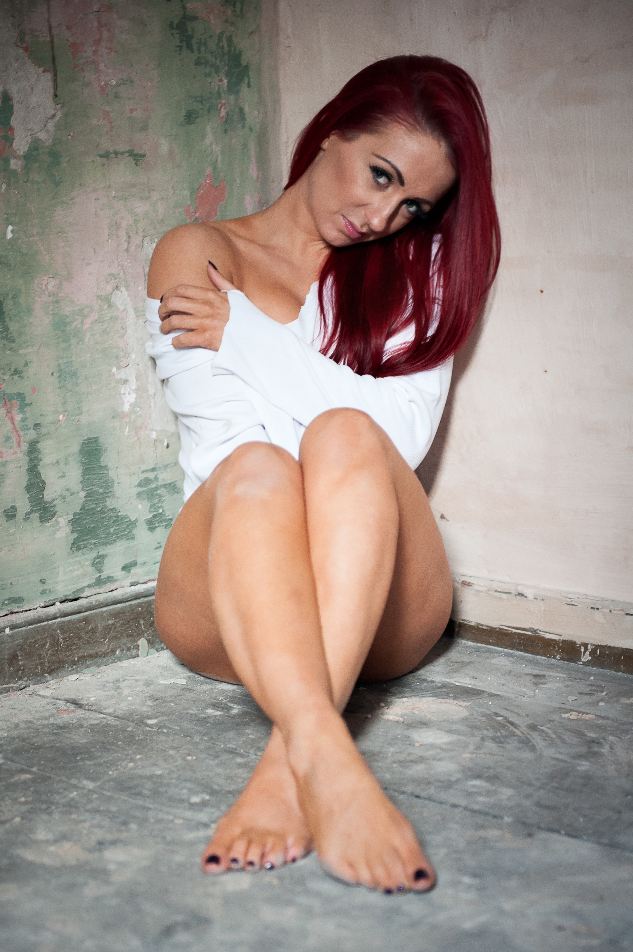
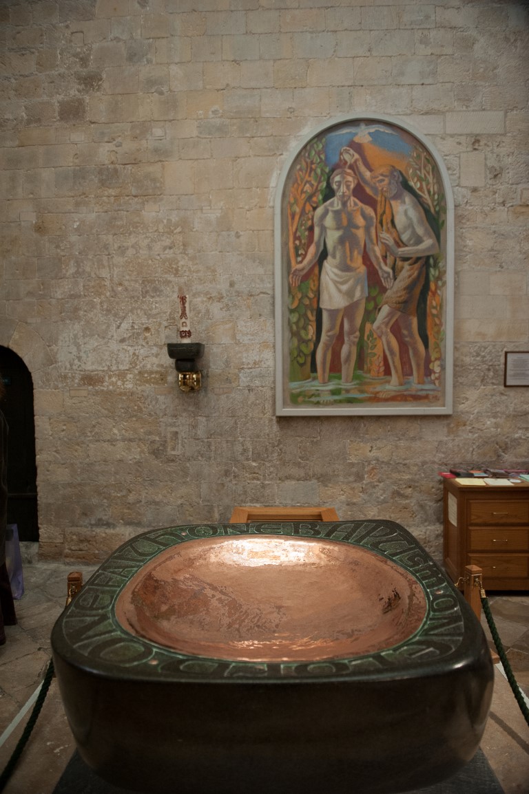
  2. Look at the male/female gaze - after receiving this bit of feedback I have done some initial reading. The Male Gaze refers to Laura Mulvey’ theory that audiences are placed into the viewpoint of a heterosexual male when watching most films. (Mulvey, 1999). I had not considered this concept before but in looking at the photographs for the contrast of hard and soft (black-and-white portrait of a man, collar portrait of a woman) these are obviously shot from a male heterosexual viewpoint. The tutor asked the question “why was the  male clothed and the female half naked?”, And the answer is I couldn’t persuade the female model to remove any more clothes. Although this is a somewhat facetious answer, the shot I had envisaged was an “implied nude” portrait thus adding a further level of vulnerability (and to my mind softness) to the photograph. This would definitely fall under the heading of “Male gaze”. I will definitely do more reading into the subject and explorer the themes if the opportunity presents itself in the upcoming assignments.
  3. Include more blog posts on what inspires me – In response to this advice, part of me wants to say “it’s tough enough finding the time to write the blog posts on the exercises and assignments” but I see the value in being able to formally reflect upon the photographers, artists, music, articles  or events that influence my own photography.

As I have mentioned in one of my previous posts I have difficulty with the question “what is art?”. This is partially going to my upbringing were there wasn’t any great emphasis on art, and partially my environment i.e. working as an IT project manager for a large manufacturing corporation relies more on planning, logistics, analysis, problem-solving et cetera. So studying art really runs counter to anything I have done in the past and to have the tutor talk about my “artistic voice” sends the little computer guy inside my head into some sort of apoplectic fit but it is also very encouraging to think that maybe I do have a fledgling artist inside me also.

Tutors Comments

Overall Comments

Your technical approach is solid and you demonstrate a confidence when approaching the exercises. Continue to challenge yourself when it comes to doing the exercises and the assignment. Your analysis of your response and your reflections are a valid part of your learning journey.

Your standard of presentation is good and your organization and logical approach to the work helps me to follow your development. The supporting research into the history as well as the unpicking of the choices made in the technical approach is good practice.

This is a good first submission. Continue to work in this way.

Feedback on assignment

Demonstration of technical and Visual Skills, Quality of Outcome, Demonstration of Creativity

Exercise projects

You have recorded your explorations and have demonstrated some good practice in discussing your findings and outcomes.

Your technical approach is good and you have a discerning eye when approaching the composition and framing of your images. Exploring the frame ratios to support the concept is a really interesting way of working. You understand some of the technical responses of the exercise and take some time to consider how the message can be also changed. The discussion of ‘why’ the photograph was taken rather than just ‘how’ is relevant here. Look at bodies of work by other photographers who have used these techniques to further their message.

Contrasts

You embraced the theme of the exercise and have presented a variety of considered visual contrasts. You have spent some time unpicking the idea of the attributes and the contrast of the images and your reflective writing is good evidence of your exploration.

When looking for inspiration for your photographic response look at bodies of photographers work and see the way they chose to compose and frame their images. Question and discuss why some images have a visual strength and engagement with these approaches (why they work).
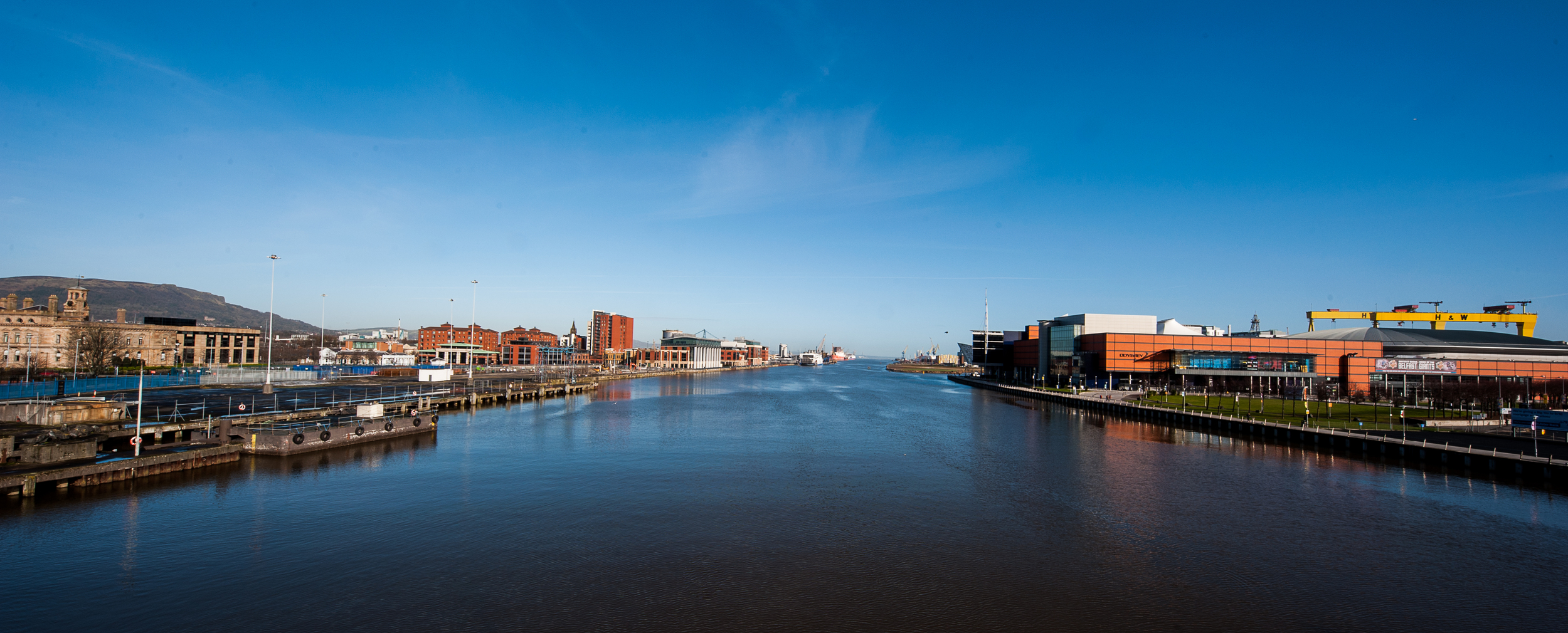
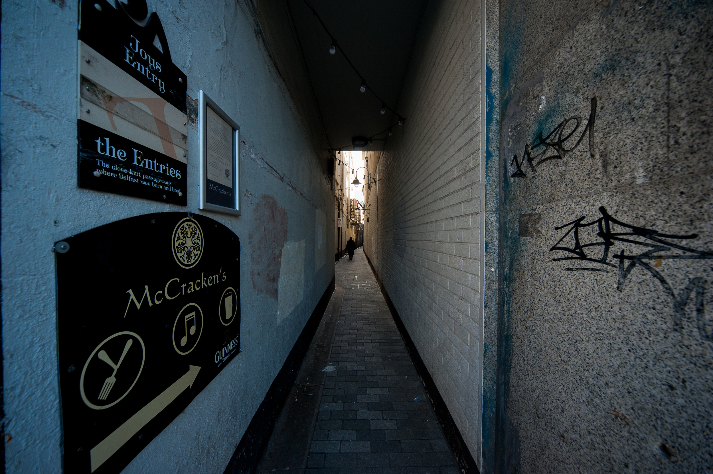
Broad/ narrow

A bright and cheerful image. You have made some considered decisions about the shape of the image here to further support the theme, this works well. I can see some dust specks in the sky so I would suggest you have your ccd sensor cleaned? It is a distraction in the clean areas of your images and you can delete them post production but it might save you much time to get the sensor cleaned.

The narrow image seems very claustrophobic with the leading lines and the more regular format, so really demonstrates a narrow environment well. Your connection of the links and the different atmospheres these have is interesting and helps to create a narrative.
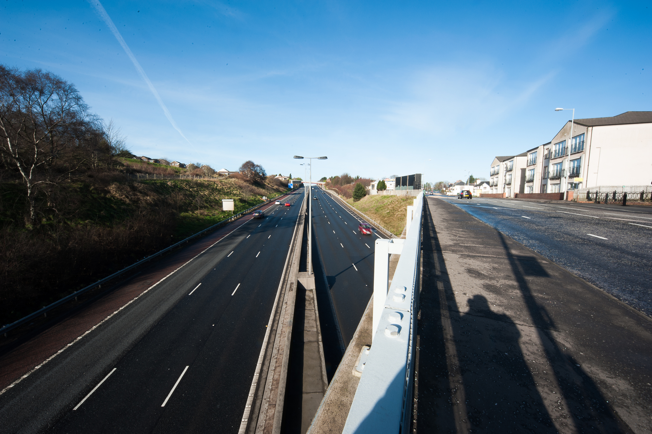
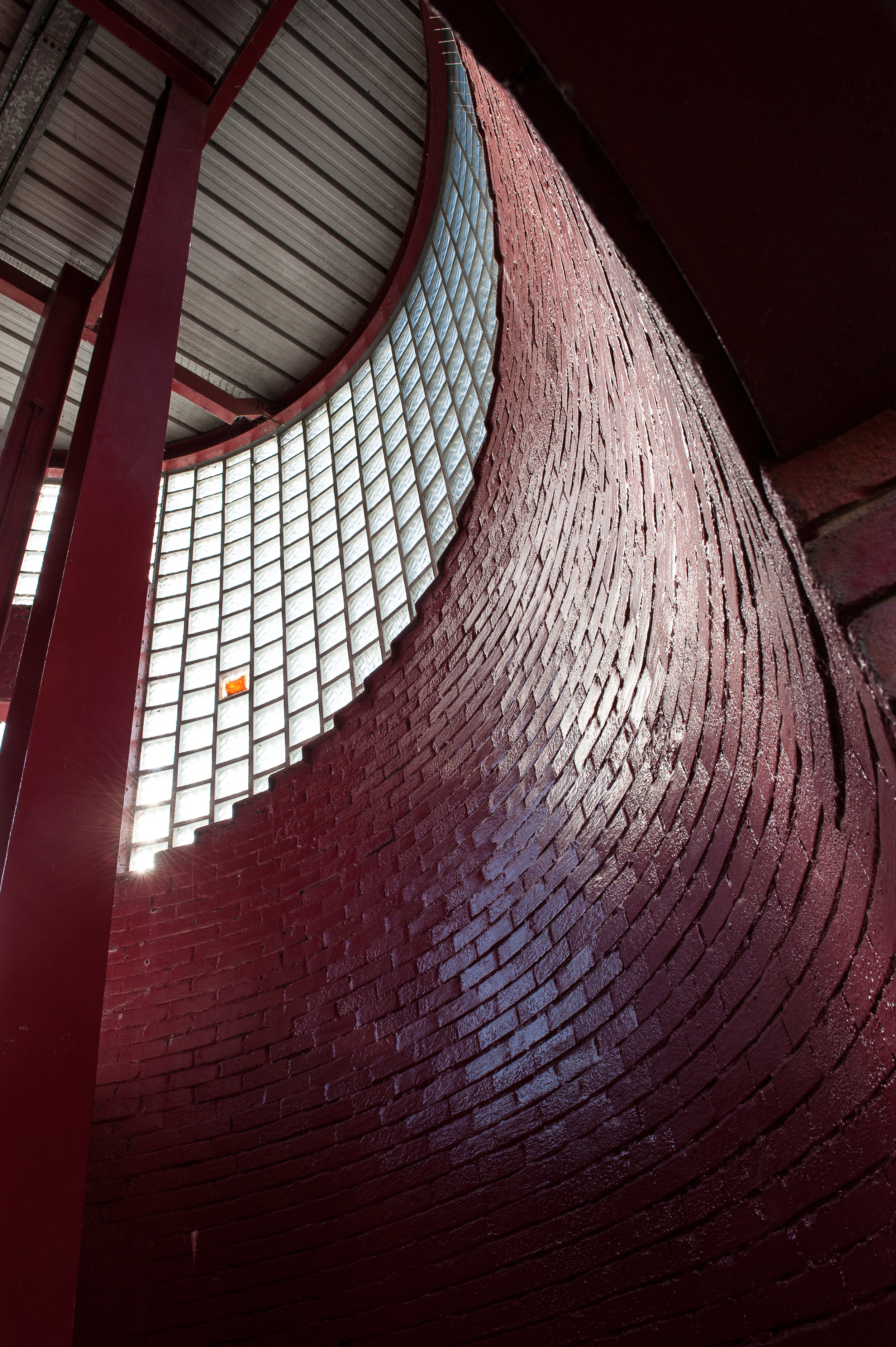
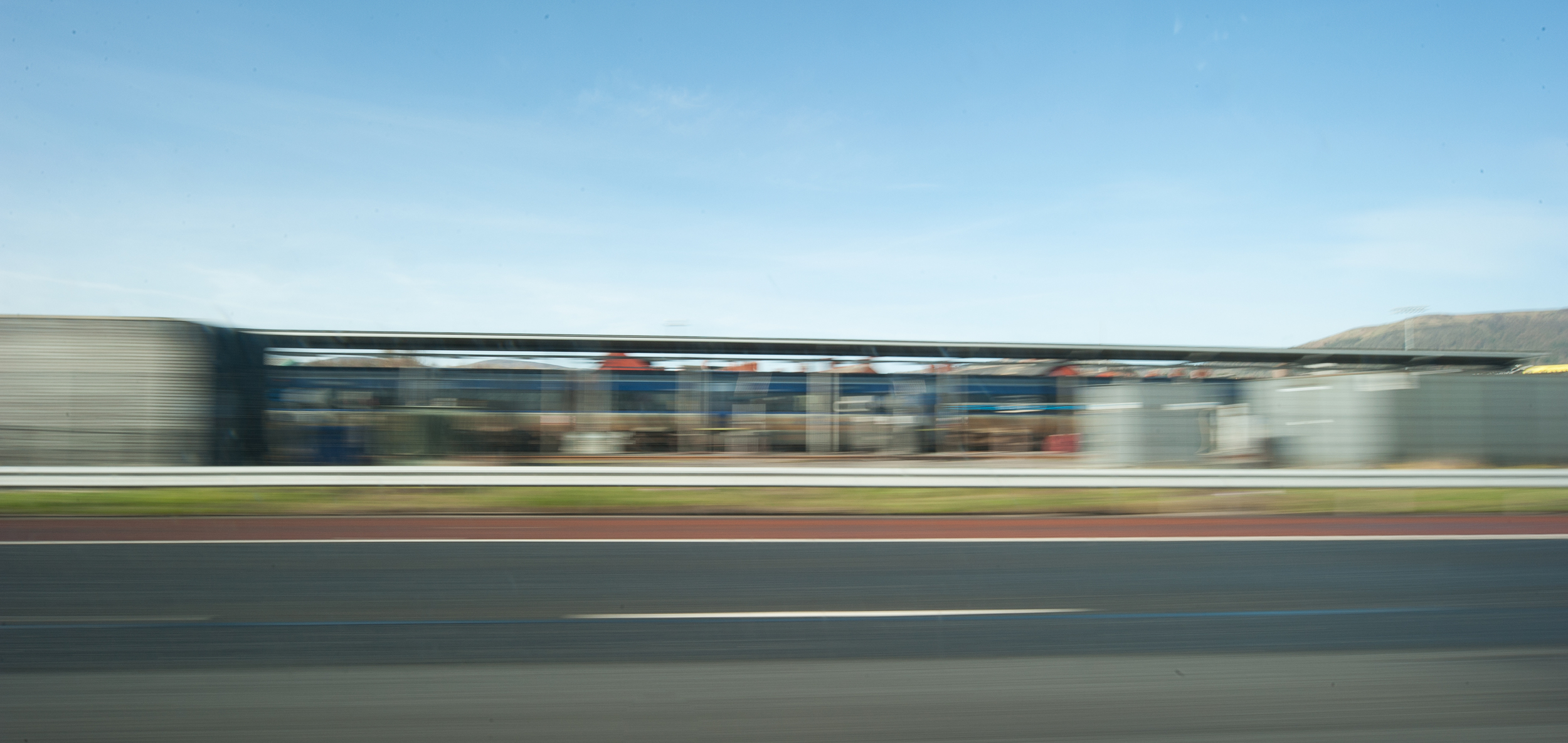
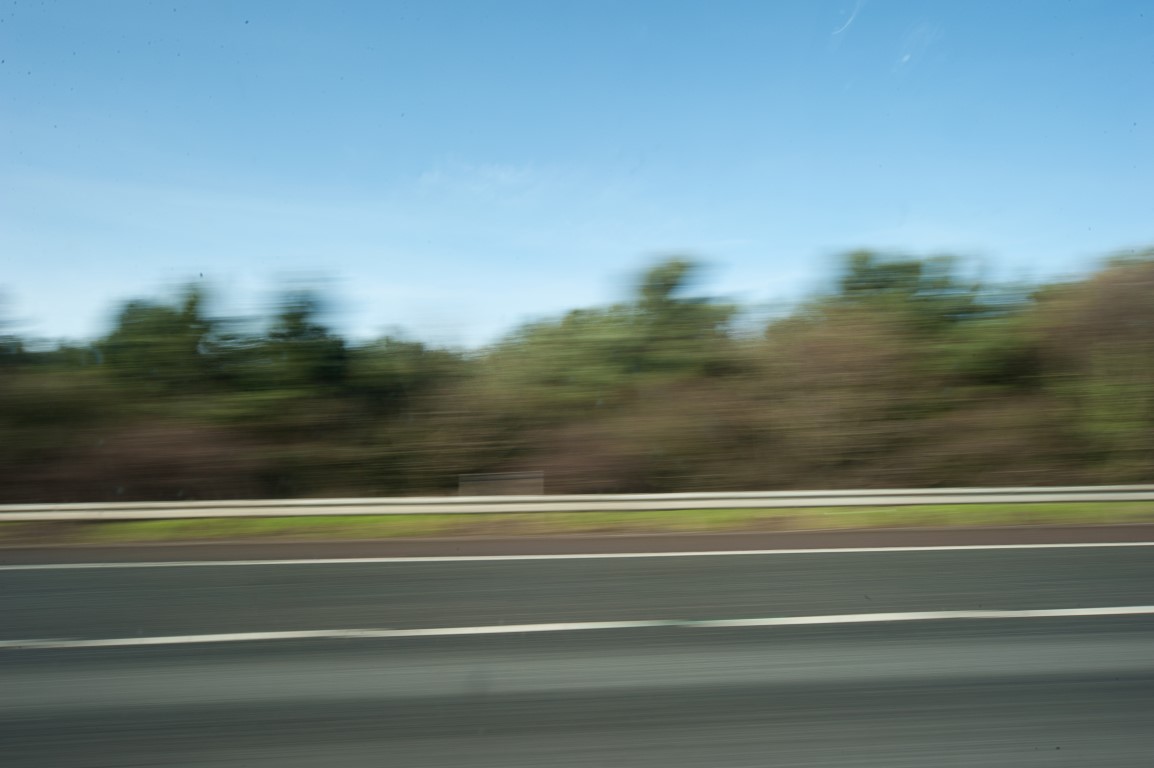
Straight/ curved

The highway image is a solid interpretation of straight and the lines and shadows further support this. Interesting to see your shadow too! Reminds me of the work of Vivian Maier.

The curved image is an interesting view and the repeating curve created by the rectangular clay and glass bricks adds interest.

Sweet/ sour

Good to see you challenging the literal interpretation of the contrasts here and it looks fun. The communication and narrative created by the two images start a story and message. It is interesting to see the matching colours worn by the models and this also has a message. In the ‘sour’ image the lighting is a little extreme from the windows so could be difficult to print as there would be little information in the file. I like your quote and reference to Martin Parr during this investigation.

Diagonal/ rounded

A good interpretation of the writing of Shore (2007). The broken lines and composition here are interesting and challenging to the viewer. You have been very measured in your image capture here. I would also like you to consider the choice you made by turning this image to black and white, does it change the image message? The rounded image is less challenging visually but is pleasing with good light control.
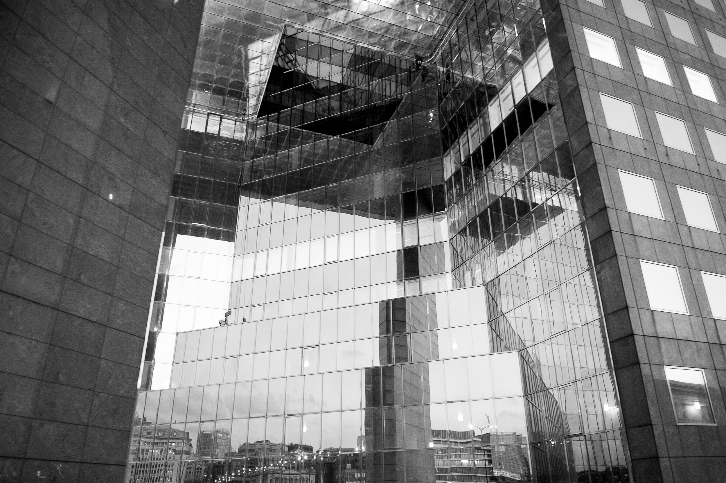
Many/ few

The composition of this image is interesting with the added visual interest created by the reflections. I do find the block on the left is a little distracting as it is quite powerful and the interest is in the reflective elements in the rest of the image. Consider your compositional and cropping options.

This is a much more simple interpretation of the theme although you have made a window connection and considered historical changes it is not as strong as the other image.
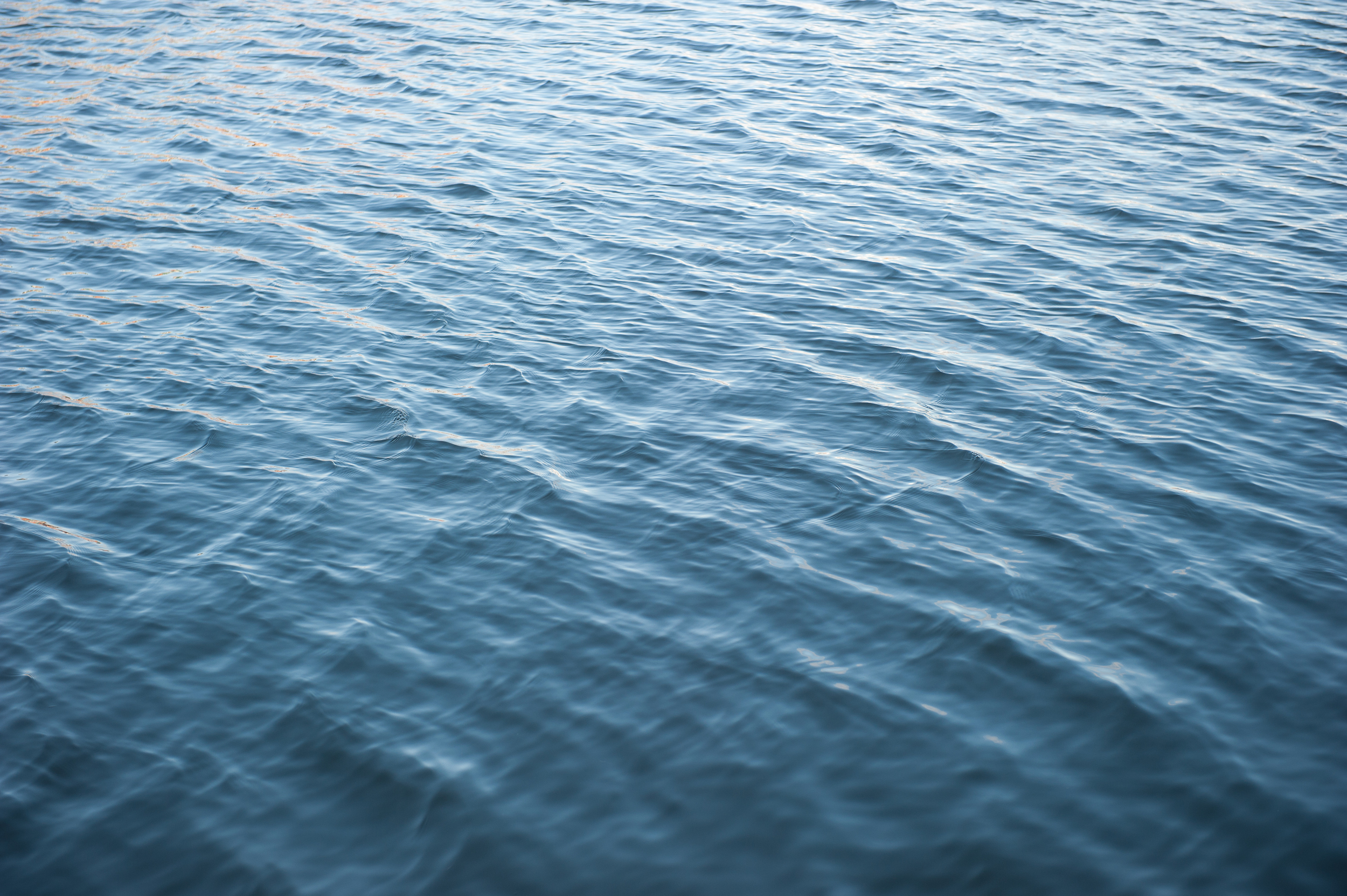
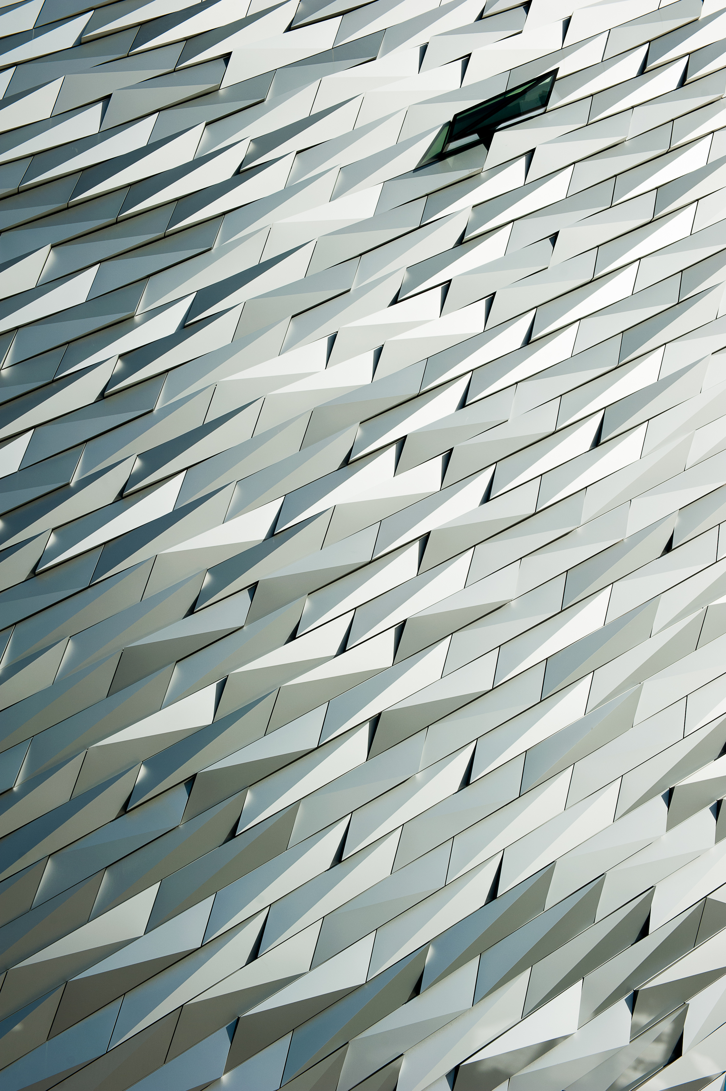
Liquid/ solid

The two images do work well together and filling the frame with the textures is a different angle of view from your other work. This is well seen although I would like to understand why you have a vertical and horizontal image, do they further support the theme using a different energy?
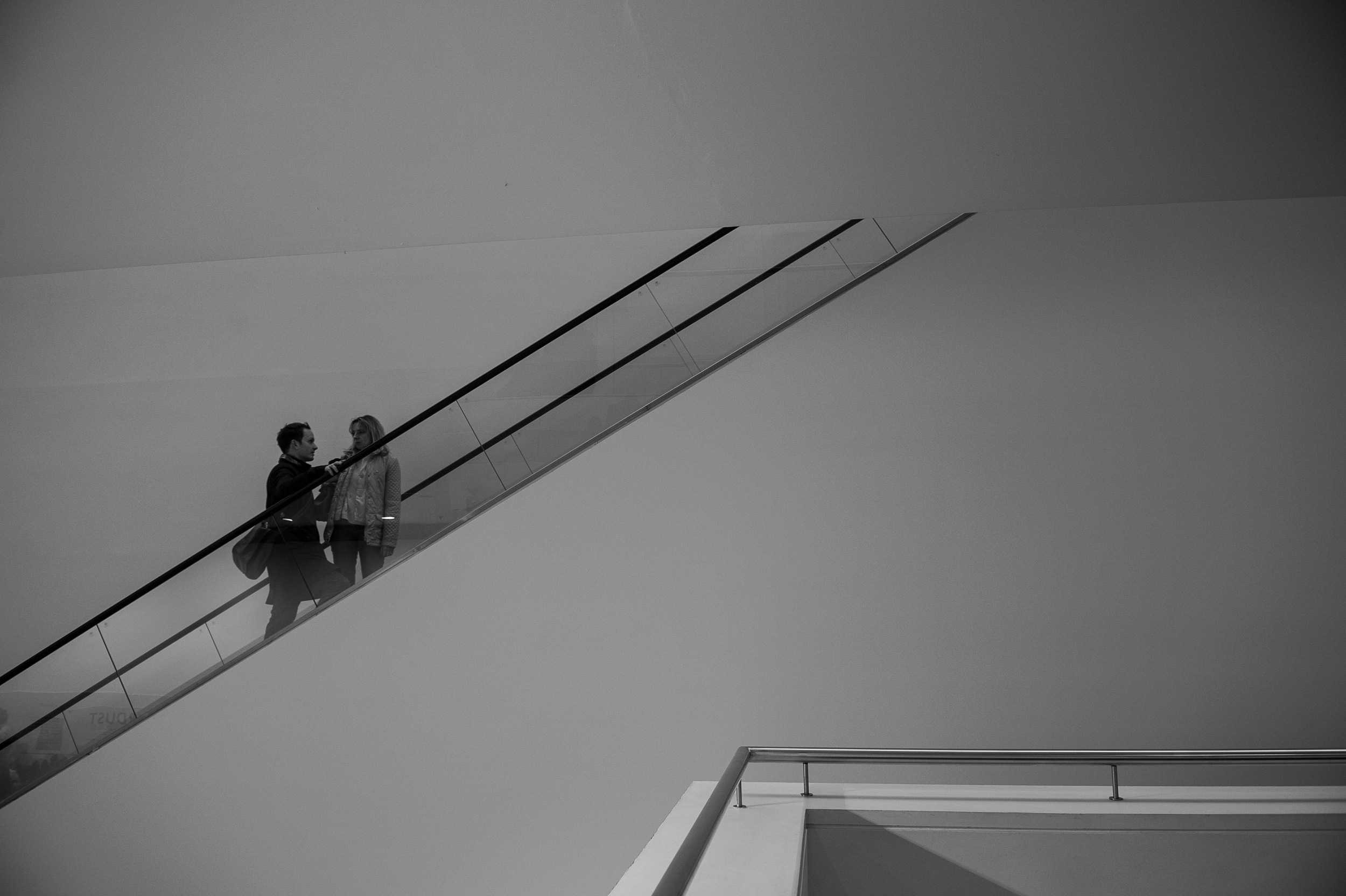
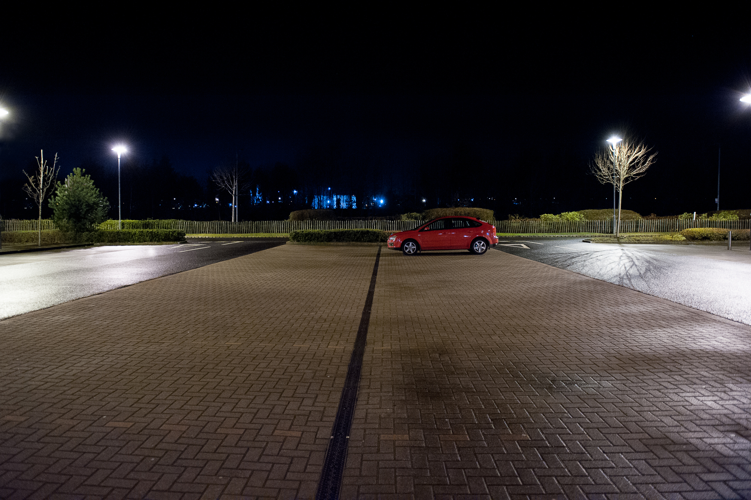
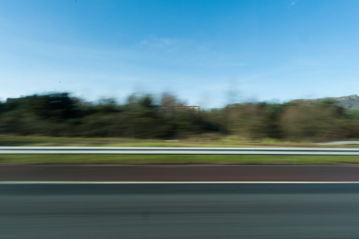
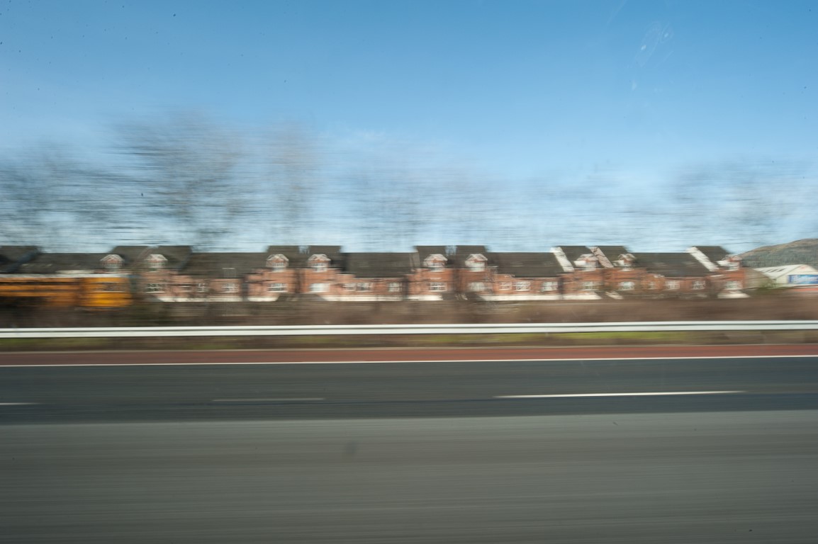
Moving/ still

An interesting exploration here, looks like a scary place for the passenger! I like the play on considering the idea of you or the view moving. The composition of this image with the bands of colour work well. The still image is most ominous. Look at the work by Gregory Crewdson to see the tension in this stillness and space and lighting. Sketching out your intent here and using words to visually demonstrate the balance is an interesting way to develop your thoughts.
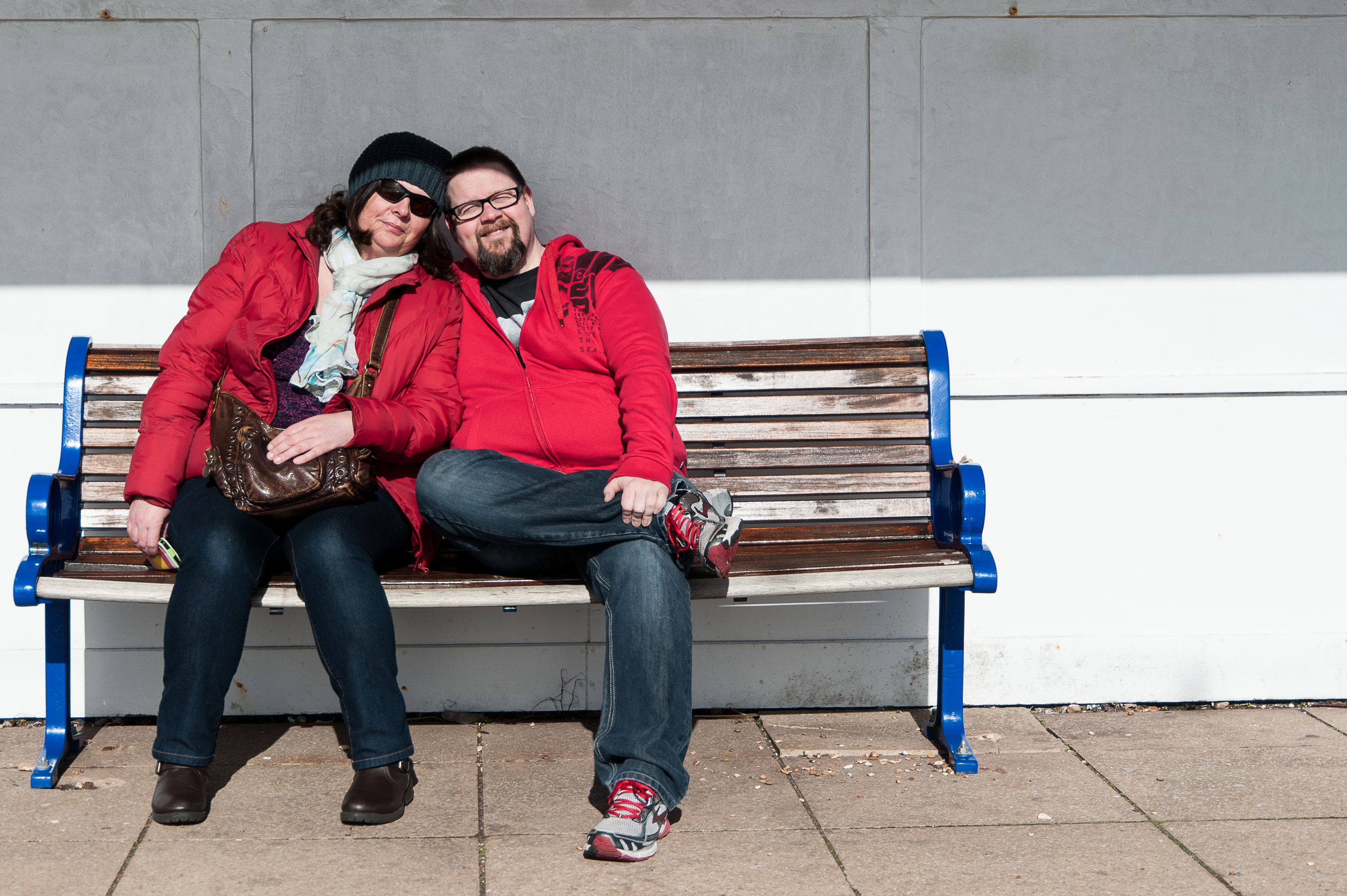
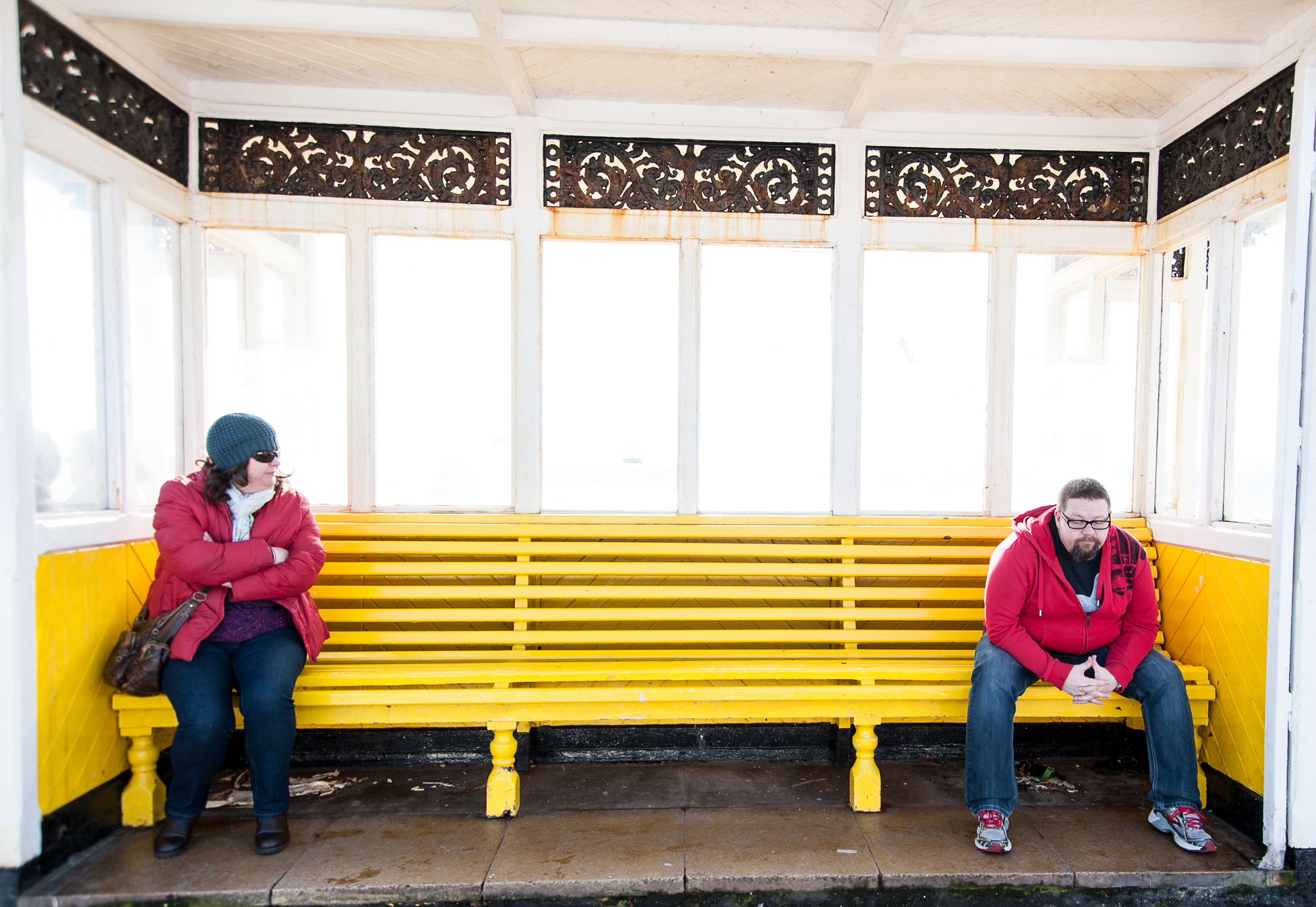
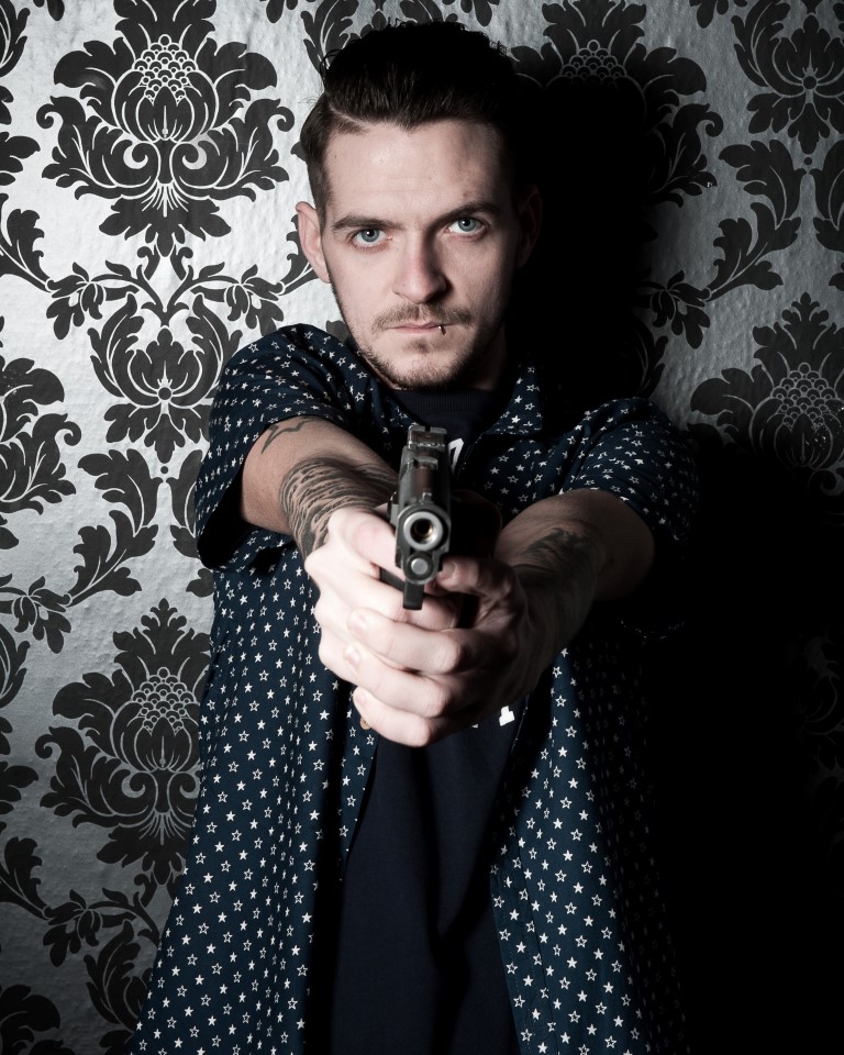
Hard/ soft

As you have moved through the contrasts you have become more exploratory and experimental with the emotional elements of the themes. This is a great way to work.

The division of the images into gender based descriptions is interesting and hopeful! The use of a weapon to indicate hard masculinity is a challenging approach. Think also about your converting this to black and white, what is the additional message here? The feminine image is a balance of soft colours and the pose is very coy/ vulnerable/ sexy a real mixture of messages. The hard man fully clothed and the soft woman half clothed?

Dark/ light

A considered interpretation of dark/ light, the compositions are confident and this is an image that challenges the ideas. The change in the object ratio in this image is also an important element; reflect on this.

Contrast light and dark in one image

Your contrast image is successful and has an interesting visual tone. In some ways it is much more simple than some of the other images you have presented. The black and white delivery of this image should also be considered. In this type of image it is interesting to explore the weight of the image, the composition and ratio of how much space or weight the image is given can really change the impact. For instance the light area being only a small part of the whole can look diminished or a torch in the darkness whereas the light area over powering the darkness is a different idea.

Within your self-assessment you recognize your areas of strength and also areas to develop. To develop your creative voice and gain an understanding of the messages within visual work, continue to engage in a variety of critical reading as you have done.

Learning Logs or Blogs/Critical essays

Context

Your Blog demonstrates your enthusiasm in the topic and you appear to be using it to potential. It is clean and clear and easy to navigate.

Breaking down the exercises is good practice but I would like to see you further exploring other artists and how they have used techniques in their narratives. You can also include sketches and other visual inspiration (look at the suggested reading below), contact/ proof sheets/ work that inspires you etc.

Suggested reading/viewing

Context

For an inspirational log book (remember this is only one approach, you need to experiment with what feels comfortable to you)

http://www.daneldon.org

Candida Hofer – interior architecture

Michael Collins- documentary architecture

Susan Sontag- critical theory, look at the male/ female gaze


Prakel, D (2007) Basics Photography: composition. Laussane: AVA Publishing.

Prakel, D (2009) Basics Photography: exposure. Laussane: AVA Publishing.

Pointers for the next assignment

It is excellent to see you looking into creating work with a message. This is a real step forward into making your photography develop and matter. Keep working in this way and also continue to reflect on other artists approaches within your reflection. This is really good practice.


Please send a sample of prints for your next assignment submission then we can explore how that can be refined and developed.

Assignment 1 - Contrasts

This is my submission for the first assignment for The Art of Photography module. The assignment was to take a minimum of eight pairs of contrasting photographs and one photograph showing, in a single image, a contrast explored in one of the previous pairings. This exercise is very similar to one set by Johannes Itten as part of the “Preliminary Course” taken by students in Bauhaus design school in the early 1920s (Freeman, 2011).

In some of the photographs below the subject matter is a literal representation of the word describing the element of the contrast. For instance to illustrate the contrast between broad and narrow, I shot something that was broad and something that was narrow. In some of the other pairings, for example sweet & sour, I tried to step away from the most obvious meaning of the words but still demonstrate contrast.

In creating these images I have attempted to use many of the elements of composition learned on the first part of the course (e.g. filling the frame, perspective, balance: positioning the horizon, et cetera).

Broad – Narrow

1Broad

Broad

This is the Belfast Lough or at least the area of the Belfast Lough that enters Belfast. When Belfast was a thriving port this was the route for goods into the city. The Titanic travelled this stretch of water on its way to Liverpool to pick up its first passengers. When I started thinking about the word broad, this stretch of water immediately came to mind, because I have to drive over it every day going to work and therefore I know how “broad” it really is.

I played about with the position of the horizon in a standard 4:3 frame, but wasn’t getting a satisfactory result because there was nothing much of interest in the sky or the water in the foreground. I decided to crop the photograph time and this also had the effect of enhancing the wideness (broadness) of the image. I shot a wide-angle 13mm, which although it has the effect of squeezing more into the photograph and actually narrowing the view, the viewer has a sense of a large expanse of water because there is so much of the riverbank included in the scene.

1Narrow

Narrow

This is Joys entry. The entries are the oldest existing parts of Belfast. They were entranceways to tenement housing similar to Edinburgh’s famous closes. When I was a kid I lived in East Belfast, in Victorian housing that had been built for the shipyard workers. Every day on my way to school I passed several entries (narrow passageways between the backs of rows of tenement houses). This got me thinking about effective contrast. In my opinion for these contrasts to work not only do the photographs need to complement each other but they also have to have links. In this case (broad/narrow) the links are access into Belfast and the fact that I would encounter both of these areas on a daily basis at some point in my life.

This photograph was also shot at 13 mm, which has the effect of enhancing the perspective and making the alleyway seen even narrower.

Straight – curved

2straight

 Straight

The first image that sprang to mind when I was considering how I was going to shoot “straight” was that of a desert highway similar to this image by Ansel Adams

The strong sunlight meant that not only did I get this straight lines of the motorway and the bridge but also some very straight elongated shadows.

2curved-5115

Curved

I struggled a lot to communicate the idea of something curved. “Straight” in two dimensions is quite easy thanks to perspective. But as I started photographing curved buildings, curved roads, curved furniture et cetera the photographs just weren’t curved enough, they were flat. Then I find myself in a spiral staircase in a car park in Chichester. I immediately realised my mistake. I was trying to photograph curved from the outside whereas it’s much easier to represent from the inside as you can see from the photograph above.

I am a little disappointed that there is no link between the subjects of these photographs to enhance the contrast but there is still a definite contrast between the two.

Sweet and sour

3sweet-5115

Sweet

For this contrast I moved away from the literal or more common meanings of the words and started thinking about representing other meanings. So for example instead of going straight to someone sucking on a lemon to represent sour, I want to show something sweet turning sour. Instead of the photograph being of something, the photograph is communicating something. My one concern is that without attaching the word sweet to the photograph above does it communicate sweet on its own?

“Mary Price argued that the meaning of the photographic image is primarily determined through associated verbal description and the context in which the photograph is used .” Price M. (1994) The Photograph: S Strange, Confined Space. Cited in Wells, L. 2009 (p29). Photography. London: Routledge

3sour-5115

 Sour

This photograph was taken in the seaside town of Southsea, so it seemed to push the colour saturation a little bit to give it a little more “Martin Parr” feel.

Diagonal- Rounded

4Diagonal-5115

Diagonal

Shore (2007) argues that the photograph exists on three levels, the physical level, the depictive level, and the mental level. He states that at the depictive level the photographer starts with the messiness of the world and imposes order. “he or she imposes this order by choosing a vantage point, choosing a frame, choosing a moment of exposure, and by selecting a plane of focus” Shore (2007:37). This is very true for this photograph.

Vantage point- I could have shot this escalator from the top, bottom, or at an angle that showed the whole escalator in context to its surroundings. Instead I chose to shoot from a platform roughly halfway up.

The frame – in the bottom left-hand corner of the photograph you can see the guardrail on the platform. I could have chosen to frame the photograph in such a way as to not include this. To the far left of the people on the escalator is a huge photograph of Michael Caine taken by David Bailey, I chose to exclude this from the frame.

Moment of exposure – an escalator is a relatively slow-moving machine so by choosing shutter speed of a 60th of a second I have frozen the movement of the people on the escalator but that is selecting the length of the exposure. As a photographer I get to choose the moment of exposure i.e. which 60th of a second I am going to capture. In other words I waited for the escalator to carry the subjects to the position where I want them in my photograph. This was the moment I want to capture.

4rounded-5114

Rounded

For this assignment I wanted to produce photographs which were interesting. As I started looking for subjects to shoot which were rounded it became quite a challenge to make a photograph which was not incredibly dull. So when I walked into Chichester Cathedral and saw the arched ceilings I was incredibly relieved to have something interesting to portray in this category and also something that linked back to the “diagonal” photograph (i.e. both building internals/architectural).

Many- Few

5Many-5116

Many

One photographer who is synonymous with the word many is Andreas Gursky. He has photographed a wide range of subjects including concert crowds, the stock exchange floors, supermarket shelves, F1 pits, and windows. It was one of these photographs of windows Paris, Montparnasse  (Sothebys.com, 2014) that inspired me to choose windows for this contrast. You will see in some of the supporting images at the end of this assignment that I had tried to copy Gursky’s style (i.e. straight on, very flat, documentary) but obviously I don’t have his skill and therefore achieved quite mediocre results. Instead I decided to keep windows for my subject matter and try to create my own interesting images.

5few-5115

Few

This contrast works at the level of quantity. In the first photograph there are a huge number of windows and in the second there are four, but the contrast also illustrates the difference in time when the buildings were erected. These days glass is a relatively cheap material, we see buildings with entirely glass walls or huge single panes of glass used in modern architecture. But when this Cathedral was built glass would have been an incredibly expensive and rare material and also incredibly difficult to produce in this size of windows that we have in our homes today.

Liquid – Solid

6liquid-5115

 Liquid

I mentioned earlier that one of the photographs needed a word associated with it to provide the meaning, whereas this shot does not. Anyone who looks at this knows it water. Nothing quite makes these patterns like liquid rippling. I have chosen to fill the frame in both photographs rather than to allow surrounding elements to give context so this rippling water could be anywhere.

6solid-5115

 Solid

The subject of this photograph is a solid wall with a single window. It is part of the Titanic visitor centre in Belfast and is designed to replicate the ripples of water and also look like shards of ice. In my opinion the contrast is quite effective because the viewer would be quite happy to dip their hand into the photo of the water but would be under no illusion that their hand would go through the wall.

Moving-Still

moving-5122

Moving

In the earlier part of the module a lot of the exercises involved shutter speed and movement however in these exercises, either the camera was still and the subject was moving, or the camera was panning with the moving subject. I wanted to keep the camera steady but still show movement. The best way to do this was to mount the camera on a moving platform i.e. my car. As a car driver your focus is mostly on what is in front of you so the sensation of speed isn’t as great as it is for someone in the passenger seat looking sideways out of the window and that’s what I want to capture.  The flat 2dimentional effect of the horizontal lines running through the photograph is reminiscent of Gurskys “The Rhine II 1999" (Gurskey, 1999)

still-5112

Still

I wanted to carry on the theme of “The Car” into my photograph representing still. Mostly the car exists in two states, moving or still so the obvious subject would be a parked car, but how to embody stillness.

2014-03-02 13_51_36-Contrast 4

I tried to combine elements of stillness:-

  • Deserted carpark
  • Empty car
  • Night
  • The quiet after a rain shower
  • No people in the Photograph

Hard – Soft

7hard-5114

Hard

In exploring this contrast I again wanted to move away from the literal or more common definition of the words. It occurred to me that the words we associate with hard are mostly masculine and the words associated with soft are feminine. In fact to call a man soft can be considered derogatory.

2014-03-01 13_10_58-Contrast 1

From this point it seemed obvious to contrast a hard masculine portrait with a soft feminine portrait. The styles of posing also exacerbated the contrast. This is a studio portrait using “hard light” to bring out the detail and texture of the subject and give a hard edge to the photograph. Although the man in this photo is not directly threating the viewer there is still the uneasiness the situation could escalate due to the weapon being drawn.

7soft-5115

Soft

This portrait is shot in natural light and F2 .8 giving the foreground a gentle blur. The light is much softer and less direct thus giving fewer but fuzzier shadows. The pose of the subject is much less confrontational than the “hard man”. There is a sense of vulnerability in contrast to the projection of menace in the previous picture.

Light - Dark

8light-5115

Light

For this contrast I wanted to play around with the same subject matter but in darkness and in daylight. In its purest form this contrast could have been represented by a totally overexposed photograph (pure white) and a totally underexposed photograph (pure black). In fact every photograph is a product of light and dark (the absence of light) hitting a sensor or film. This got me thinking about negatives and could I take a pair of photos where on image was a negative of the other and for that I needed something that was brightly lit at night but that I could also shoot in silhouette to give the effect of a negative image.

8Dark-5115

Dark

Ansel Adams is often quoted as saying “A good photograph is knowing where to stand.” (Adams, n.d.) and for this photo of the oilrig I must have taken around one hundred images before I found the right place to stand. There is a huge difference in the quality of the photographs in this spot compared to those taken for instance 20ft to the left.

8xDark and light-5115

Light and dark in one image

It could be argued that all of the previous photographs (in fact any photograph) is a combination of light and dark in one image. So to have the contrast in one image the light and dark had to be elements of the photograph. The elements of light come from the very well lit souvenir shop, the light reflected off the pavement and the people walking into the photograph from the left, and of course the lights from the buildings and the boat in the background. This single strong source of light just above the shop is swallowed up eventually by the dark. The elements of the dark are the silhouettes and shadows created from the strong light source, the night sky, the ceiling created by the bridge under which the shop is situated and the fact that the light can only extend a finite distance before it is surrounded and swallowed up by the darkness.

Reflection/learning

I thoroughly enjoyed this assignment. It was a great learning experience in applying the knowledge of composition I have gained so far on the course. I also learned that photography is not just pointing and clicking. Having a theme or a message to convey will yield better results than just wondering about hoping to stumble upon the photo of a lifetime. Photography is not just a way of getting images of things or places it can be a way of communicating with a language of its own.

I believe I have managed to avoid dull boring images shot only to closely illustrate a word and have been able to produce some photographs which can stand alone outside the requirements of this assessment. I have noticed a marked improvement in the composition of my images since starting the course.

References

Adams, A. n.d. Ansel Adams Quotes at BrainyQuote.com. [online] Available at: http://www.brainyquote.com/quotes/quotes/a/anseladams141237.html [Accessed: 2 Mar 2014].

Christies.com. 2014. ANSEL ADAMS (1902-1984)   | Coastal Road, c. 1953   | Photographs Auction | 1950s, Photographs | Christie's. [online] Available at: http://www.christies.com/lotfinder/photographs/ansel-adams-coastal-road-c-1953-5420881-details.aspx [Accessed: 2 Mar 2014].

Freeman, M. 2011. Composition, Contrast and the Bauhaus. [online] Available at: http://thefreemanview.com/observations/composition-contrast-and-the-bauhaus/ [Accessed: 2 Mar 2014].

Gurskey, A. 2014. The Rhine II 1999). [online] Available at: http://www.tate.org.uk/art/images/work/P/P78/P78372_10.jpg [Accessed: 2 Mar 2014].

Price, M. 1994. The photograph--a strange confined space. Stanford, Calif.: Stanford University Press.

Shore, S. 2013. The nature of photographs. London: Phaidon.

Sothebys.com. 2014. Rear Window: Gursky in Paris on Sotheby's Blog. [online] Available at: http://www.sothebys.com/en/news-video/blogs/all-blogs/contemporary/2013/10/rear-window-gursky-.html [Accessed: 2 Mar 2014].

Wells, L. 2009. Photography. London [u.a.]: Routledge.

Supporting Images

Below are Images which did not make it into the final pairs for contrast but I hope will give you an idea of some of the work I was doing to get to the main images

soft-5117 (Medium)

soft-5116 (Medium)

hard-5117 (Medium)

hard-5116 (Medium)

hard-5115 (Medium)

moving-5116 (Medium)

moving-5115 (Medium)

moving-5113 (Medium)

rounded-5115 (Medium)

rounded-5116 (Medium)

diagonal-5114 (Medium)

4rounded-5117 (Medium)

Many-5115 (Medium)

many-5114 (Medium)

liquid-5114 (Medium)